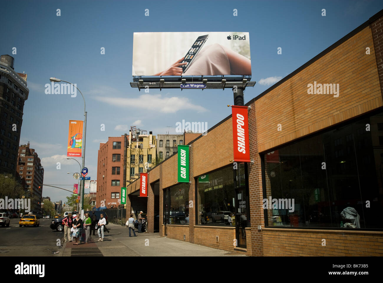
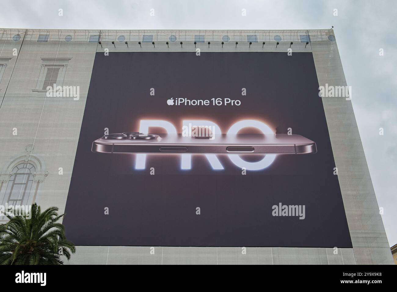
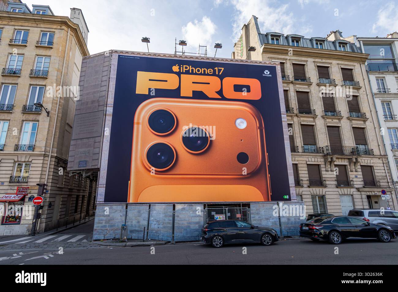
Apple billboard advertising in public spaces represents one of the most successful out-of-home (OOH) marketing strategies in modern corporate history. By prioritizing radical visual simplicity, ultra-low copy density, massive visual scale, and high-impact placement, Apple transforms public infrastructure into premium brand canvases that drive high recall and reinforce its product aesthetics.
The Anatomy of Apple's Out-of-Home (OOH) Strategy
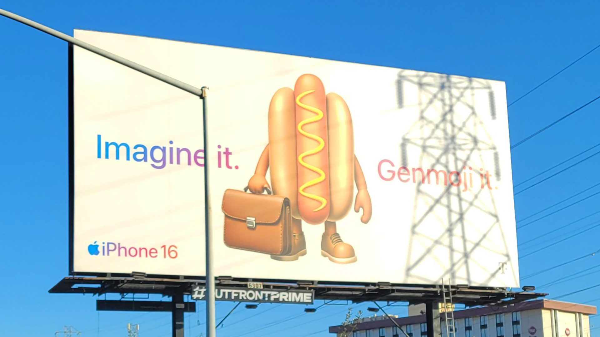
Out-of-home advertising often suffers from visual clutter. Advertisers frequently attempt to compress website-level product descriptions, feature lists, call-to-action buttons, and social media handles onto a single physical display. Apple takes the opposite approach. Its public billboard strategy relies on eliminating friction, focusing on a single sensory or conceptual takeaway that can be processed in under three seconds by a pedestrian or motorist.
The core objective of an Apple billboard is not immediate transactional conversion; it is brand equity reinforcement, aspirational product positioning, and visual dominance of high-traffic urban corridors.
Apple Visual Architecture
- Ultra-High-Resolution Image: Visual Anchor (Product/Photo)
- Negative / Solid Space: Contrast & Eye Focus
- Minimalist Copy (1-5 Words): Instant Cognitive Processing
- Iconic Apple Logo: Immediate Brand Attribution
Visual Hierarchy and Radical Simplification
Apple’s structural design framework relies on extreme visual hierarchy:
- The Hero Asset: A single, pristine photograph—either displaying the sleek industrial design of a hardware product or an extraordinary photograph captured using an iPhone.
- Negative Space: Expansive areas of solid white, deep black, or vibrant monochrome backgrounds that force the viewer’s eye toward the hero asset.
- Micro-Copy: Rarely exceeding five words, the typography uses custom, clean sans-serif typefaces (historically ITC Garamond, followed by Myriad Pro, and currently San Francisco) set at high contrast.
- Subtle Branding: The iconic Apple logo is frequently placed in a corner, rendered small relative to the overall canvas, operating on the premise that the design language itself acts as the primary signature.
High-Impact Urban Placements and Architecture Integration
Apple does not buy media inventory indiscriminately. Its media agency network (primarily Media Arts Lab, a dedicated unit of TBWA\Chiat\Day) targets high-dwell, ultra-dense urban nodes. Strategic placement priorities include:
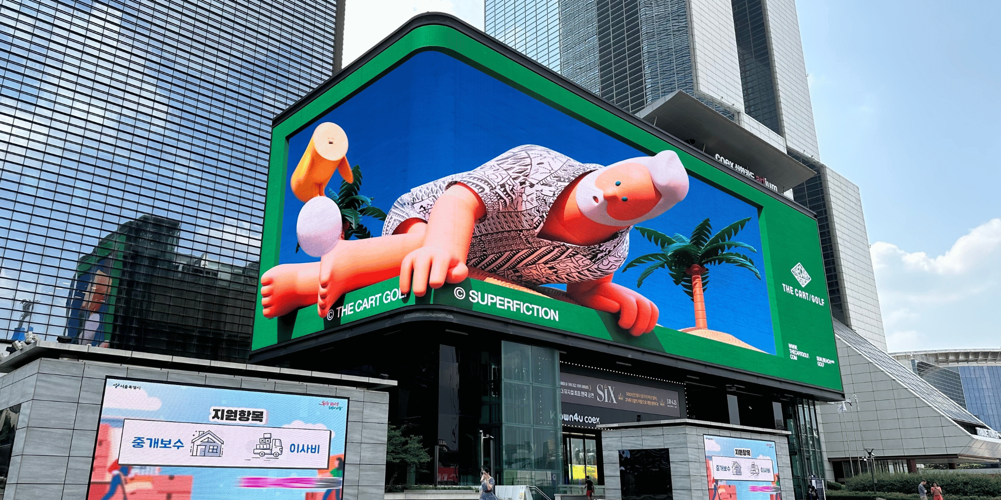
- Architectural Wraps: Wrapping entire exterior facades of historic or modern skyscrapers in financial capitals like New York, London, Tokyo, and Shanghai.
- Transit Hub Terminals: Securing exclusive multi-display takeovers along major commuter transit lines, such as Grand Central Terminal in New York or Waterloo Station in London.
- High-Contrast Sightlines: Positioning traditional static billboards at bends in highways or major intersection focal points where viewing duration is maximized.
- Contextual Event Placement: Placing targeted spatial ads directly adjacent to industry trade shows or competitor events (e.g., erecting privacy-focused billboards in Las Vegas during the Consumer Electronics Show).
Evolution of Iconic Apple Public Advertising Campaigns
Understanding how Apple utilizes public spaces requires examining its pivotal outdoor advertising campaigns over the past three decades.
- 1997
- "Think Different"
- Black & White Portraits
- 2003
- iPod Silhouettes
- Neon & Black Contrast
- 2015
- "Shot on iPhone"
- UGC at Global Scale
- 2019–Present
- Privacy & Hardware
- Bold Copy, Single Motif
"Think Different" (1997): Cultural Anchors in Public Spaces
Following Steve Jobs’s return to Apple in 1997, the "Think Different" campaign re-established the brand’s identity. The public billboard component did not showcase computers or technical specifications. Instead, it displayed large, black-and-white portraits of visionaries like Albert Einstein, Martin Luther King Jr., Bob Dylan, and Mahatma Gandhi, paired with the small "Think Different" slogan and the rainbow Apple logo.
By placing these portraits on monumental outdoor boards in major cultural centers, Apple transformed standard advertising space into fine-art portrait galleries, associating its identity with innovation, creative courage, and non-conformity.
iPod Silhouette Series (2003–2008): Color, Motion, and Contrast
The iPod silhouette campaign remains one of the most recognizable outdoor media executions in advertising history. The design formula was strikingly simple: dark vector silhouettes of people dancing against vivid neon backgrounds (magenta, cyan, yellow, green), wearing iconic white iPods with distinct white headphone wires.
This campaign solved a crucial challenge: how to advertise a digital audio product visually. By emphasizing the bright white earbuds and cable against stark black figures, the billboards turned a physical hardware accessory into a status symbol. When deployed across subway stations, bus wraps, and highway billboards, the high-saturation colors cut through grey urban environments, establishing an immediate visual link between the product and youth culture.
"Shot on iPhone" (2015–Present): User-Generated Content at Scale
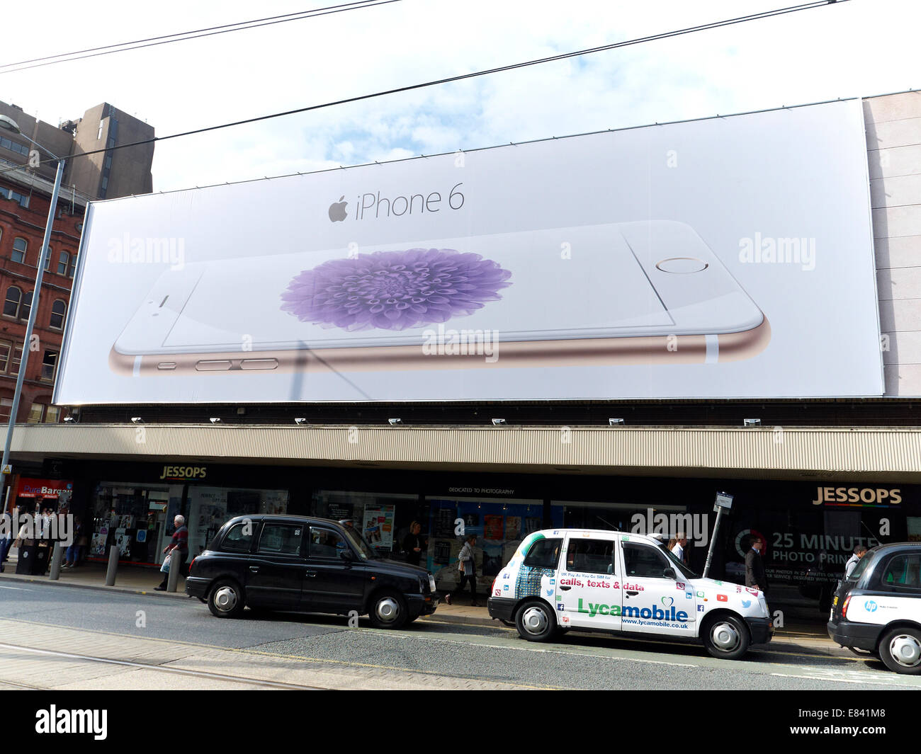
Launched originally in 2015 to highlight the camera capabilities of the iPhone 6, the "Shot on iPhone" campaign transformed public spaces into open-air museum installations.
Rather than using studio-shot commercial assets, Apple curated high-resolution photographs taken by everyday users and professional photographers around the globe. These photos were printed on massive wall wraps, billboard structures, and transit posters in dozens of countries.
The campaign achieved several strategic outcomes:
- Authentic Social Proof: It demonstrated camera quality through real-world examples rather than benchmark statistics.
- Localization: Billboards featured images taken by local creators or captured in local geographic environments, creating a hyper-relevant connection with city residents.
- Democratization: It framed the iPhone not just as a device, but as an accessible tool for creative expression.
Privacy & Security Campaigns: Copywriting as Visual Design
In recent years, Apple shifted part of its OOH focus toward security and user data privacy. Campaigns featuring simple slogans like "Privacy. That's iPhone." used stark typography on neutral backgrounds.
A notable placement occurred during the 2019 Consumer Electronics Show (CES) in Las Vegas. Apple—which did not officially exhibit at the trade show—installed a massive billboard on the side of a hotel overlooking the convention center featuring the line: "What happens on your iPhone, stays on your iPhone." The execution demonstrated how targeted physical placements can influence industry narratives and social media amplification beyond the footprint of the board itself.
Comparative Analysis of Apple's Billboard Media Formats
Apple leverages various digital and static physical formats depending on the campaign objective, density of the location, and surrounding environmental dynamics.
| Media Format | Primary Objective | Key Visual Characteristics | Typical Locations | Strengths |
|---|---|---|---|---|
| Building Wraps & Wallscapes | Brand Dominance & Monumental Impact | Single hero image, high resolution, extreme scale | Financial districts, iconic city centers (e.g., Soho, Shibuya) | Unrivaled visual prestige; high organic social shareability. |
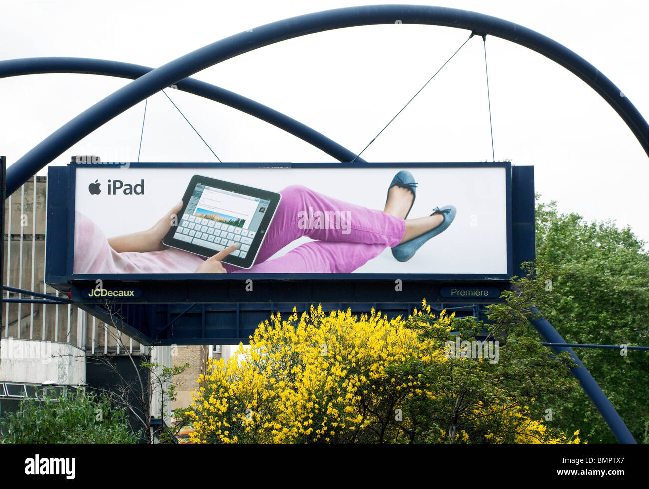
| Traditional Static Billboards | Sustained Messaging & Frequency | Single product shot, ultra-short copy (1–4 words) | Highway corridors, major urban intersections | High repetition rate for daily commuters; consistent brand presence. |
| Digital Out-of-Home (DOOH) | Dynamic Feature Showcase | Subtle motion, smooth transitions, high frame-rate loops | Transit hubs, high-footfall shopping arcades | Allows motion graphics without sacrificing minimal visual aesthetics. |
| Transit Terminal Takeovers | Immersive Brand Surround | Synchronized multi-panel imagery, sequential visual story | Major train stations, international airports | High dwell time; total environmental control reduces competitor noise. |
| Street Furniture / Bus Shelters | Pedestrian-Level Engagement | Detailed product photography, crisp eye-level alignment | Retail corridors, residential urban districts | Close-range interaction; ideal for demonstrating fine product textures. |
Design and Technical Principles Behind Apple Outdoor Ads
Apple’s outdoor advertising success is driven by disciplined execution. Marketers and visual designers can analyze Apple’s approach through several core operational principles.
Apple Design Principles (OOH)
- The 3-Second Rule: Readable at 60 mph in under 3 secs.
- Monochrome Contrast: Saturated solids force eye focus.
- Isolated Product Focus: Zero distracting structural graphics.
- Contextual Relevance: Alignment with local geography.
The 3-Second Rule and Text Reduction
A primary failure in standard billboard advertising is excessive copy. Apple adheres strictly to the three-second rule: a passerby driving at 60 miles per hour should be able to comprehend the entire message without visual distraction.
- Word Count Caps: Most Apple billboards contain between one and five words.
- No Feature Bullet Points: Technical specifications (such as processor speeds, megapixel counts, or battery life hours) are virtually never listed on outdoor boards.
- Single Cognitive Message: Each board presents one isolated idea—whether that is camera quality, privacy, water resistance, or color availability.
Product-Centric Photography and Dynamic Lighting
When showcasing hardware, Apple relies on studio lighting techniques that highlight product materials—such as textured glass, recycled aluminum, or polished titanium.
The images are captured and rendered at extraordinary resolutions to prevent pixelation or blur when scaled up to multi-story building wraps. The product is often positioned at an angle that creates depth, making the hardware appear almost three-dimensional against flat background fills.
Contextual & Location-Specific Adaptations
While Apple maintains a unified global brand identity, its public advertising often adapts to local contexts without altering its minimalist framework:
- Geographic Synergy: A "Shot on iPhone" billboard in Tokyo might feature a night photograph of the Shinjuku neon landscape, while a board in Rio de Janeiro might display a high-contrast coastal sunset.
- Architectural Integration: Apple frequently tailors graphics to fit the physical contours of a building, utilizing architectural curves, glass facades, or corner angles to make the advertisement feel integrated into the structure rather than plastered over it.
Operational and Strategic Execution for Marketers
Executing an OOH campaign with Apple-level clarity requires strict coordination between creative, media buying, and brand strategy teams.
Media Buying & Premium Site Selection
Apple does not buy billboards in bulk based solely on low Cost Per Thousand (CPM) metrics. Instead, site selection prioritizes visual clarity and unobstructed sightlines.
Evaluating High-Impact OOH Locations
- Sightline Quality: Unobstructed by trees, wires, or buildings
- Dwell Time: Traffic signals, pedestrian plazas, jams
- Architectural Fit: Clean structural borders framing the board
- Competitor Distance: Absence of competing adjacent displays
When planning high-tier outdoor campaigns, media buyers should evaluate:
- Vector of Approach: Ensure the display is perpendicular or directly angled to incoming traffic rather than parallel to the roadway.
- Environmental Noise: Avoid cluttered billboard clusters where five or six competing brands are grouped on a single frame structure.
- Lighting and Day/Night Dynamics: Choose digital or backlit static displays that maintain true color integrity during both full sunlight and night hours.
Synergistic Campaign Integration Across Digital and Physical Channels
Apple's outdoor billboards rarely operate in isolation. They serve as physical touchpoints within an integrated ecosystem:
- Social Amplification: High-impact physical billboards (such as the "Shot on iPhone" wallscapes) are photographed and shared across social platforms like Instagram, X, and LinkedIn, converting physical impressions into digital views.
- Retail Proximity: Outdoor boards are frequently deployed within a 1-mile radius of flagship Apple Store locations, driving immediate foot traffic from awareness down to physical retail exploration.
- Public Relations Hooks: Unique or witty billboard placements (such as the Las Vegas privacy campaign) generate earned media coverage across trade publications and news outlets.
Common Pitfalls in Copying Apple's Billboard Style
Many brands attempt to imitate Apple's aesthetic but fail due to key operational missteps:
- Lack of Brand Recognition: Apple can omit its name and rely only on a minimal logo because it possesses global brand equity. Smaller or growing brands that omit clear value propositions risk leaving viewers confused about who is advertising.
- Vague Imagery: Minimalist advertising requires an extraordinary core image. If the photography is bland or ambiguous, the billboard becomes invisible.
- Inconsistent Cross-Channel Messages: An ultra-minimalist billboard must align with the landing pages, video ads, and retail displays that follow. If the user journey breaks into complex jargon downstream, the clarity established by the billboard is wasted.
Frequently Asked Questions
Why does Apple put so little text on its public billboards?
Apple minimizes billboard text to match human cognitive processing speeds in motion. Passersby typically have only two to three seconds to view an outdoor ad. By eliminating technical specifications, calls to action, and web URLs, Apple ensures the central visual message is digested instantly without causing visual fatigue or distraction.
How does Apple handle outdoor advertising for new product launches?
During major product announcements, Apple coordinates global billboard rollouts simultaneously across primary metropolitan markets. These campaigns feature high-resolution hardware renders emphasizing new design finishes, form factors, or standout capabilities, driving broad public awareness while PR and digital channels deliver detailed technical specifications.
Are Apple billboards mostly static prints or digital displays?
Apple uses a combination of both formats. It utilizes large static vinyl wraps for iconic, long-term building placements where monumental scale and pristine print quality are critical. Simultaneously, Apple leverages Digital Out-of-Home (DOOH) networks in transit hubs and urban plazas to show subtle motion graphics and dynamic visual loops.
How can smaller businesses apply Apple's billboard principles on a limited budget?
Smaller businesses can apply Apple's principles by focusing on message reduction and visual contrast. Instead of attempting to list multiple services, phone numbers, and addresses on one board, focus on a single compelling image, one clear headline (under six words), a visible logo, and a clean domain name.
What media agency manages Apple's billboard campaigns?
Apple’s outdoor advertising and broader creative marketing are primarily managed by Media Arts Lab (MAL), a bespoke, dedicated agency subdivision within TBWA\Chiat\Day created specifically to handle Apple’s global brand strategy, creative development, and media integration.
Strategic Recommendations for Media Planners and Brand Managers
To execute high-impact outdoor billboard campaigns inspired by Apple's methodology, follow these actionable steps:
- Audit Copy for Extreme Reduction: Review your billboard draft and eliminate every word that is not essential to the core message. Target a total word count of six words or fewer.
- Prioritize Single-Point Visual Anchors: Avoid multi-image collages. Choose one high-resolution, professionally lit hero photograph or graphic asset that communicates the product's primary benefit.
- Select Sites Based on Sightlines, Not Just Volume: Invest in fewer, ultra-premium media locations with unobstructed viewing angles and high dwell times rather than buying dozens of low-visibility, high-clutter boards.
- Ensure High Contrast and Legibility: Test billboard creative at scale or on screen from a distance of 20 feet for three seconds. If the brand, logo, and core image are not immediately recognizable, increase background-to-text contrast and simplify the composition.
- Connect Physical Impressions to Digital Channels: Design outdoor installations with shareability in mind, ensuring the visual execution is striking enough to encourage organic photography and social distribution.