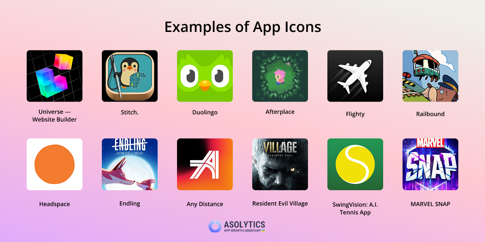
App icons require specific pixel dimensions, aspect ratios, file formats, and density scales across iOS, Android, macOS, Windows, and Web platforms. Mobile operating systems automatically mask squared source images into platform-native shapes. Consequently, creating app icons demands rendering high-resolution, unmasked master assets—typically 1024×1024 pixels for Apple and 512×512 pixels for Google Play—alongside scaled raster and vector variants for system-level displays.
Understanding App Icon Metrics: Points, Pixels, and Pixel Density
Designing app icons requires distinguishing between points (pt) or density-independent pixels (dp) and physical pixels (px). Operating systems use logical coordinate systems so visual elements remain consistently sized across devices with vastly different screen pixel densities.
Physical screen resolution measures how many hardware pixels fit into a display, whereas logical resolution determines how the user interface scales visually. To bridge this gap, hardware platforms use scaling factors.
- iOS (@1x, @2x, @3x): Apple measures interface elements in points. A standard 60×60 pt home screen icon converts to 120×120 px on a retina (@2x) display and 180×180 px on a Super Retina (@3x) display.
- Android (mdpi to xxxhdpi): Android uses density-independent pixels (dp), where 1 dp equals 1 px on a baseline 160 dpi screen (mdpi). Higher-density displays scale up linearly: High (hdpi at 1.5x), Extra High (xhdpi at 2x), Extra-Extra High (xxhdpi at 3x), and Extra-Extra-Extra High (xxxhdpi at 4x).
- Web and Desktop (100% to 400% Display Scaling): Web applications and desktop platforms like Windows and macOS support dynamic scaling multipliers (such as 125%, 150%, 200%, or 300%) to accommodate high-DPI monitors.
Logical Dimension (pt/dp) × Scale Factor (@2x / @3x / Density) = Physical Dimension (px)
Always design master artwork using vector shapes inside high-resolution canvases. Rasterizing artwork at exact required pixel outputs ensures graphics remain crisp without unexpected interpolation blur or edge distortion.
iOS and iPadOS Icon Dimensions and Requirements
Apple enforces strict standards for app icons displayed across iPhone and iPad screens, the App Store, and internal system menus. Developers submit a master 1024×1024 px image, while asset catalogs inside Xcode require explicit raster sizes for optimal system rendering.
iOS App Store and Home Screen Specifications
The primary application icon represents your product across the iOS ecosystem. The App Store submission requires a single high-resolution source file, while the device home screen uses smaller targeted render sizes.
- App Store Master Icon: 1024×1024 px (PNG, sRGB or Display P3, no transparency, no rounded corners).
- iPhone Home Screen (@3x): 180×180 px (60×60 pt at 3x scale, used on modern Super Retina displays).
- iPhone Home Screen (@2x): 120×120 px (60×60 pt at 2x scale, used on legacy standard Retina displays).
- iPad Pro / iPad Air / iPad Home Screen (@2x): 152×152 px (76×76 pt at 2x scale) and 167×167 px (83.5×83.5 pt at 2x scale for iPad Pro models).
System Icons: Settings, Spotlight, and Notifications
Beyond the home screen, iOS displays icons in search results, management settings, and notification alerts. Providing tailored assets prevents the OS from downscaling the home screen icon, which can degrade legibility.
- Spotlight Search Icon: 120×120 px (40×40 pt @3x) and 80×80 px (40×40 pt @2x).
- Settings Menu Icon: 87×87 px (29×29 pt @3x) and 58×58 px (29×29 pt @2x).
- Notification Badge Icon: 60×60 px (20×20 pt @3x) and 40×40 px (20×20 pt @2x).
Apple Corner Radius and Masking Rules
Apple applies a proprietary continuous curve (superellipse or squircle) to all iOS and iPadOS app icons.
Important: Never crop app icon artwork with rounded corners prior to export. Submit completely square images without alpha transparency.
If you pre-crop an icon with custom rounded corners, the operating system applies its standard mask on top of your artwork, leaving black or white artifacts around the perimeter.
Android Icon Dimensions and Guidelines
Android app icons accommodate variable launcher shapes across device manufacturers (such as circles, squircles, and rounded squares) by separating icon assets into distinct layers.
Google Play Store Icon Standards
Google Play requires a dedicated high-resolution store listing asset separate from the in-app launcher package.
- Dimensions: 512×512 px
- Format: 32-bit PNG (with alpha channel allowed, though transparent cutouts are filled with background color by the store frame).
- Color Space: sRGB
- Maximum File Size: 1,024 KB
- Shape: Square layout. Google Play automatically applies a dynamic mask with a corner radius equal to 20% of the overall size (102 px radius) and subtle drop shadow effects during store rendering.
Android Adaptive Icons: Foreground, Background, and Safe Zones
Introduced in Android 8.0 (API level 26) and refined in subsequent system releases, Adaptive Icons consist of two distinct layers: a foreground layer containing the visual badge/logo and a background layer containing colors or patterns.
- Total Canvas: 108 × 108 dp (Includes 18 dp outer bleed on all four sides)
- Safe Zone (Visible Mask Area): 72 × 72 dp Diameter Circle
- Logo
- Safe Zone (Visible Mask Area): 72 × 72 dp Diameter Circle
Both layers must measure 108×108 dp. The central 72×72 dp diameter region represents the core safe zone. The outer 18 dp edge on all sides serves as a bleed area, visible only during interactive visual transitions, parallax scrolling, or dynamic OEM mask animations.
To export adaptive raster assets across standard density buckets, scale the 108×108 dp canvas accordingly:
- mdpi (1x): 108×108 px (Safe zone: 72×72 px)
- hdpi (1.5x): 162×162 px (Safe zone: 108×108 px)
- xhdpi (2x): 216×216 px (Safe zone: 144×144 px)
- xxhdpi (3x): 324×324 px (Safe zone: 216×216 px)
- xxxhdpi (4x): 432×432 px (Safe zone: 288×288 px)
Android Notification and Themed Icons
Android enforces simplified monochrome representations for system bar notifications and dynamic home screen themes:
- Notification Icons: Must feature pure white graphics on a transparent background. Dimensions scale from 24×24 px (mdpi) up to 96×96 px (xxxhdpi). Non-transparent pixels appear as solid white shapes when displayed in the status bar.
- Monochrome Themed Icons (Android 13+): Supplied as a single-color vector drawable (
VectorDrawableXML). The operating system dynamically colors the icon based on the user's active wallpaper palette and system theme settings.
macOS, watchOS, and visionOS Icon Specifications
Apple’s extended hardware ecosystem uses specialized display formats tailored to each operating system's interface paradigm.
macOS Desktop App Icons
macOS icons adopt a rounded-rectangle squircle style featuring subtle drop shadows, realistic textures, and perspective tilt options. The macOS icon grid utilizes an internal safe frame inside a 1024×1024 px canvas.
- Master Canvas Size: 1024×1024 px (@2x 512 pt)
- Asset Catalog File Bundle: 16×16 px, 32×32 px, 64×64 px, 128×128 px, 256×256 px, 512×512 px, and 1024×1024 px.
- Transparency: Allowed. Unlike iOS, macOS icon boundaries permit transparent cutouts around key elements when crafting depth effects or floating tools.
watchOS App and Complication Asset Sizes
Apple Watch displays use varied icon sizes based on screen dimensions, case sizes, and watch face complication slots:
- App Store Icon for watchOS: 1024×1024 px (Square, no alpha channel).
- Watch Home Screen (Launcher):
- 38mm / 40mm / 41mm cases: 80×80 px to 88×88 px
- 42mm / 44mm / 45mm / 49mm (Ultra) cases: 96×96 px to 108×108 px
- Watch Complications: Circular, modular, and corner complications require specialized vector template assets ranging from 16×16 pt to 84×84 pt.
visionOS Spatial App Icons
visionOS utilizes multi-layered 3D spatial app icons. Icons consist of two or three distinct layers (a background element and one or two foreground elements) inside a circular mask.
- Master Layer Size: 1024×1024 px per layer.
- Safe Region: Concentric circle of 800 px diameter centered in the 1024×1024 frame.
- Visual Output: System parallax effects adjust depth and specular highlights dynamically based on where the user looks.
Web Application and Progressive Web App (PWA) Icon Sizes
Web applications and Progressive Web Apps (PWAs) rely on standardized image configurations so browsers, desktop environments, and mobile platforms can display site shortcuts cleanly.
Browser Favicons and Apple Touch Icons
- Standard Favicon (
.icoor.png): 16×16 px, 32×32 px, and 48×48 px. Packaging multiple pixel dimensions into a multi-resolutionfavicon.icoensures compatibility across legacy desktop browsers. - Modern Modern SVG Favicon: A single scalable vector graphic (
favicon.svg) supported by modern browsers, allowing dynamic dark mode color changes via CSS media queries. - Apple Touch Icon: 180×180 px PNG file declared in the page head tag
. iOS uses this asset when a user taps "Add to Home Screen."
Web App Manifest Icons and Maskable Requirements
To pass PWA installability criteria, web applications must reference icon configurations inside a manifest.json file.
{ "icons": [ { "src": "/icons/icon-192.png", "type": "image/png", "sizes": "192x192", "purpose": "any" }, { "src": "/icons/icon-512.png", "type": "image/png", "sizes": "512x512", "purpose": "any" }, { "src": "/icons/icon-maskable-512.png", "type": "image/png", "sizes": "512x512", "purpose": "maskable" } ] }
- Standard PWA Icons:
192×192 px(for taskbar and home screen shortcuts) and512×512 px(for splash screens and installation dialogs). - Maskable PWA Icons: A dedicated
512×512 pximage where key visuals fit inside an internal safe zone circle (diameter equal to 80% of canvas width, or 410 px). Android adaptive masking crops non-safe areas dynamically depending on system preferences.
Windows Desktop and Microsoft Store Icon Dimensions
Windows apps (built using WinUI 3, UWP, or legacy desktop frameworks) use tiled app representations across the Start Menu, Taskbar, and Microsoft Store.
- Microsoft Store Artwork: 300×300 px (Square App Logo) and 1280×720 px (Featured Store Banner).
- Small Tile (Start Menu): 71×71 px (@100% scale) up to 142×142 px (@200% scale).
- Medium Tile / App List Icon: 150×150 px (@100% scale) up to 300×300 px (@200% scale).
- Taskbar Target Sizes: 16×16 px, 24×24 px, 32×32 px, 48×48 px, and 256×256 px raster sizes generated into
.icoor.pngasset bundles.
Cross-Platform App Icon Dimensions Reference
The table below outlines exact required dimensions, target scale factors, masking behaviors, and alpha channel allowances across modern operating systems.
| Platform / Context | Application Environment | Pixel Dimensions (px) | Aspect Ratio / Shape | Alpha Channel (Transparency) | Platform Mask Applied? |
|---|---|---|---|---|---|
| iOS / iPadOS | App Store Master | 1024 × 1024 | 1:1 Square | No (Opaque) | Applied by App Store |
| iOS | iPhone Home Screen (@3x) | 180 × 180 | 1:1 Square | No (Opaque) | Applied by System Squircle |
| iOS | iPhone Home Screen (@2x) | 120 × 120 | 1:1 Square | No (Opaque) | Applied by System Squircle |
| iPadOS | iPad Home Screen (@2x) | 152 × 152 / 167 × 167 | 1:1 Square | No (Opaque) | Applied by System Squircle |
| iOS / iPadOS | Spotlight Search (@3x) | 120 × 120 | 1:1 Square | No (Opaque) | Applied by System Squircle |
| iOS / iPadOS | Settings Menu (@3x) | 87 × 87 | 1:1 Square | No (Opaque) | Applied by System Squircle |
| Android | Google Play Store | 512 × 512 | 1:1 Square | Allowed (PNG) | Applied by Google Play |
| Android | Adaptive Icon (xxxhdpi) | 432 × 432 (108dp canvas) | 1:1 Square | Allowed (Layers) | Masked to OEM shape |
| Android | Adaptive Safe Zone | 288 × 288 (72dp circle) | Circular Region | Allowed (Layers) | Masked to OEM shape |
| Android | Notification (xxxhdpi) | 96 × 96 | 1:1 Flat Graphic | Allowed (White only) | Monochrome render |
| macOS | App Store / Desktop Canvas | 1024 × 1024 | 1:1 Canvas Frame | Allowed | Custom outer cutouts OK |
| watchOS | App Store Master | 1024 × 1024 | 1:1 Square | No (Opaque) | Applied by watchOS |
| visionOS | Spatial Multi-Layer Asset | 1024 × 1024 (per layer) | 1:1 Square | Allowed (per layer) | Applied system circular mask |
| Web / PWA | Web App Manifest Standard | 192 × 192 & 512 × 512 | 1:1 Square | Allowed (PNG) | Browser defined |
| Web / PWA | PWA Maskable Icon | 512 × 512 | 1:1 Square (80% safe zone) | No (Full background) | Cropped to dynamic shape |
| iOS Web | Apple Touch Icon | 180 × 180 | 1:1 Square | No (Opaque) | Applied when pinned |
| Windows | Microsoft Store | 300 × 300 | 1:1 Square | Allowed | Standard square/rect frame |
Best Practices for Designing and Exporting App Icons
Constructing app icon assets requires adhering to color space parameters, structural grid constraints, dynamic layer setups, and file compression workflows.
Color Spaces: sRGB vs. Display P3
Modern hardware displays support wide-gamut color profiles. Color setup errors during file export lead to dull or mismatched visual assets across customer devices:
- sRGB: The global standard color space for web and universal digital graphics. All platforms render sRGB reliably.
- Display P3: Provides 25% wider color spectrum than standard sRGB, producing richer greens and reds on modern Apple displays.
Tip: If designing in Display P3, export your primary App Store master assets with embedded P3 profiles. Always test fallback sRGB conversions to ensure colors do not shift or desaturate on legacy hardware.
Managing Transparency and Corner Radius Masking
One of the most common reasons app store builds get rejected during submission is alpha channel misconfiguration.
Incorrect Submission:
- Pre-trimmed rounded corners
- App Store applies mask
- Artifacts on edges
Correct Submission:
- Full square master canvas
- App Store applies mask
- Clean platform rendering
iOS / watchOS / visionOS Master Graphics: Export fully square images with sharp 90-degree corners. Fill the background completely; do not include transparent pixels anywhere in the canvas.
Android Adaptive Icons: Separate artwork into two independent 108×108 dp layers. The background layer must be an opaque fill or full bleed pattern. The foreground layer contains the primary brand mark with a transparent background.
Optimization and File Formats
Keep vector source files intact and use automated export workflows to handle batch generation.
- Work in Vector Format: Build master icons inside vector design tools (Figma, Adobe Illustrator, or Sketch) using vector paths and procedural layer effects.
- Use Asset Generation Tools: Utilize native framework tools (such as Xcode Asset Catalogs or Android Studio Asset Studio) to auto-generate downscaled raster sizes directly from master vector files or single high-res PNG inputs.
- Lossless Compression: Run PNG assets through lossless compression tools (like
pngquantorImageOptim) before embedding them in application binaries. This step decreases build sizes without sacrificing visual quality.
Frequently Asked Questions
Why do my iOS app icon corners look distorted after installation?
Corner distortion occurs when designers manually clip an icon's edges with rounded corners before uploading it to Xcode or App Store Connect. Apple applies an automatic continuous-curve squircle mask to square icons during system rendering. If your source image already contains rounded corners, Apple's system mask clips your pre-rounded edges, leaving visible black or white artifacts around the corners. Always upload fully square artwork with sharp 90-degree corners.
What is the difference between an Android Adaptive Icon and a standard PNG icon?
A standard PNG icon is a single static graphic displayed inside a fixed boundary. An Android Adaptive Icon consists of two separate visual layers: a background layer and a foreground layer. The operating system stacks these layers and applies a device-specific mask (such as a circle, squircle, or rounded square) defined by the phone manufacturer. Adaptive icons also support animated visual feedback during launcher interactions, parallax tilting, and gesture animations.
Do I need to export every individual pixel size for iOS asset catalogs?
While modern versions of Xcode support single-size asset submission (where Xcode automatically downsamples a single 1024×1024 px master image for all target devices), manually supplying explicit raster assets for specific scales (@2x and @3x) remains best practice for complex graphics. Downscaling high-detail master graphics automatically can blur pixel-aligned lines, fine text, or thin strokes on smaller displays like settings menus and notification badges.
What is a PWA maskable icon, and why is it required?
A maskable icon is a custom visual asset designed for Progressive Web Apps installed on Android devices. Because Android applies launcher masks to app icons, standard unmasked PWA icons often end up shrink-wrapped inside white background circles. A maskable icon supplies a full-bleed background image alongside a designated inner safe zone (the central circle equal to 80% of canvas width). This structure allows Android to crop the image into any OEM shape without clipping essential brand visuals.
Can I use transparent backgrounds for app icons?
Transparency policies vary by platform. Apple requires fully opaque backgrounds with zero alpha transparency for all iOS, iPadOS, and watchOS home screen and App Store icons. Uploading an iOS icon containing an alpha channel triggers an error during app validation. Conversely, Android adaptive foreground layers, macOS app desktop canvas icons, and browser favicons allow alpha channel transparency.
Recommended Next Steps for App Developers and Designers
To ensure your application icons look sharp across every device screen:
- Create Two Master Vectors: Build one master 1024×1024 px square canvas for Apple ecosystems and desktop environments, and a separate 108×108 dp layered canvas (with a 72×72 dp safe zone) for Android Adaptive Icons.
- Verify Asset Rules: Check that your iOS master artwork contains no alpha transparency and no pre-cut rounded corners.
- Automate Asset Bundles: Import vector source files into Android Studio Asset Studio and Xcode Asset Catalogs (
Assets.xcassets) to auto-generate correctly scaled raster variations. - Audit on Physical Hardware: Test exported builds across real devices running light, dark, and themed display modes to verify edge clarity, color fidelity, and safe-zone alignment before public deployment.