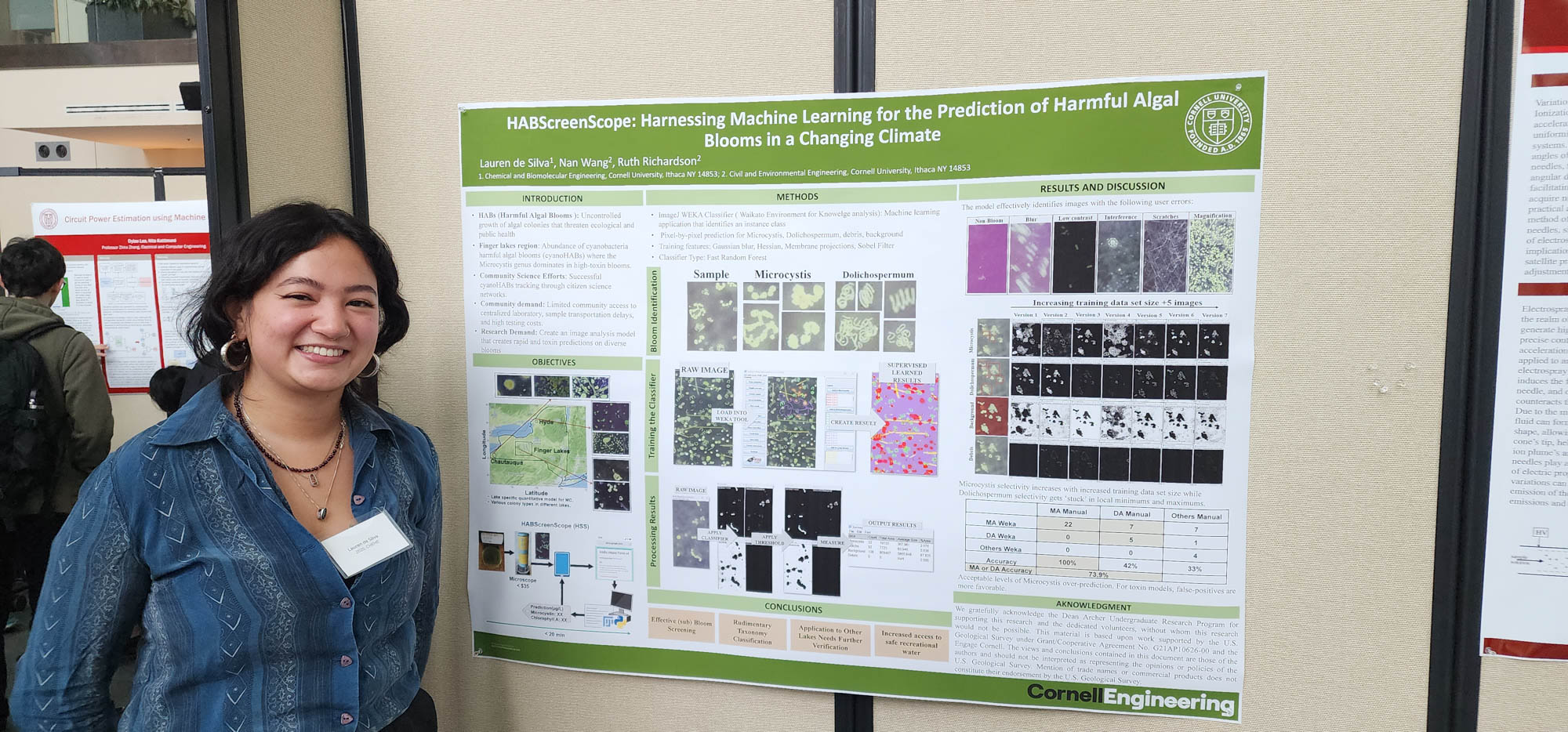
A good poster design functions as a visual shorthand that captures attention within three seconds, communicates a clear hierarchy of information, and drives a specific viewer response. It achieves this through the strategic balance of bold typography, purposeful color palettes, high-quality imagery, and the effective use of negative space to ensure legibility from a distance.
Poster design remains one of the most challenging disciplines in graphic design because it requires the distillation of complex ideas into a single, static frame. In 2026, despite the ubiquity of digital screens, the physical and digital poster continues to serve as a primary touchpoint for event promotion, brand awareness, and social advocacy. An effective poster does not merely present information; it creates an emotional resonance that compels the viewer to engage further with the subject matter.
The Anatomy of an Exemplary Poster Design
To understand what constitutes "good" design, one must look past aesthetic trends and examine the structural foundations. An exemplary poster is built on a framework that respects the cognitive load of the viewer. When an individual encounters a poster—whether on a subway platform or a social media feed—their brain performs a rapid scan to determine relevance.
Visual Hierarchy: Directing the Viewer's Gaze
Visual hierarchy is the arrangement of elements in a way that implies importance. In an example of good poster design, the hierarchy is undeniable. The most critical information—usually the "hook" or the headline—is the largest and most prominent element.
Designers often utilize the F-pattern or the Z-pattern to guide the eye. For a poster, the "Z-pattern" is frequently more effective; the eye starts at the top left (branding or headline), moves across to the top right, diagonally down to the bottom left (supporting details), and finally to the bottom right (call to action). By placing the most vital information along this natural path, the designer ensures that even a casual glance results in information retention.
The Power of Focal Points
Every successful poster has a singular focal point. This is the "entry point" for the viewer's eyes. It could be a striking photograph, a bold piece of custom lettering, or a high-contrast graphic shape. Without a clear focal point, the viewer’s eye wanders, leading to "visual fatigue," where the brain chooses to ignore the medium entirely because it is too difficult to process. In contemporary 2026 design, focal points often leverage maximalism—using oversized elements to break the "frame" of the poster—to create a sense of depth and movement.
Typography as a Structural and Emotional Tool
In poster design, typography is rarely just a medium for text; it is a visual element in its own right. A good example of poster design uses typography to convey the "voice" of the message before the words are even read.
Typeface Selection and Pairing
The choice of typeface must align with the poster's intent. For instance, a poster for a 2026 cybersecurity conference would likely employ a clean, high-tech sans-serif like Inter or Roboto Mono to evoke precision and modernity. Conversely, an arts festival poster might utilize a high-contrast serif or a "liquid" display font to suggest creativity and fluidity.
Effective posters typically limit themselves to two or three typefaces. A common strategy involves pairing a highly stylized "display" font for the headline with a highly legible "body" font for secondary details. This contrast helps establish the visual hierarchy mentioned previously.
Legibility and Scaling
A poster must be legible from varying distances. This is known as the "10-5-2 rule":
- At 10 feet: The viewer should recognize the primary image and the main headline.
- At 5 feet: The viewer should be able to read the secondary information (date, location, or sub-headline).
- At 2 feet: The viewer should be able to process the fine details, such as a URL, QR code, or fine-print sponsorship logos.
To achieve this, designers must pay close attention to kerning (the space between characters) and leading (the space between lines of text). Tight leading can make a poster feel urgent or claustrophobic, while generous leading suggests elegance and high-end positioning.
The Strategic Use of Color Theory
Color is perhaps the most immediate way to trigger an emotional response. In high-quality poster design, color is never decorative; it is functional.
Psychological Impact of Color
In 2026, color trends have shifted toward high-chroma gradients and neo-noir palettes, but the underlying psychology remains constant. Red evokes urgency and passion, making it ideal for "Last Chance" sales or political activism. Blue suggests stability and trust, often used for corporate or healthcare posters.
A "good" design uses a limited color palette—often based on complementary or triadic color schemes—to create harmony. Overcomplicating the palette can lead to a "muddy" appearance that dilutes the message.
Contrast as a Tool for Accessibility
High contrast is the hallmark of professional poster design. Dark text on a light background (or vice versa) ensures that the message is accessible to individuals with visual impairments and remains readable under different lighting conditions. Designers in 2026 increasingly use color contrast checkers to ensure their work meets WCAG (Web Content Accessibility Guidelines) standards, even for printed media, recognizing that inclusivity is a core component of "good" design.
Negative Space: The "Invisible" Designer
One of the most common mistakes in amateur poster design is the fear of empty space. Experienced designers know that negative space (or "white space") is just as important as the elements themselves.
Negative space acts as a buffer, preventing elements from clashing and allowing the viewer’s eye to "rest." It can also be used creatively to form secondary images—a technique known as double entendre or figure-ground reversal. For example, a poster for a film about a forest might use the negative space between the trees to form the silhouette of a protagonist. This level of intentionality is what separates a functional poster from an award-winning one.
Comparative Analysis of Poster Design Styles
Different goals require different design approaches. The following table compares three dominant styles frequently cited as examples of good design in 2026.
| Design Style | Primary Characteristics | Best Use Case | Key Strength |
|---|---|---|---|
| Swiss (International) Style | Grid-based, sans-serif type, objective photography. | Corporate events, public information, transit signs. | Unmatched clarity and timelessness. |
| Minimalism | Sparse elements, bold use of negative space, singular focus. | Luxury branding, high-end gallery openings, film teasers. | Creates an air of mystery and sophistication. |
| Maximalism / Neo-Psychedelia | Vibrant colors, distorted type, layered textures. | Music festivals, youth-oriented marketing, street wear ads. | High "stopping power" and energy. |
| Flat Design 2.0 | Simplified illustrations, subtle shadows, bright accents. | Tech product launches, app promotions, educational posters. | Highly legible and easy to adapt for digital screens. |
Technical Specifications for Professional Production
A design can look stunning on a 5K monitor but fail miserably when printed if technical requirements are ignored. Good poster design incorporates production considerations from the very first draft.
- Resolution and DPI: For a standard 24" x 36" poster, the file must be created at a minimum of 300 DPI (dots per inch) to avoid pixelation. In 2026, many designers work in vector formats (SVG or AI) to allow for infinite scaling without loss of quality.
- Color Mode (CMYK vs. RGB): While digital posters live in the RGB (Red, Green, Blue) space, printed posters must be converted to CMYK (Cyan, Magenta, Yellow, Black). Failing to account for the "gamut" difference often results in dull colors in the final print.
- Bleed and Margins: A "good" design includes a "bleed" area (typically 0.125 inches) where the background extends beyond the trim line. This ensures that no white edges appear if the paper shifts slightly during the cutting process.
- Sustainability in 2026: Modern professional design also considers the substrate. Using soy-based inks and FSC-certified recycled paper is now a standard part of the "design" process for ethical brands.
Common Mistakes to Avoid
Even with a strong concept, a poster can fail due to execution errors. Identifying these pitfalls is essential for anyone seeking to create a high-quality example of design.
- Information Overload: Trying to include every detail (full bios, long descriptions, multiple sponsors) creates a cluttered mess. A poster is a "gateway," not a brochure. Use a QR code to link to the extensive details.
- Poor Image Quality: Using low-resolution stock photos or "stretching" an image to fit the frame immediately signals amateurism.
- Lack of Alignment: Elements that are "almost" aligned create visual tension that feels like a mistake rather than a choice. Using a modular grid system ensures that all elements feel connected and intentional.
- Weak Call to Action (CTA): If a viewer likes the poster but doesn't know what to do next (e.g., "Buy Tickets," "Join Us," "Visit the Site"), the design has failed its primary mission.
The Role of the QR Code and "Phygital" Integration
By 2026, the QR code has evolved from a clunky necessity to a seamless design element. A good poster design integrates the QR code into the composition—sometimes even using it as a central graphic element. This "phygital" (physical + digital) approach allows the poster to remain minimalist while providing access to rich media, such as AR (Augmented Reality) filters, event registration pages, or artist playlists.
When placing a QR code, the designer must ensure there is enough contrast for a smartphone camera to read it quickly, and it should be placed at a height where it is easily scannable by people of different statures or those using mobility aids.
Frequently Asked Questions
What is the most important element of a poster? The visual hierarchy is the most critical element. It dictates the order in which the viewer consumes information. Even the most beautiful illustration will fail if the viewer cannot immediately identify the purpose of the poster or the next steps they should take.
How many fonts should I use in a poster design? Ideally, you should limit your design to two typefaces: one for headlines and one for body text. You can create variety within these two choices by using different weights (bold, light, italic) or sizes. Using more than three fonts often leads to a disorganized and unprofessional appearance.
What is the standard size for a professional poster? The most common professional sizes are 18" x 24" (Medium) and 24" x 36" (Large). For transit or movie posters, the standard "One Sheet" size is 27" x 40". Selecting a standard size early in the design process is important for managing printing costs and ensuring availability of frames.
Does a good poster design need to be "pretty"? Not necessarily. A poster's "goodness" is measured by its effectiveness. A poster for a punk rock show might be intentionally gritty, distorted, and "ugly" to reflect the subculture, yet it is considered a good design because it perfectly communicates the mood and reaches the intended audience.
How do I choose the right color palette? Start with the "vibe" of the event or product. Use tools like Adobe Color or Coolors to explore palettes. A safe and effective starting point is the 60-30-10 rule: 60% dominant color (usually the background), 30% secondary color, and 10% accent color for the CTA or key highlights.
Practical Recommendation for Next Actions
To create or commission an example of good poster design, start by defining a single primary goal. Before opening any design software, sketch your layout on paper using simple shapes to establish your visual hierarchy. Ensure your headline is the most prominent feature, select a high-contrast color palette, and leave at least 20% of the canvas as negative space to ensure the design can "breathe." If the poster is for a public event, verify the legibility of your typography from a distance of at least five feet before finalizing the file for print.