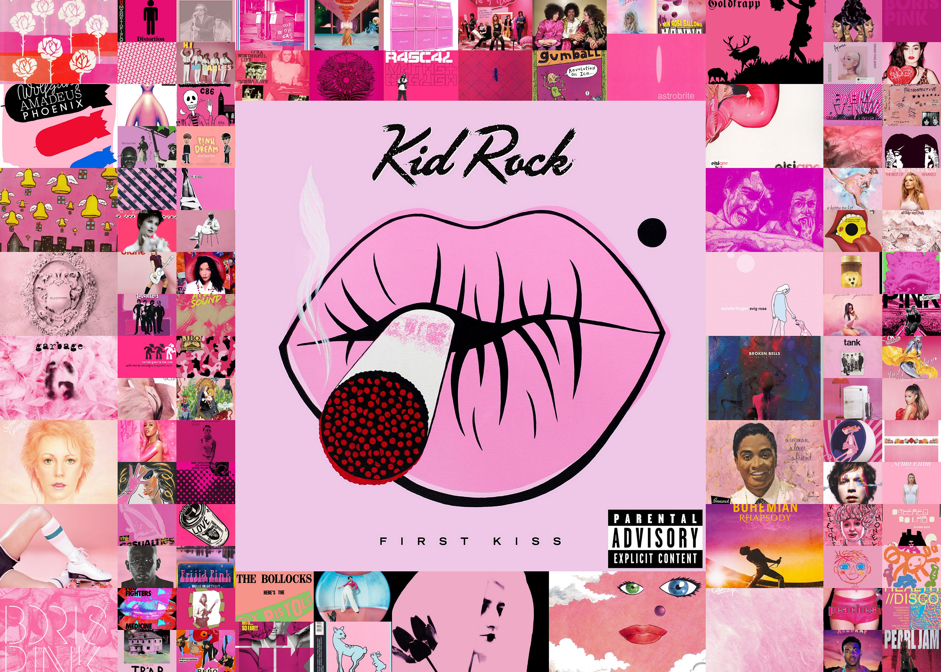
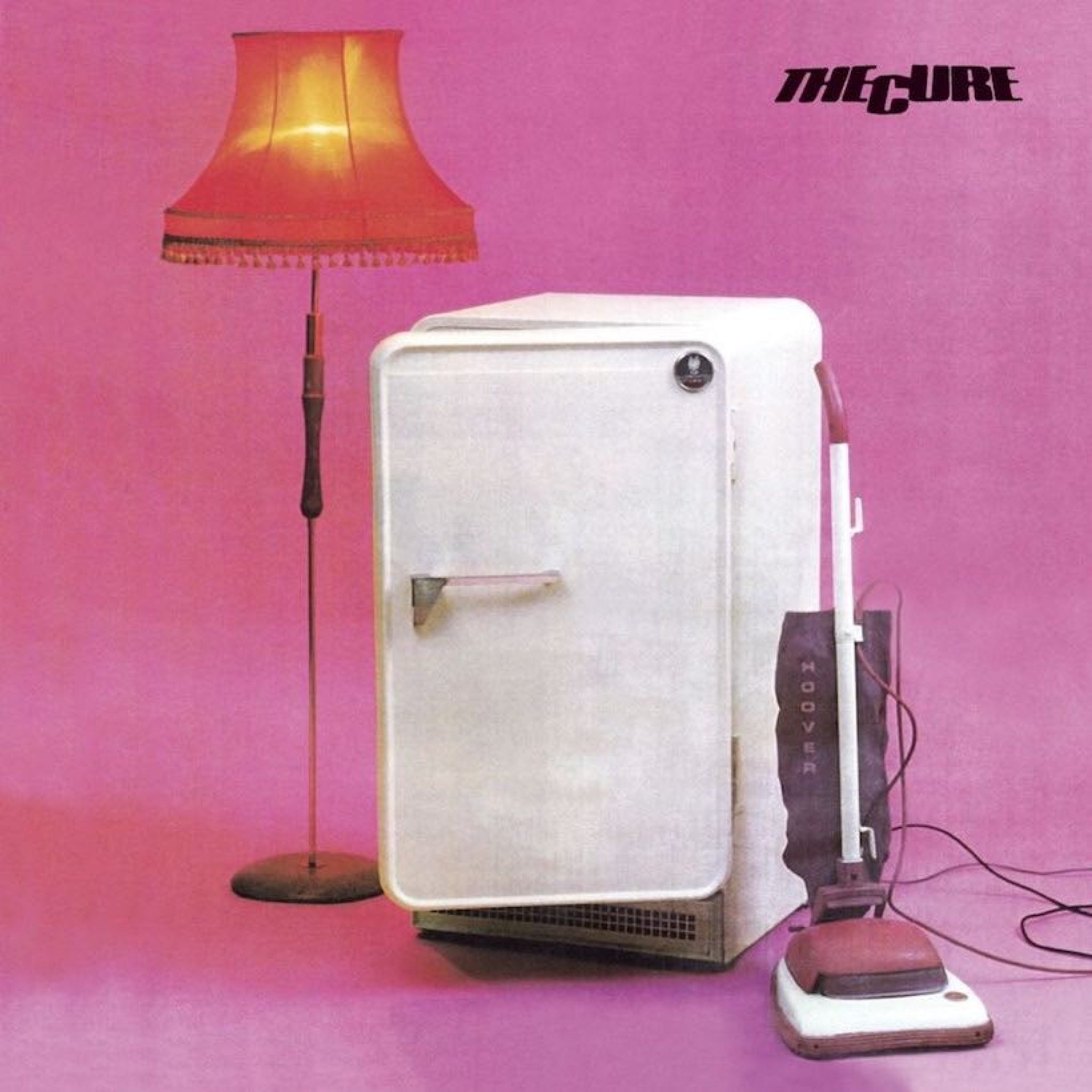
Pink album covers utilize a diverse spectrum of hues—from soft pastels to aggressive neons—to communicate specific emotional depths, genre defiance, and brand identity. Key examples like My Bloody Valentine’s Loveless, Tyler, the Creator’s Igor, and Nicki Minaj’s Pink Friday demonstrate how this color choice influences listener perception and historical legacy across various musical eras.
The Psychology and Evolution of Pink in Music Design
The use of pink in album art has undergone a radical transformation over the last several decades. Historically associated with femininity, sweetness, or fragility in Western culture, the music industry has frequently subverted these associations to create striking, often confrontational visual statements. As we assess the landscape in 2026, pink is no longer a gendered pigeonhole but a versatile tool for high-concept branding.
In the mid-20th century, pink was often used sparingly or in soft tones to denote pop accessibility. However, the punk movement of the 1970s, most notably with the Sex Pistols' Never Mind the Bollocks, Here's the Sex Pistols (which featured high-contrast neon pink and yellow on various pressings), hijacked the color to signify a "toxic" or artificial aesthetic. This shift proved that pink could be jarring and rebellious rather than comforting.
In contemporary design, "Millennial Pink" and its successors have dominated the digital space. This muted, dusty rose became a hallmark of the mid-2010s indie and synth-pop scenes, representing a blend of nostalgia and modern minimalism. By 2026, designers have moved toward "Digital Pink"—high-saturation magentas and fluorescent tones that are optimized for OLED screens and streaming platform thumbnails, ensuring the artwork "pops" against dark mode interfaces.
Defining Eras: Landmark Pink Album Covers
To understand the impact of pink album covers, one must examine the specific records that changed the visual language of their respective genres. These albums did not just use the color; they became synonymous with it.
Shoegaze and the Magenta Blur: My Bloody Valentine’s Loveless (1991)
Perhaps the most famous use of pink in alternative rock is the cover of Loveless. The artwork features a blurred, high-contrast photograph of a Fender Jazzmaster guitar, processed through a heavy pink and red filter. This visual choice perfectly mirrors the auditory experience of the album: a wall of sound that is simultaneously beautiful and disorienting. The use of pink here suggests a dreamlike state, intimacy, and a certain sensory overload that remains influential to indie artists in 2026.
Hip-Hop Branding: Nicki Minaj and the Pink Friday Series
Nicki Minaj effectively "owned" the color pink within the hip-hop landscape of the 2010s. Starting with Pink Friday (2010) and continuing through The Pinkprint (2014) and Pink Friday 2 (2023), Minaj used the color to establish a brand that balanced "Barbie" aesthetics with lyrical ferocity. The covers often utilize vibrant, saturated pinks that signify luxury, femininity, and dominance. This consistent branding helped turn a color into a multi-platinum empire.
The Subversion of the Persona: Tyler, the Creator’s Igor (2019)
The cover of Igor features a minimalist portrait of Tyler against a flat, bright pink background. This choice was a deliberate departure from the darker, more visceral imagery of his earlier work like Goblin. In Igor, the pink backdrop represents the vulnerability and erratic emotions associated with the album’s themes of love and heartbreak. It highlights the "performance" aspect of the Igor persona, using the starkness of the color to draw all focus to the artist's expression.
Genre-Specific Aesthetics of Pink
The shade of pink chosen often signals the genre of music contained within the sleeve. While these are not hard rules, the music industry has developed a visual shorthand that listeners subconsciously decode.
- Bubblegum Pop and Hyperpop: These genres typically lean into "Hot Pink" or "Barbie Pink." Artists like Katy Perry (One of the Boys) or Charli XCX have used these tones to signify high-energy, synthetic, and hyper-feminine themes. In the realm of Hyperpop, these pinks are often paired with metallic textures to emphasize the "manufactured" nature of the sound.
- Indie-Rock and Dream-Pop: Soft pastels and salmon tones are prevalent here. The 1975’s second album, I Like It When You Sleep, for You Are So Beautiful yet So Unaware of It, famously used a neon pink sign against a muted background. This signaled a shift toward a more polished, 80s-inspired pop-rock sound.
- Punk and Post-Punk: As mentioned with the Sex Pistols, punk uses pink as a weapon. Fluorescent pinks are often used in "ransom note" typography or as a jarring background color to create visual friction. This tradition continues into 2026 with modern "Egg Punk" and experimental hardcore bands using neon pink to stand out in a genre typically dominated by black and white.
Technical Considerations for Designers in 2026
When creating pink album covers, designers face specific technical challenges regarding color reproduction. Pink is a notoriously difficult color to maintain across different mediums.
CMYK vs. RGB Limitations
True "Neon" pinks are impossible to achieve using standard CMYK (Cyan, Magenta, Yellow, Black) printing processes used for most vinyl and CD packaging. Magenta is the closest base, but to get a truly glowing pink, designers must specify a Pantone Matching System (PMS) spot color, such as Pantone 806 C. This adds significant cost to physical production. In 2026, many artists opt for "RGB-first" designs, prioritizing how the pink looks on Spotify and Apple Music, while accepting a more muted "dusty rose" appearance for their standard vinyl pressings.
Texture and Materiality
The perceived mood of a pink cover changes based on the finish:
- Matte Finishes: These tend to make pink look more sophisticated, earthy, and "indie." It reduces the "plastic" feel of the color.
- Gloss/UV Coatings: These enhance the saturation, making the pink appear more commercial, energetic, and "pop."
- Holographic Foiling: Frequently seen in 2026 luxury vinyl editions, layering holographic elements over pink creates a "cyber" aesthetic popular in electronic music.
Comparative Analysis of Notable Pink Album Covers
The following table compares influential pink album covers based on their visual style and historical impact.
| Artist | Album Title | Release Year | Primary Shade | Visual Style |
|---|---|---|---|---|
| My Bloody Valentine | Loveless | 1991 | Magenta/Hot Pink | Abstract, Blurred Photography |
| Nicki Minaj | Pink Friday | 2010 | Electric Pink | High-Fashion, Surrealist Pop |
| Tyler, the Creator | Igor | 2019 | Carnation Pink | Minimalist, Portraiture |
| The 1975 | I Like It When You Sleep... | 2016 | Neon Pink | Still Life, Typography |
| Doja Cat | Hot Pink | 2019 | Fuchsia | Illustrative, Graphic |
| Nick Drake | Pink Moon | 1972 | Soft Pink/Multi | Surrealist, Folk |
| Tame Impala | Currents | 2015 | Purple/Pink Mix | Kinetic, Psychedelic |
The "Pink Moon" Phenomenon: Literal vs. Abstract
It is important to distinguish between albums that are visually pink and those that use the word "pink" in the title. Nick Drake’s Pink Moon is a classic example. While the title suggests a dominant color, the original artwork is a surrealist landscape with various muted tones. However, the reputation of the album has draped it in a "pink" identity in the minds of fans.
In contrast, albums like Olivia Rodrigo's GUTS (which leans more toward purple/lavender) or various K-pop releases from groups like BLACKPINK often use pink as a literal brand identifier. For BLACKPINK, the pink represents the "pretty" side of their duality, while the black represents their "tough" side. This strategic use of color ensures that any pink-themed merchandise is immediately recognizable to their global fanbase.
Common Pitfalls in Pink Cover Design
While pink is a powerful tool, it can be misused, leading to a "washed out" or overly "juvenile" look that might not suit the music.
- Legibility Issues: White text on light pink is a common accessibility failure. Designers in 2026 are encouraged to use high-contrast pairings, such as deep navy or "off-black" text on pastel pink, or bold white text on high-saturation magenta.
- Over-Saturation: While bright pinks are eye-catching, they can cause visual fatigue. Successful covers often balance a dominant pink with "grounding" colors like grey, cream, or dark green to provide the eye with a place to rest.
- Genericism: Because "Millennial Pink" became so ubiquitous in the late 2010s, there is a risk of an album looking like a generic lifestyle brand rather than a unique musical statement. To avoid this, modern designers incorporate grit, grain, or glitch effects to disrupt the "perfection" of the color.
Frequently Asked Questions
What is the most famous pink album cover of all time?
While subjective, My Bloody Valentine’s Loveless is widely considered the most iconic pink cover in alternative music due to its unique abstract photography. In the pop world, Nicki Minaj’s Pink Friday and Tyler, the Creator’s Igor are the modern benchmarks for the aesthetic.
Why do so many indie artists use light pink?
Light pink, often called "Millennial Pink" or "Rose Quartz," became a symbol of a specific era of indie-pop. It conveys a sense of nostalgia, irony, and "soft masculinity," making it a popular choice for artists who want to appear approachable yet aesthetically conscious.
Are there pink album covers in heavy metal?
Yes, though they are rare. Bands like Deafheaven (with the album Sunbather) famously used a bright pink/orange gradient for their cover. This was controversial at the time because it defied the traditional "black and white" or "gory" aesthetic of metal, signaling a shift toward "Blackgaze" or more melodic, atmospheric heavy music.
Does the color of the album cover affect sales?
Visual identity is a massive driver of "click-through" rates on streaming platforms. In 2026, a vibrant pink cover often performs better in algorithmic discovery because it stands out against the more common blue and black tones of digital interfaces, potentially leading to higher initial streams.
How do I print a neon pink album cover?
To achieve a true neon pink on a physical record sleeve, you must use a fluorescent ink as a fifth color in the printing process. This is an "additive" process that goes beyond standard CMYK. Consult with a specialized vinyl pressing plant to ensure they support Pantone neon spot colors.
Final Recommendation for Artists and Collectors
For musicians looking to utilize pink in their 2026 releases, the key is intentionality. Do not choose pink simply because it is trending; choose the specific shade that aligns with the sonic frequency of the music. Deep magentas suit heavy, bass-driven electronics, while dusty, desaturated pinks complement acoustic or lo-fi arrangements.
For collectors, pay close attention to the printing quality of pink covers. Because these pigments can fade more quickly than others when exposed to UV light, storing these records in high-quality, UV-protective outer sleeves is essential to maintaining the vibrancy of the "pink aesthetic" for years to come.