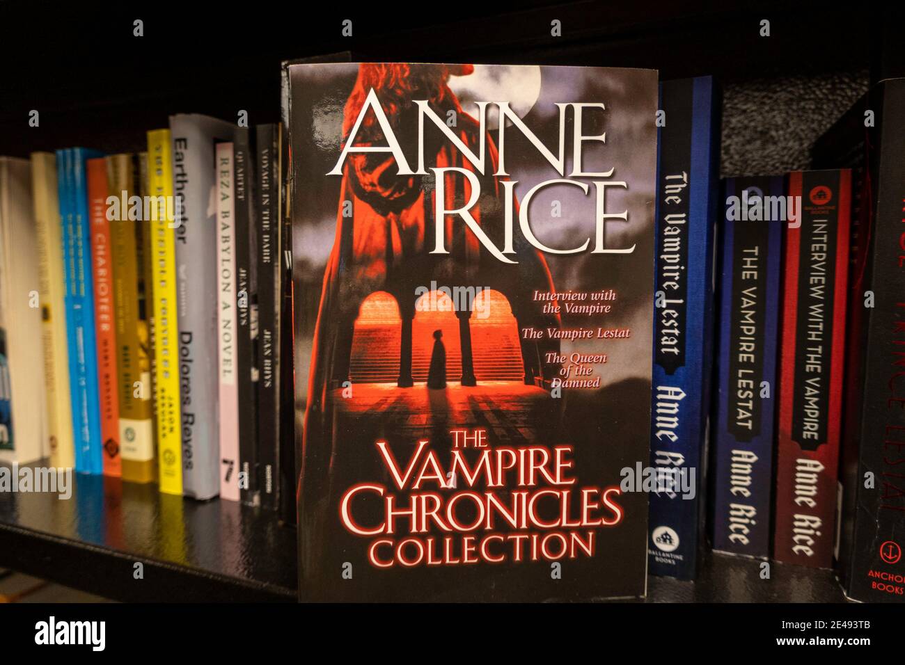
Anne Rice book covers have undergone significant artistic transformations since the publication of Interview with the Vampire in 1976. From original Gothic hardcovers designed by acclaimed illustrators to sleek modern mass-market reissues, these visual designs define dark fantasy aesthetics, capturing themes of immortality, decadence, and baroque romanticism across decades of printings.
The Historical Evolution of Anne Rice Cover Designs
The visual branding of Anne Rice’s bibliography reflects broad shifts in book publishing, graphic design, and dark fantasy illustration over the last half-century. When Rice introduced Lestat de Lioncourt and Louis de Pointe du Lac to the literary world, gothic fiction was largely confined to pulp paperbacks or traditional horror tropes. Her publishers at Alfred A. Knopf recognized that her work bridged literary fiction and supernatural fantasy, prompting a design strategy that favored elegance, texture, and understated dread over sensationalized gore.
- 1970s: Elegant Hardcovers & Atmospheric Typography
- 1980s: Golden Age of Gothic Realism (Mel Odom, Lush Foil Lettering)
- 1990s: Baroque Surrealism & Stepback Flaps (Mark Ryden, Stephen Youll)
- 2000s+: Minimalist Symbols, High-Contrast Digital & Reissue Branding
The Early Hardcover Era (1976–1985)
The original 1976 dust jacket for the hardcover edition of Interview with the Vampire, designed by R. D. Scudellari, set a sophisticated tone. Rather than using vivid monster imagery, the cover featured clean, classical typography set against a deep black background, anchored by a subtle red rose motif. This restraint signaled to readers that the book was a serious psychological exploration of grief and immortality rather than a standard monster novel.
By the time The Vampire Lestat was released in 1985, Knopf capitalized on the growing cult status of the series. The second novel featured rich gold foil lettering set against a dark canvas, establishing a hallmark design choice that would follow Rice’s hardcovers for the next two decades: bold metallic typography paired with rich jewel tones.
The Golden Age of Gothic Realism & Mass-Market Paperbacks (1980s–1990s)
During the late 1980s and throughout the 1990s, mass-market paperback editions transformed Anne Rice’s books into visual icons. Ballantine Books and Del Rey invested heavily in custom painted cover art that captured the sensual, melancholic world of the undead.
Publishers embraced special printing techniques to make these paperbacks stand out on bookstore shelves:
- Embossed Foil Titling: Raised gold, silver, metallic red, and purple foil letters gave the covers a tactile, luxurious feel.
- Die-Cut Window Covers: Outer covers featured cutout shapes—such as keyholes or arches—revealing a portrait on the page beneath.
- Stepback Flaps: Opening the front cover uncovered a second, full-page color illustration, often depicting a key character or dramatic scene in painterly detail.
Modern Minimalist and Digital Redesigns (2000s–Present)
As publishing trends shifted toward clean vector graphics and high-contrast digital art, reissues of Rice's catalog adapted accordingly. Publishers such as Anchor Books and Vintage Books introduced unified back-list designs. These modern covers replaced painted character portraits with symbolic iconography: a single drop of blood, a antique crucifix, a Venetian mask, or gilded filigree against matte black background paper.
While these modern editions appeal to contemporary readers seeking sleek trade paperbacks, veteran collectors often prefer the lush, illustrative covers of the 1980s and 1990s that originally defined the dark fantasy aesthetic.
Iconic Cover Artists Behind the World of Anne Rice
The visual world of Anne Rice was shaped by celebrated fine artists and commercial illustrators who brought her lush prose to life. Understanding the artists behind these jackets offers insight into how her characters transformed from text into visual culture.
Mel Odom: Sensual Realism and Luminous Portraiture
Mel Odom played a pivotal role in visual design for Ballantine’s paperback editions of Interview with the Vampire and The Vampire Lestat. Known for his stylized, Art Deco-influenced fashion illustration and luminous portraiture, Odom captured the porcelain skin, haunting eyes, and timeless elegance of Rice’s vampires. His depictions emphasized emotional vulnerability and otherworldly beauty rather than terrifying monsters, mirroring Rice’s literary redefinition of the vampire as a sympathetic figure.
Mark Ryden: Surrealist Baroque Precision
In the late 1990s, renowned Pop Surrealist artist Mark Ryden was commissioned to create covers for The Vampire Armand (1998) and Vittorio the Vampire (1999). Ryden’s distinct aesthetic—combining Renaissance portrait composition with surreal, slightly unsettling porcelain-doll figures—fit Rice’s New Tales of the Vampires series perfectly.
Ryden’s cover for The Vampire Armand features Armand dressed in Renaissance garments, holding a pristine white flower while framed by ornate, carved gilded frames. The fine detailing and dreamlike atmosphere made these editions instant collector items.
John Jude Palencar and Stephen Youll: Atmospheric Dark Fantasy
For Lives of the Mayfair Witches and later volumes of The Vampire Chronicles, publishers frequently turned to dark fantasy painters John Jude Palencar and Stephen Youll.
- John Jude Palencar: Known for his moody, painterly surrealism and muted earth tones, Palencar’s work brought a sense of ancient history and occult dread to titles like The Witching Hour and Lasher.
- Stephen Youll: Youll contributed detailed, photorealistic oil paintings for hardcovers and paperbacks, including Memnoch the Devil and Violin. His work balanced realistic light and shade with ornate Gothic architecture, capturing Rice's vivid descriptions of New Orleans, Venice, and classic European cities.
Visual Themes Across Major Series
Anne Rice’s bibliography spans multiple interconnected universes and pseudonymous projects. Each sub-series developed its own distinct visual language across different print runs.
- THE VAMPIRE CHRONICLES
- Dominant Colors: Gold, Crimson, Deep Black, Royal Purple
- Key Imagery: Velvet, Venetian Masks, Antique Rosaries, Pale Faces
- LIVES OF THE MAYFAIR WITCHES
- Dominant Colors: Emerald Green, Sepia, Deep Violet, Moss Green
- Key Imagery: Emerald Necklaces, Victorian Mansions, Keyholes
- Atmosphere: Southern Gothic Decay, Occult Symbols, Foliage
- A. N. ROQUELAURE (SLEEPING BEAUTY SERIES)
- Dominant Colors: Royal Blue, Crimson, Cream
- Key Imagery: Classical Statuary, Roses, Ribbons, Renaissance Prints
- Style: Fine Art Erotica, Understated Classical Typography
The Vampire Chronicles: Gold Foil, Crimson Accents, and Venetian Elegance
The covers of The Vampire Chronicles emphasize luxury, history, and decadence. Core design elements recurring across four decades of releases include:
- Rich Color Palettes: Crimson red, midnight blue, deep purple, and burnished gold dominate the covers, reflecting the opulent lifestyles of Lestat, Louis, and Marius.
- Venetian and Baroque Motifs: Masks, velvet drapes, gothic archways, and candelabras accentuate the historical settings of the novels.
- Typography: Serif fonts with elongated swashes, metallic foil stamping, and chiseled lettering evoke ancient manuscripts and classic literature.
Lives of the Mayfair Witches: Occult Symbols and Southern Gothic Atmosphere
Starting with The Witching Hour (1990), Lives of the Mayfair Witches shifted the visual identity toward Southern Gothic mystery and occult magic.
- The Emerald Pendant: The jewel passed down through generations of Mayfair witches serves as a central symbol on multiple hardcovers and mass-market printings.
- Architectural Elements: Renderings of First Street—the famous New Orleans mansion featured in the books—appear frequently in background illustrations, surrounded by overgrown foliage and ironwork.
- Earthy Palette: Unlike the bold primary jewel tones of the vampire books, the Mayfair covers utilize rich emerald greens, deep ambers, and shadowy violet tones.
Erotic Pseudonymity: A. N. Roquelaure and Anne Rampling Covers
When Anne Rice published her erotic fiction in the 1980s under the pseudonyms A. N. Roquelaure (The Sleeping Beauty Quartet) and Anne Rampling (Exit to Eden, Belinda), publishers used cover art to distinguish these books from her horror output.
- A. N. Roquelaure Editions: Early hardcovers and paperbacks featured classical fine art styles, classical statues, soft pastel watercolor washes, and elegant typography that signaled fairy-tale erotica rather than contemporary romance.
- Anne Rampling Editions: The covers for Exit to Eden adopted contemporary, sleek photography and bold typography, leaning into mainstream romantic mystery aesthetics.
Comprehensive Cover Comparison: Eras, Styles, and Collectibility
The table below breaks down the major design eras of Anne Rice’s print editions, detailing key artists, design signatures, and their appeal to collectors today.
| Era / Edition Type | Primary Artists & Designers | Key Design Features | Notable Book Examples | Collector Demand & Rarity |
|---|---|---|---|---|
| First Edition Hardcovers (1976–1990) | R. D. Scudellari, Knopf Design Team | Plain dark dust jackets, gold/silver foil lettering, minimalist symbolism | Interview with the Vampire (1976), The Vampire Lestat (1985) | Very High (Original 1976 jacket in fine condition commands high market value) |
| Golden Age Paperbacks (1980s–1990s) | Mel Odom, Hiroko, Stephen Youll | Stepback flaps, die-cut windows, metallic foil titles, lush painted portraits | The Queen of the Damned, The Tale of the Body Thief | Moderate–High (Unread condition stepback paperbacks are sought after) |
| Pop Surrealism Era (Late 1990s) | Mark Ryden | Fine-detail oil paintings, porcelain figures, baroque frames, surreal mood | The Vampire Armand, Vittorio the Vampire | High (Prized by both Anne Rice collectors and Mark Ryden art fans) |
| Specialty Small Press (2000s–Present) | Various Illustrators, Subterranean Press | Custom leather/cloth bindings, slipcases, signed tip-in sheets, exclusive art | Limited editions of The Vampire Chronicles | Very High (Low print runs; highly sought after on secondary markets) |
| Modern Trade Reissues (2010s–2020s) | Vintage / Anchor Design Teams | Minimalist vector graphics, single symbolic objects, uniform back-list branding | The Vampire Chronicles trade paperback reissues | Low (Widely available for general reading) |
Regional Variants: US vs. UK Cover Aesthetics
International publishing houses often took fundamentally different approaches to marketing Anne Rice’s novels. Comparing American editions with UK editions reveals distinct graphic design philosophies.
- UNITED STATES (Knopf / Ballantine / Del Rey)
- Focus: Character portraiture, detailed realism, painterly scenes
- Printing: Heavy use of gold foil, stepback flaps, embossed text
- Tone: Romantic gothicism, character-focused storytelling
- UNITED KINGDOM (Futura / Sphere / Chatto & Windus)
- Focus: Atmospheric landscapes, abstract symbols, moody photography
- Printing: Matte finishes, stark color contrast, clean sans-serif
- Tone: Psychological mystery, gothic horror, literary thriller
American Covers: Character Realism and Deluxe Finishes
American publisher Alfred A. Knopf and paperback imprints Ballantine and Del Rey prioritized character portraiture. US covers put faces to names: Lestat’s golden hair, Armand’s youthful visage, or Rowan Mayfair’s intense gaze. The heavy use of metallic foil, textured stepback covers, and raised lettering created a tangible sense of luxury designed to attract readers browsing physical bookshops in shopping malls and downtown plazas.
British and International Editions: Abstract Symbolism and Atmospheric Moods
UK publishers—such as Futura, Sphere, and Chatto & Windus—frequently favored abstract or atmospheric covers over character realism.
- Atmospheric Photography: British paperbacks from the 1980s and 1990s often featured dark photographs of fog-covered streets, lonely statues in cemeteries, or moody silhouettes rather than detailed character paintings.
- Stark Contrast: Typography on UK editions was often understated, using clean serif or sans-serif fonts set against high-contrast black-and-white or monochromatic photography.
- Literary Framing: UK packaging often emphasized Rice’s standing within dark romantic literature, positioning the books alongside classic Gothic novels like Bram Stoker’s Dracula or Mary Shelley’s Frankenstein.
Collector's Guide: Identifying Rare Cover Variants and Hardcover Editions
For book collectors, identifying early printings and rare cover variants requires attention to specific publishing marks, dust jacket points, and binder details.
- Front Flap: Check for original retail price ($8.95 etc.)
- Copyright Page: Look for "Stated First Edition"
- Spine: Verify foil stamping integrity & sun fading status
- Stepback Flap: Confirm artwork page is intact and unblemished
- Back Cover: Inspect bar code layout and author photo
Key Identification Factors for First Edition Hardcovers
When evaluating first edition dust jackets—particularly for early titles published by Alfred A. Knopf—look for the following key indicators:
- Price Unclipped: The original 1976 hardcover of Interview with the Vampire had a retail price of $8.95 printed on the upper corner of the front dust jacket flap. Clipped flaps reduce collector value significantly.
- Stated First Edition: Knopf books during this era typically state "First Edition" on the copyright page.
- Dust Jacket Color and Texture: The black ink on original Interview with the Vampire jackets is prone to rubbing and spine fading. Jackets with rich, unfaded black backgrounds and intact red rose imagery command premium prices.
- Foil Condition: On mid-era hardcovers like The Vampire Lestat and The Queen of the Damned, verify that the metallic foil stamping on the spine has not flaked off or dulled due to handling.
Deluxe, Leatherbound, and Small-Press Editions
Collectors seeking display-grade volumes often target specialty editions with unique cover treatments:
- Easton Press Editions: Bound in genuine leather with 22k gold accents, gilded page edges, and satin ribbon page markers. These feature clean, traditional bound designs rather than illustrated dust jackets.
- Subterranean Press Limited Editions: These small-press hardcovers feature exclusive wraparound dust jacket illustrations, custom slipcases, and signature pages signed by Anne Rice and the interior illustrators.
- Lord John Press: Published limited, signed broadsides and novellas with unique hand-bound paper and cloth covers, highly prized for their low print numbers.
Collecting Mass-Market Paperback Variants
Mass-market paperbacks may seem common, but specific printing variations carry high collector appeal:
- Unblemished Stepbacks: Stepback covers are prone to creasing along the outer fold. Finding vintage 1980s and 1990s paperbacks with crisp, uncreased stepback flaps is increasingly rare.
- Die-Cut Cutouts: Verify that the inner visual layer behind die-cut windows has not suffered tears, moisture damage, or alignment shifting over time.
Preserving and Caring for Vintage Book Cover Art
Because many of the most iconic Anne Rice covers feature foil stamping, glossy coatings, or delicate stepback flaps, proper care is essential for long-term preservation.
Protecting Dust Jackets and Paperbacks
- Archival Mylar Covers: Fit hardcover dust jackets with acid-free, clear archival jacket protectors (such as Brodart or Gaylord archival covers). Avoid self-adhesive covers that stick directly to the paper.
- Shelving Alignment: Store hardcovers and heavy paperbacks upright on flat shelves. Prevent leaning, which causes spine twist and damages dust jacket edges.
- Environmental Controls: Keep books away from direct sunlight, which bleaches the metallic inks and red color pigments commonly used on Rice's covers. Maintain room humidity between 40% and 50% to prevent cover warping or foxing.
Frequently Asked Questions About Anne Rice Book Covers
Who illustrated the iconic original paperbacks for The Vampire Chronicles?
The visual identity of the 1980s and early 1990s mass-market paperbacks published by Ballantine Books was created by several renowned artists. Mel Odom painted the famously melancholic character portraits for early paperbacks of Interview with the Vampire and The Vampire Lestat. Other key cover artists include Stephen Youll, John Jude Palencar, and Hiroko.
Why do UK editions of Anne Rice books look different from US editions?
Publishing houses tailor cover art to regional market preferences. US publishers focused heavily on detailed character paintings, raised foil titling, and stepback illustrations to appeal to fantasy readers. UK publishers (such as Futura and Sphere) leaned toward atmospheric landscape photography, abstract gothic symbolism, and subtle typography to position the novels within dark fiction and literary horror.
How can I tell if a hardcover cover of Interview with the Vampire is a genuine First Edition?
A genuine first-edition dust jacket published by Alfred A. Knopf in 1976 features an unclipped retail price of $8.95 on the front jacket flap. The copyright page must state "First Edition." Additionally, the jacket should have a rich black background with clean red and white typography, without later print-run notices or book club blind stamps on the back cover.
Did Anne Rice have personal input into her book cover designs?
While publishing design teams traditionally control cover decisions, Rice gained significant influence over her packaging as her sales grew. She frequently praised artists like Mel Odom and Mark Ryden for capturing the spirit of her characters. In later years, she collaborated directly with specialty publishers like Subterranean Press to approve custom illustrations and deluxe edition materials.
What are "stepback" covers on mass-market Anne Rice paperbacks?
A "stepback" cover is a paperbound printing feature popular in 1980s and 1990s publishing. The outer front cover opens to reveal a second cover underneath—usually containing a full-color, full-page illustration free of promotional text. Ballantine Books used stepback covers extensively for The Vampire Chronicles and Lives of the Mayfair Witches to showcase detailed artwork alongside embossed foil outer covers.
Practical Recommendations for Collectors and Fans
Whether building an Anne Rice library or collecting rare cover variants, follow these practical steps:
- Define Your Focus: Decide whether you are collecting illustrative paperbacks (focusing on Mel Odom and Mark Ryden artwork), first edition hardcovers (focusing on Knopf printings with pristine jackets), or specialty leatherbound editions (such as Easton Press or Subterranean Press).
- Inspect Condition Thoroughly: When buying online, ask sellers for clear photos of dust jacket edges, foil integrity on the spine, and the interior pages of stepback flaps.
- Invest in Preservation: Immediately enclose vintage hardcover dust jackets in clear, acid-free archival covers to prevent shelf wear and dust damage.