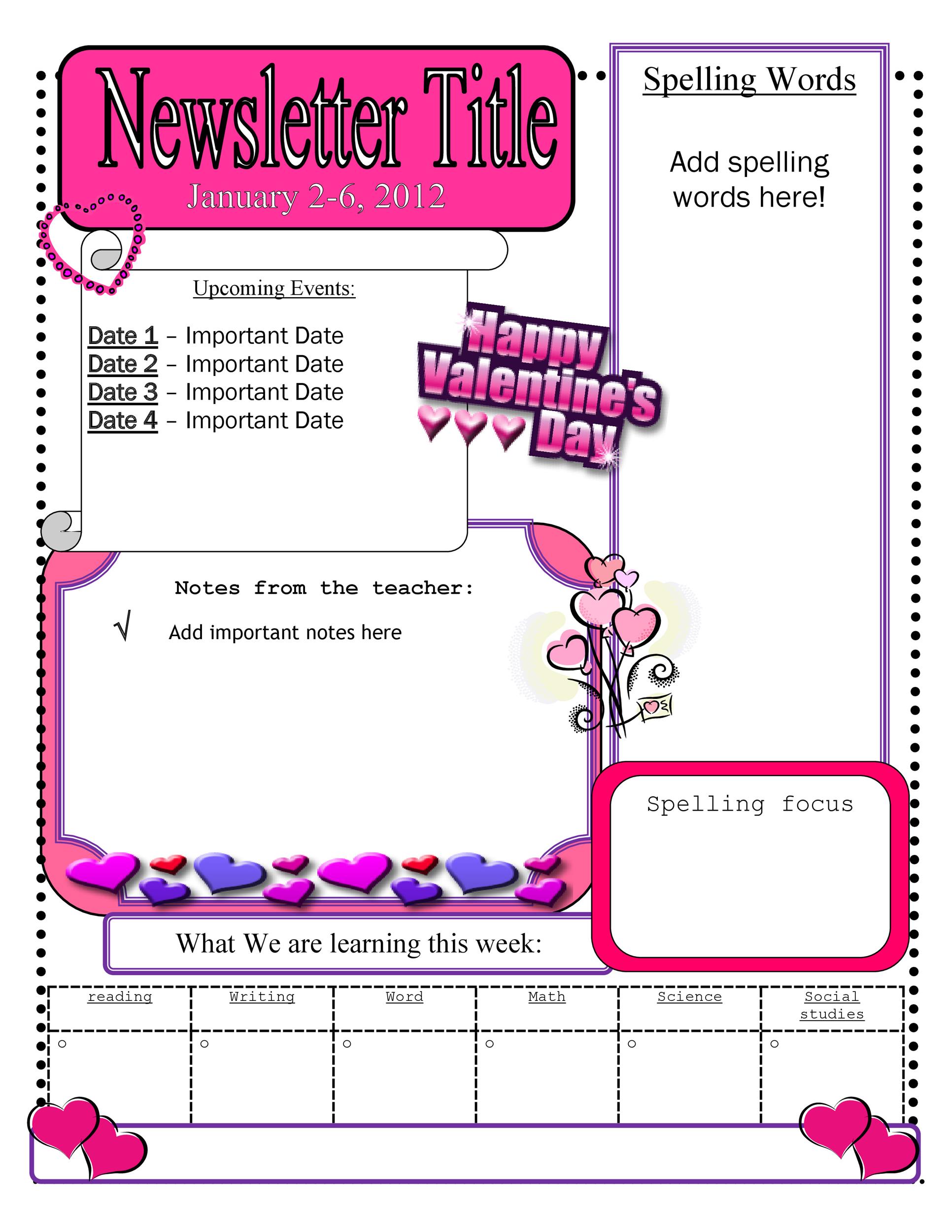
Discovering the right template can transform email marketing performance, and analyzing the top newsletter designs highlights how clean layouts, strong visual hierarchies, and strategic white space improve reader engagement and click-through rates.
When looking for the best newsletter designs, digital creators, marketers, and publishers often evaluate how structure influences readability and conversions. Examining the most successful examples reveals clear patterns in typography, color application, mobile responsiveness, and content chunking. This guide explores ten standout design frameworks that defined email marketing aesthetics, providing actionable insights for building high-performing campaigns.
Understanding the Anatomy of a High-Performing Newsletter
Before selecting a layout or template, examining the core components that drive successful email design is essential. A well-constructed digital publication relies on a balanced ecosystem where form follows function, ensuring subscribers can easily digest information regardless of their device or email client.
Modern email architecture begins with a recognizable header that establishes brand identity instantly. Following the header, a strong single-column layout or structured multi-column grid guides the human eye along a natural reading path. Typography plays an equally vital role; utilizing web-safe system fonts or properly embedded web fonts guarantees legibility across desktop and mobile screens alike. Furthermore, intentional white space prevents cognitive overload, allowing critical calls-to-action to stand out without competing against dense blocks of text.
The Shift Toward Minimalist and Text-Centric Frameworks
A prominent trend across digital publishing is the move toward minimalist, text-centric layouts. Inspired by traditional print media and personal correspondence, these designs strip away heavy graphics and complex multi-column grids in favor of clean typography and generous margins.
This approach offers multiple technical and strategic advantages. First, text-centric emails load instantaneously and rarely trigger image-blocking filters built into modern email clients like Apple Mail or Gmail. Second, they foster a more intimate, conversational connection with the reader. When an email looks like a letter from a colleague or a trusted mentor rather than a corporate advertisement, open and read-through rates frequently see a measurable increase.
Balancing Rich Media with Accessibility Standards
While minimalist designs excel in narrative-driven content, many industries—such as e-commerce, media, and design—rely heavily on rich media, including product photography, custom illustrations, and embedded video placeholders. Balancing visual richness with accessibility standards is a core challenge for modern creators.
Accessibility in email design goes beyond visual appeal. Ensuring high contrast ratios between text and background colors, adding descriptive alternative text to every image, and maintaining a logical HTML tag hierarchy allows screen readers to interpret the content accurately for visually impaired subscribers. Designing with accessibility in mind broadens audience reach and aligns with digital compliance best practices.
10 Best Newsletter Design Frameworks
Evaluating the top approaches to email layout reveals distinct styles tailored to specific publishing goals, audience expectations, and content types.
| Design Framework | Primary Use Case | Key Aesthetic Strength |
|---|---|---|
| 1. The Curated Digest | Aggregated links, news roundups, curation | Clear categorization, grid lists |
| 2. The Minimalist Essay | Long-form thought leadership, personal | Generous white space, typography |
| 3. The E-commerce Grid | Product showcases, seasonal sales | High-impact imagery, clear CTAs |
| 4. The Brand Magazine | Deep-dive journalism, lifestyle brands | Editorial layout, rich imagery |
| 5. The Split-Screen | Dual-focus content, contrasting offers | Asymmetric layout, visual balance |
| 6. The Data-Driven | Analytics summaries, SaaS updates | Embedded charts, clean metrics |
| 7. The Interactive | Polls, dynamic modules, gamification | User engagement elements |
| 8. The Mono-Color | Bold branding, artistic newsletters | Monochromatic palette, contrast |
| 9. The Card-Based | Multi-topic updates, community roundups | Modular blocks, grid alignment |
| 10. The Legacy Print | Traditional journalism, op-eds | Multi-column text, drop caps |
1. The Curated Digest
The curated digest format is the gold standard for newsletters that aggregate external articles, tools, and industry updates. By organizing disparate pieces of content into predictable categories, this design respects the reader's time and facilitates scanning.
- Structure: Features a clear masthead, followed by neatly separated thematic sections denoted by subtle subheadings or divider lines.
- Best For: Industry roundups, resource-sharing newsletters, and weekly community digests.
- Design Tip: Use consistent thumbnail sizes for linked articles to maintain a tidy, professional vertical rhythm.
2. The Minimalist Essay
For creators focusing on deep insights, storytelling, or opinion pieces, the minimalist essay format removes all unnecessary visual friction. It treats the email canvas like a blank sheet of high-end paper.
- Structure: Single-column layout with a narrow reading width (typically 600 to 650 pixels), ample line height, and a prominent author signature at the conclusion.
- Best For: Substack publications, founder updates, and philosophical or creative writing.
- Design Tip: Choose a distinctive, highly legible serif font for body text to give the publication an editorial, literary feel.
3. The E-commerce Grid
Retail and direct-to-consumer brands require layouts that showcase physical goods without overwhelming the subscriber's inbox. The e-commerce grid balances lifestyle photography with direct purchase pathways.
- Structure: Prominent hero image at the top, followed by a two- or three-column product grid featuring product names, pricing, and distinct button-style calls-to-action.
- Best For: Online stores, apparel brands, and hardware product launches.
- Design Tip: Ensure product buttons have a minimum touch target size of 44x44 pixels for optimal mobile usability.
4. The Brand Magazine
Modeled after glossy print publications, the brand magazine style uses stunning imagery, striking color palettes, and varied module sizes to tell a cohesive visual story.
- Structure: Asymmetric content blocks, large header photography, pull quotes, and editorial commentary woven together seamlessly.
- Best For: Lifestyle brands, travel companies, and high-end design studios.
- Design Tip: Always implement fallback background colors for clients that block images by default, ensuring text remains readable.
5. The Split-Screen Layout
When a newsletter needs to present two competing ideas, dual product highlights, or an announcement alongside a community call-to-action, the split-screen layout provides a balanced solution.
- Structure: The horizontal or vertical canvas is divided into two distinct halves, often utilizing contrasting background colors to separate the messages.
- Best For: A/B testing narrative angles, contrasting two subscription tiers, or promoting two distinct events.
- Design Tip: Stack the split sections vertically on mobile viewports so the layout collapses gracefully without squeezing text columns.
6. The Data-Driven Dashboard
Software-as-a-service (SaaS) companies, financial analysts, and metrics-heavy publications benefit from dashboard-style layouts that present quantitative information clearly.
- Structure: Incorporates stat callouts (large numbers with small labels underneath), clean progress bars, and high-contrast summary boxes.
- Best For: Weekly analytics reports, financial digests, and user account activity summaries.
- Design Tip: Render complex data visualizations as static PNG or JPEG files rather than relying on live HTML/CSS charts, which often break across email clients.
7. The Interactive Module Framework
Modern email service providers support limited interactivity, allowing designers to incorporate elements like hover effects, light polls, or embedded carousels directly inside the inbox.
- Structure: Standard layout interspersed with interactive HTML elements that respond to user taps or mouseovers.
- Best For: Audience feedback collection, product feature walk-throughs, and engaging customer retention campaigns.
- Design Tip: Always provide a static fallback experience for email clients that do not support advanced CSS interactions.
8. The Mono-Color Statement
Using a single striking accent color across a mostly monochrome background creates a bold, modern aesthetic that demands attention.
- Structure: High-contrast black text on a crisp white or cream background, anchored by a vibrant primary brand color used exclusively for links and buttons.
- Best For: Design agencies, tech startups, and contemporary cultural publications.
- Design Tip: Limit your color palette to no more than two hues to maintain a clean, high-fashion look.
9. The Card-Based Modular Grid
Inspired by modern web UI design, the card-based layout groups related content into distinct visual containers, or "cards," complete with borders or subtle background shading.
- Structure: A modular grid system where each card contains its own image, headline, snippet, and link.
- Best For: Multi-topic newsletters, resource libraries, and community bulletin boards.
- Design Tip: Maintain consistent padding inside every card to preserve structural harmony across the entire email.
10. The Legacy Print Layout
Drawing inspiration from mid-century broadsheets and newspapers, this traditional style utilizes multi-column text flows, thin horizontal rule separators, and classic typography.
- Structure: Dense text blocks organized into columns, accompanied by small black-and-white illustrations or engraved-style graphics.
- Best For: Historical retrospectives, literary reviews, and niche academic publications.
- Design Tip: Limit multi-column text to desktop views, shifting back to a single-column stack on mobile devices to prevent horizontal scrolling.
Technical Requirements for Modern Newsletter Design
Creating a visually stunning layout is only half the battle; ensuring that design renders correctly across dozens of varying email clients is where technical execution matters most.
Mastering Fluid Hybrid Design
Unlike modern web development, which relies heavily on CSS Flexbox and Grid, email design requires a more conservative approach due to the varying rendering engines used by inbox providers. Microsoft Outlook on Windows, for instance, still renders HTML using Microsoft Word's layout engine, which does not support modern CSS standards.
To overcome this limitation, professional email developers rely on fluid-hybrid design (also known as spry-hybrid coding). This technique uses table-based structures combined with conditional HTML tags and percentage-based widths. Tables ensure that older desktop clients maintain their structure, while CSS media queries allow the layout to adapt smoothly on mobile devices like iPhones and Android smartphones.
Optimizing File Sizes and Image Assets
Slow-loading emails frustrate subscribers and can trigger spam filters. Optimizing every visual asset before embedding it in a template is a critical step in the deployment workflow.
- Image Compression: Compress all JPEG and PNG assets using lossless tools to minimize file weight without degrading visual clarity.
- Retina Scaling: Export raster images at twice their display dimension to ensure crisp rendering on high-resolution retina screens, while explicitly defining smaller pixel dimensions in the HTML attributes.
- Web-Safe Fonts: Always declare reliable fallback fonts (such as Arial, Helvetica, Georgia, or Times New Roman) behind custom web fonts to prevent layout collapse if a client lacks web-font support.
Common Newsletter Design Mistakes to Avoid
Even experienced marketers occasionally fall into traps that undermine readability and hurt campaign performance. Recognizing these pitfalls helps safeguard deliverability and audience retention.
- Overloading the Above-the-Fold Area: Cramming every headline, banner, sponsor logo, and call-to-action into the very top of the email creates visual clutter. Guide the reader's eye downward through a natural narrative flow instead.
- Neglecting Dark Mode Compatibility: With a vast percentage of users enabling dark mode on their operating systems, failing to test how background colors and transparent PNGs render against dark backgrounds results in invisible text and unprofessional artifacts.
- Relying Entirely on Images: Sending an email composed of a single large image slice is a critical error. If the recipient has images disabled by default, they will see a blank space with no context, and spam filters will frequently flag the message as promotional noise.
- Inconsistent Branding: Changing font families, color palettes, and header styles drastically between consecutive issues confuses subscribers and weakens brand recognition.
Frequently Asked Questions
What is the ideal width for a newsletter design?
The standard, universally accepted width for desktop email templates is 600 pixels. This dimension ensures the email fits comfortably within the reading panes of major desktop webmail clients without requiring horizontal scrolling, while also providing a stable foundation for mobile responsiveness.
How can I make my newsletter mobile-friendly?
Ensuring mobile responsiveness involves utilizing a single-column layout, setting font sizes to a minimum of 16 pixels for body text, ensuring call-to-action buttons are large enough to tap easily with a thumb (at least 44x44 pixels), and testing the campaign across multiple mobile devices and email clients before broadcasting.
Should I use dark mode testing for email campaigns?
Yes. Testing your newsletter in both light and dark modes is essential. Inverting colors can turn dark text invisible against dark container backgrounds if proper CSS media queries and color declarations are not implemented in the HTML code.
How many images should a newsletter contain?
The ideal image-to-text ratio depends on your niche, but a healthy benchmark is maintaining a balance of roughly 80% text and 20% imagery. This proportion satisfies anti-spam algorithms, ensures readability when images are blocked, and keeps file sizes optimized for fast loading speeds.
Conclusion and Next Actions
Selecting the best newsletter design for your publication requires aligning your visual framework with your core content type and audience expectations. Whether you choose the minimalist essay approach, a curated digest layout, or a vibrant e-commerce grid, consistency, readability, and technical optimization remain paramount.
To take your email marketing to the next level, audit your current template against the standards outlined in this guide. Test your next campaign across desktop, mobile, and dark-mode environments, monitor your engagement metrics, and iterate based on how your subscribers interact with your chosen layout.