The Arm & Hammer logo originated in the 1860s, inspired by Vulcan, the Roman god of fire and metalworking. Created by James A. Church, the symbol represents strength, purity, and the manual power used to "hammer" baking soda into a fine powder, remaining largely unchanged for over 150 years.
The Origins of an Icon: Church & Co. and the 1860s
The history of the Arm & Hammer logo is inextricably linked to the birth of the modern baking soda industry in the United States. While many consumers associate the brand with a modern multinational corporation, its roots lie in a small family business during the mid-19th century. In 1846, Dr. Austin Church and his brother-in-law, John Dwight, began preparing and packaging bicarbonate of soda (baking soda) in their kitchen. However, the specific "Arm and Hammer" brand was not the immediate result of this partnership.
Instead, the duo initially operated under separate brands. John Dwight used the "Cow Brand" (featuring a Jersey cow), while Dr. Austin Church eventually formed Church & Co. with his sons. It was James A. Church, one of Austin's sons, who introduced the iconic Arm & Hammer trademark in 1867. Before this transition, the company had experimented with a "Spice Mill" logo, which depicted a mechanical grinder used for processing various household goods.
The shift from the spice mill to the muscular arm holding a hammer was a strategic move to emphasize the labor-intensive process of producing high-quality sodium bicarbonate. In the 1860s, baking soda was not just a pantry staple; it was a miracle of industrial chemistry that required significant refinement. The imagery was intended to convey the "strength" of the product and the "purity" resulting from a rigorous manufacturing process. By 1868, the Arm & Hammer mark was formally adopted as the primary identifier for Church & Co.’s products.
The Vulcan Connection: Mythology in Branding
To understand the specific visual elements of the logo, one must look toward classical mythology. James A. Church was a student of history and lore, and he drew direct inspiration from Vulcan, the Roman god of fire, metalworking, and the forge. In Roman mythology, Vulcan was the blacksmith of the gods, responsible for forging weapons and armor in the depths of Mount Etna.
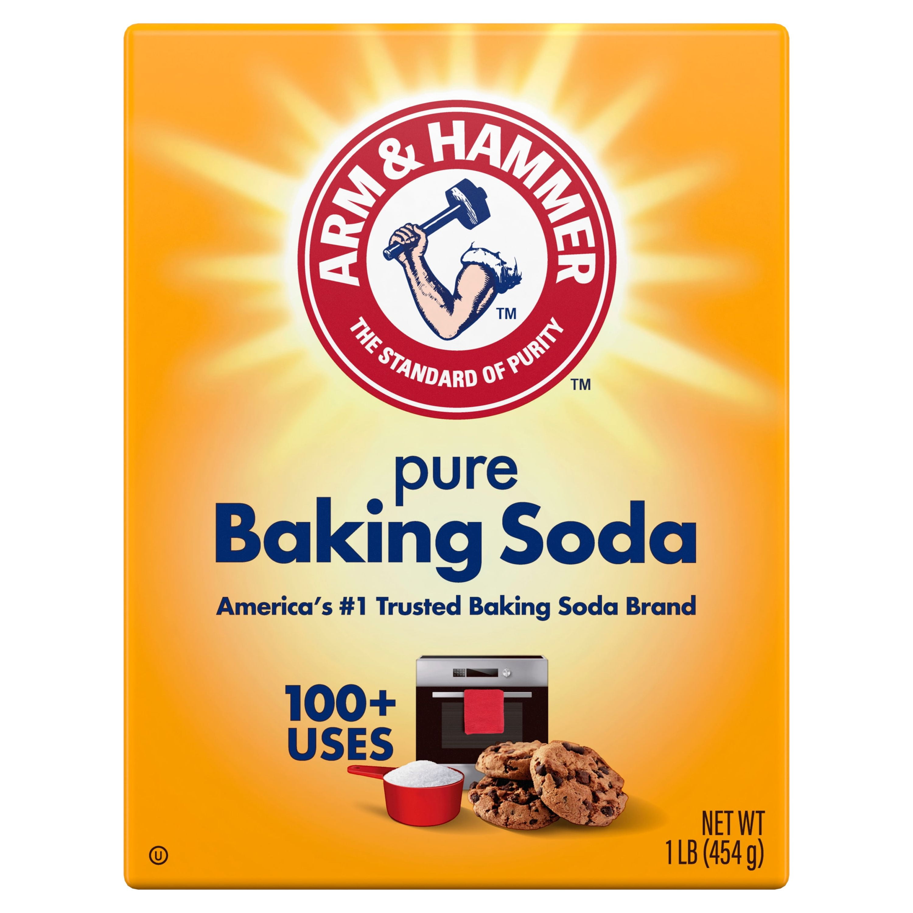
The logo depicts the brawny, flexed arm of a smith, poised to strike a heavy hammer against an unseen anvil. This imagery served several functions:
- Industrial Might: During the post-Civil War Industrial Revolution, symbols of manual labor and mechanical power were highly respected. The "smith" represented the ultimate creator who could transform raw materials into something refined and useful.
- Chemical Metaphor: The "hammering" action was a metaphor for the chemical processing of soda ash. It suggested that the brand was "beating out" impurities to provide a superior, pharmaceutical-grade product.
- Trust and Reliability: A blacksmith’s work was essential to the survival of 19th-century communities. By aligning baking soda with this trade, the brand tapped into a deep-seated cultural trust in craftsmanship.
Even as we look at the brand from the perspective of 2026, the Vulcan imagery remains potent. It bridges the gap between ancient craftsmanship and modern chemical engineering, a testament to the enduring nature of archetypal symbols in marketing.
The 1878 Milestone and the Formal Trademark
While the logo was in use by the late 1860s, it was in 1878 that the trademark gained its definitive status. As the popularity of Church & Co.’s baking soda grew, the company recognized the need to protect its intellectual property from imitators. This era saw a rise in "generic" baking sodas that often contained harmful fillers or lacked the potency of the Church & Co. variety.
The registration of the Arm & Hammer trademark solidified the brand’s identity. It featured the muscular arm, the hammer, and the circular border—a design that has survived with only minor graphical updates to this day. The circular frame originally included the text "Church & Co." and later "Church & Dwight Co., Inc." after the two founding families officially merged their business interests in 1896.
This merger was a pivotal moment in corporate history. By combining John Dwight’s "Cow Brand" and Austin Church’s "Arm & Hammer," the new entity, Church & Dwight, became the dominant force in the sodium bicarbonate market. While the Cow Brand remained popular in certain regions for decades, the Arm & Hammer logo eventually became the global face of the company due to its more aggressive and memorable visual appeal.
Disambiguation: The Socialist Labor Party and Armand Hammer
One of the most persistent myths in American branding history involves the relationship between the Arm & Hammer logo and two unrelated entities: the Socialist Labor Party of America (SLP) and the industrialist Armand Hammer.
The Socialist Labor Party Confusion
The Socialist Labor Party, founded in the 1870s, also adopted an "arm and hammer" logo to represent the dignity of the working class and the power of organized labor. Because the SLP’s rise coincided with the growth of Church & Co., many consumers mistakenly believed that the baking soda brand was a socialist enterprise or that the party had sold the rights to the logo. In reality, the two organizations developed their logos independently. The Church family’s use of the symbol was rooted in Roman mythology and chemical purity, while the SLP’s use was rooted in political ideology and labor rights.
The Armand Hammer Saga
Perhaps even more famous is the story of Armand Hammer, the late CEO of Occidental Petroleum. Born in 1898, Hammer was often asked if he was named after the baking soda brand. The truth is quite the opposite: his father, Julius Hammer, was a staunch socialist and reportedly named his son "Armand" after the "arm and hammer" symbol used by the Socialist Labor Party.
As Armand Hammer grew into a billionaire industrialist, the coincidence became a frequent topic of conversation. In an ironic twist of fate, Hammer eventually became so tired of the questions—and saw so much business potential in the brand—that he attempted to buy Church & Dwight. While he did not succeed in a full takeover, he did acquire a significant stake in the company and served on its board of directors until his death in 1990. Despite his involvement, the logo predates his birth by over 30 years and his involvement with the company by over a century.
Analyzing the Design Elements
The Arm & Hammer logo is a masterclass in minimalist, high-impact design. Over the last 150+ years, while the typography has been updated to be more legible, the core iconography has remained static.
The Color Palette
As of 2026, the classic palette of red, white, and gold/yellow continues to define the brand.
- Red: Evokes energy, passion, and urgency. It ensures the orange boxes (the signature packaging of the baking soda) stand out on crowded retail shelves.
- White: Represents the purity of the sodium bicarbonate.
- Yellow/Gold: Often used for the hammer or the border, it suggests high quality and value.
Typography
The font used for the "ARM & HAMMER" text has evolved from 19th-century block lettering to a more modern, customized sans-serif. The weight of the letters is heavy and balanced, mirroring the strength of the muscular arm. The text is typically arched around the top of the circle, following the curve of the emblem, which creates a sense of unity and containment.
The Power of the Circle
The circular emblem is a "stamp of quality." In the 1800s, goods were often stamped with wax seals or embossed logos to prove authenticity. The circular design of the Arm & Hammer logo mimics this seal of approval, telling the consumer that the contents are genuine and meet the company's rigorous standards.
Timeline of Key Historical Milestones
The following table outlines the critical dates in the evolution of the Arm & Hammer brand and its iconic imagery.
| Year | Milestone | Description |
|---|---|---|
| 1846 | Founding of Industry | Austin Church and John Dwight begin manufacturing baking soda. |
| 1867 | Logo Creation | James A. Church introduces the Arm & Hammer logo for Church & Co. |
| 1868 | Formal Adoption | The Vulcan-inspired smith's arm becomes the primary brand mark. |
| 1878 | Trademark Registration | The logo is officially registered with the U.S. Patent and Trademark Office. |
| 1896 | Corporate Merger | Church & Co. and John Dwight & Co. merge to form Church & Dwight Co., Inc. |
| 1970 | Earth Day | The brand becomes a symbol of environmental cleaning (The first Earth Day sponsor). |
| 1986 | Armand Hammer | The industrialist joins the Church & Dwight board, linking his name to the logo. |
| 2026 | Modern Status | The logo remains one of the world's most recognized and trusted trademarks. |
Cultural Impact and Modern Expansion
In 2026, the Arm & Hammer logo is no longer just for baking soda. It has become a "halo brand" that lends credibility to a vast array of product categories. This expansion began in earnest in the 1970s and 1980s when Church & Dwight realized that the consumer's trust in the logo's "purity" and "strength" could be applied to other household needs.
Today, the flexed arm can be found on:
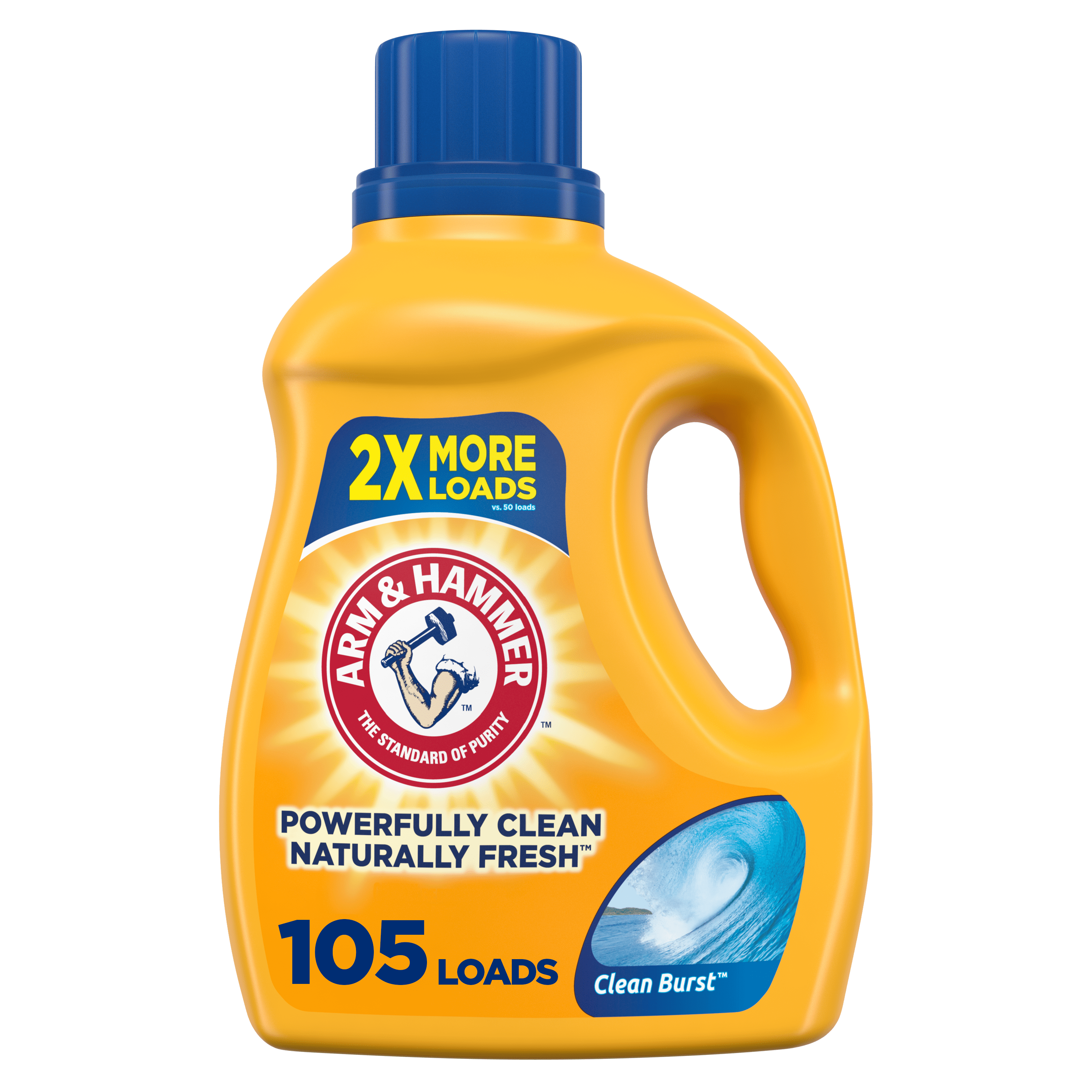
- Laundry Detergents: Where the hammer represents the "power" to remove tough stains.
- Toothpaste: Where the imagery suggests a "deep clean" and dental strength.
- Cat Litter: Where the brand's deodorizing properties are emphasized.
- Personal Care: Including deodorants and nasal salines.
The logo’s transition from a niche baking ingredient to a multi-billion dollar household staple is a case study in brand equity. Because the logo has not fundamentally changed since 1867, it carries a level of "inherited trust." When a consumer in 2026 sees that arm and hammer, they are seeing the same symbol their great-grandparents trusted in their kitchens. This continuity is a rare commodity in a modern market characterized by frequent rebrands and "flat design" trends.
The Secret to Its Longevity
Why has the Arm & Hammer logo survived while other 19th-century icons—like the original Aunt Jemima or the early iterations of the Pepsi logo—have been drastically changed or retired?
The answer lies in its abstract universality. Unlike logos that featured specific people or outdated technology, the Arm & Hammer logo features a mythological archetype. A muscular arm and a tool are timeless symbols of human effort. Furthermore, the brand avoided the pitfalls of racial or cultural stereotypes that plagued other historical trademarks. It is a symbol of labor and science, two concepts that remain as relevant in 2026 as they were in 1867.
Furthermore, Church & Dwight has been remarkably disciplined. While many companies feel the urge to "modernize" their look every decade, the custodians of the Arm & Hammer brand have limited their updates to "cleanup" work—sharpening lines, adjusting color gradients for digital screens, and ensuring the typography remains legible in mobile app icons. By resisting the urge to follow design fads, they have maintained a visual link to their heritage that few other companies can match.
Frequently Asked Questions
Is the Arm & Hammer logo based on a real person?
No, the logo is not a portrait of a specific individual. It is an artistic representation of Vulcan, the Roman god of the forge. James A. Church chose this mythological figure to symbolize the strength and industrial process involved in creating pure baking soda.
Why did the brand choose a hammer for a food product?
In the 1860s, baking soda (sodium bicarbonate) was produced through chemical processes that involved refining minerals. The "hammer" symbolized the "beating out" of impurities. Additionally, baking soda was often sold in hard chunks that needed to be crushed, though the logo primarily refers to the strength of the chemical's action rather than literal hammering of the product.
Did the billionaire Armand Hammer create the logo?
No. The logo was created and trademarked by the Church family in the 1860s, decades before Armand Hammer was born. He was reportedly named after the symbol (via his father's socialist ties) and only became involved with the company much later in his life during the 1980s.
What is the significance of the red circle?
The red circle serves as a "seal" or a "stamp." In the 19th century, such designs were used to indicate authenticity and prevent counterfeiting. Today, the red color provides high visual contrast, making the brand easily identifiable on retail shelves and digital marketplaces.
Has the logo ever changed significantly?
The core elements—the muscular arm, the hammer, and the circular frame—have never changed. The only updates have been to the typography (making it cleaner and more modern) and the color vibrancy to accommodate modern printing and digital display standards.
Practical Recommendations for Brand Enthusiasts
For those interested in the history of American commerce or branding, the Arm & Hammer logo serves as a definitive example of how to build and maintain brand equity over centuries.
- Verification: If you come across "vintage" boxes claiming to be from the early 1800s, look for the logo. If the Arm & Hammer mark is present, the item likely dates to 1867 or later. Items from the 1840s and 1850s would feature different branding, such as the "Spice Mill" or early Church & Co. text.
- Trademark Research: For researchers, the U.S. Patent and Trademark Office (USPTO) maintains records of the 1878 registration, which provides a fascinating look at 19th-century legal protections for brands.
- Corporate History: For a deeper look at the business evolution, the Church & Dwight Co., Inc. official archives provide context on how the logo was integrated into their diverse product portfolio through 2026.
As the brand moves further into the 21st century, the Arm & Hammer logo remains a beacon of industrial reliability. It proves that a well-designed symbol, rooted in timeless mythology and consistent values, can withstand the test of time, global market shifts, and the complexities of modern corporate growth.