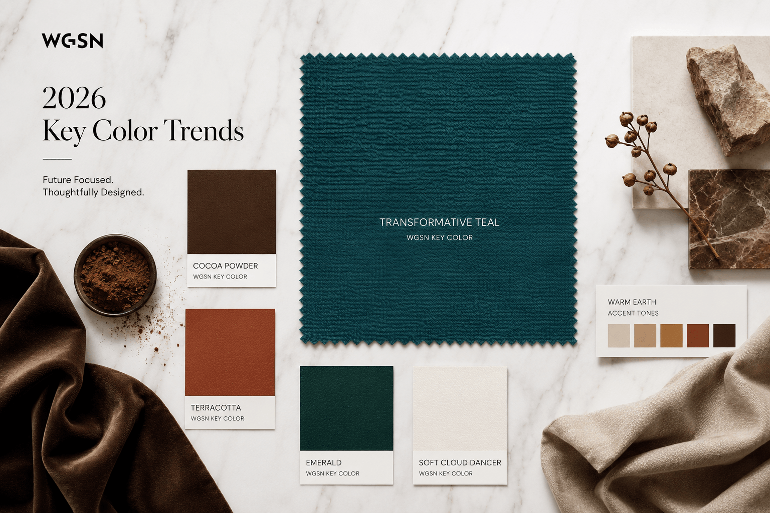
The 2026 color of the year is teal, a sophisticated blue-green hue chosen for its unique ability to bridge the gap between calming oceanic tones and invigorating, vibrant vitality. As a complex secondary color, teal offers interior designers and manufacturers a versatile, high-impact aesthetic that works across residential, commercial, and fashion-forward applications, grounding modern spaces in a sense of natural equilibrium.
The Significance of the 2026 Color Selection
The designation of teal as the 2026 color of the year reflects a broader cultural pivot toward spaces that emphasize restoration and technological grounding. After years of neutral palettes dominated by beige and greys, teal emerges as a deliberate choice for individuals looking to infuse their environments with personality without sacrificing a sense of serenity.
Teal is classified as a medium-to-deep blue-green. Its inherent composition is a mixture of blue, which conveys trust and stability, and green, which evokes growth and rejuvenation. In a digital-heavy era, this color serves as an "analog" anchor, providing a visual resting point that feels both sophisticated and deeply familiar. By selecting this hue, design authorities are acknowledging that modern living spaces are no longer just aesthetic vessels; they are functional sanctuaries that must support mental clarity.
The Versatility of Teal in Interior Design
One of the primary drivers behind teal's selection is its extraordinary flexibility. It occupies a "sweet spot" on the color wheel, meaning it functions effectively as both a dramatic focal point and a subtle accent. Understanding how to deploy this color requires an examination of its depth and light-reflective properties.
Strategic Application Methods
- The Statement Wall: Because teal has significant depth, it absorbs light differently throughout the day. Using it on a single accent wall in a room with ample natural light can create an illusion of depth, effectively "pushing" the wall back and expanding the perceived size of a room.
- Textile and Upholstery Integration: For those hesitant to commit to wall paint, teal velvet, linen, or high-performance synthetic upholstery provides a luxury feel. Teal pairs exceptionally well with brass and brushed gold hardware, creating an elegant contrast that feels timeless rather than trendy.
- Cabinetry and Kitchen Design: In kitchens, teal offers an alternative to the ubiquitous white or navy cabinetry. It hides smudges better than lighter colors while offering more visual interest than standard black. When paired with marble countertops or warm wooden accents, it creates an organic, high-end look.
Technical Considerations: Pigments and Lighting
When working with teal, you must account for the specific technical properties of the pigment. Teal is highly sensitive to the color temperature of the lighting within a room. This is a critical factor for contractors, homeowners, and interior designers to manage to avoid unexpected results.
Lighting Impact on Hue
- Cool Lighting (5000K+): Under cool, blue-leaning light, the green undertones of teal are minimized, and the blue component becomes more prominent, resulting in a stark, crisp appearance.
- Warm Lighting (2700K–3000K): In spaces with warm artificial lighting, the green undertones are amplified. This creates a softer, more "forest-like" atmosphere, making the room feel cozier and more intimate.
- Natural Light (Diurnal Shift): Because the sun’s angle changes the color temperature of daylight, a room painted in teal will appear to "change" colors. It may look vibrant and bright in the morning and transition to a deeper, moody navy by sunset.
Comparison of Teal Complementary Palettes
The table below outlines how to integrate teal with other colors to achieve specific design goals.
| Pairing | Design Objective | Psychological Effect |
|---|---|---|
| Teal + Burnt Orange | High-energy, mid-century modern look | Energizing and adventurous |
| Teal + Cream/Off-White | Airy, coastal sophistication | Calming and clean |
| Teal + Charcoal/Black | Dramatic, masculine, or moody | Sophisticated and grounded |
| Teal + Soft Pink/Blush | Balanced, feminine, and modern | Harmonious and refreshing |
Common Challenges and Troubleshooting
Despite its popularity, working with deep, saturated colors like teal can present challenges for DIY enthusiasts and professionals alike. The most common issues revolve around application quality and color bleeding.
Avoiding "The Blotchy Effect"
Deep teal paints are often heavily pigmented. If applied over a light or uneven primer, the final coat may look streaky. Always use a high-quality, tinted primer that is gray-toned. This reduces the number of topcoats required and ensures a uniform color depth across the entire surface.
Managing Border Lines
When painting trim against a teal wall, the "bleed" is more visible than with lighter colors. Professionals recommend a high-tack painter's tape and the "sealing" technique: after applying your tape, paint a thin layer of the original wall color (or a clear caulk/sealer) along the tape edge. Once this dries, paint your teal over it. This prevents the teal from seeping under the tape, ensuring a razor-sharp finish.
Sustainability and Material Sourcing
As of 2026, the movement toward sustainable interiors has influenced how teal pigments are sourced. Many manufacturers are now opting for bio-based resins and low-VOC (Volatile Organic Compound) formulas. When selecting a teal product, look for labels that certify the absence of harmful solvents, which is particularly important for interior applications in bedrooms or children's rooms where air quality is a priority.
Furthermore, consider the longevity of the materials. Teal is a classic color that resists rapid "style obsolescence." Unlike neon trends or hyper-specific pastels that feel dated after a single season, teal has historical roots in Art Deco and Victorian design. Investing in high-quality items—such as a solid wood cabinet or a high-durability sofa in teal—is a decision that provides long-term value, reducing the need for replacement and minimizing waste.
Frequently Asked Questions
Does teal make a room look smaller? Not necessarily. While dark colors can make a space feel "closed in," they can also create a sense of infinite depth. In a small room, using a high-gloss teal paint can actually reflect light and make the space feel larger by blurring the lines between the walls and corners.
What is the best way to clean teal-colored walls or fabrics? For walls, use a damp microfiber cloth with a small amount of mild dish soap. Avoid abrasive scrubbers, which can "burnish" or polish the paint, leaving shiny spots on a matte finish. For textiles, check the manufacturer's care tag, as deep-dyed fabrics may require specific spot-cleaning agents to prevent fading.
Can I mix teal with other shades of blue or green? Yes, this is known as a monochromatic or analogous color scheme. Mixing varying shades of teal, aqua, and deep navy creates a layered, professional look. The key is to vary the textures—such as combining a matte teal wall with a velvet teal pillow—to ensure the room doesn't feel flat.
Is teal appropriate for home offices? Teal is often cited by psychologists as an excellent color for focused work environments. It is stimulating enough to prevent drowsiness but calming enough to mitigate the stress associated with high-pressure tasks. It is considered a "productive" color that supports sustained cognitive effort.
Next Steps for Implementing the 2026 Color
If you are looking to incorporate the 2026 color of the year into your environment, begin with a small-scale pilot. Purchase a sample jar of your chosen shade and apply it to a 2-foot by 2-foot piece of poster board. Move this board around your room at different times of the day to observe how the local lighting affects the color.
If you are committing to a larger renovation, such as painting a whole room or investing in major furniture pieces, ensure you have verified the color under both natural and artificial light sources. For those operating within a limited budget, switching out small accessories—such as throw pillows, rugs, or decorative ceramics—is the most cost-effective way to refresh a space with the 2026 color without requiring a permanent architectural commitment.