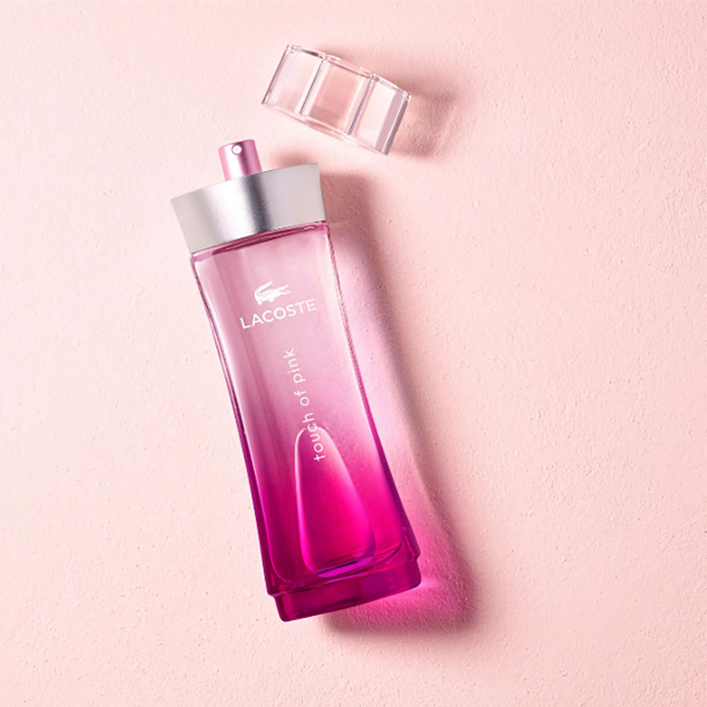
A touch of pink is a deliberate design approach that introduces subtle rose, blush, or magenta tones into interior spaces, fashion aesthetics, or artistic compositions to add warmth, contrast, and visual interest without overwhelming the primary palette.
The phrase "a touch of pink" can refer to several distinct creative domains, most notably interior design accents, fashion styling choices, and specific media titles such as literature or film references. In interior architecture and home decor, incorporating this specific hue means utilizing small-scale elements—such as throw pillows, ceramics, floral arrangements, or statement artwork—against neutral backgrounds like crisp whites, warm grays, or deep charcoals. This restrained application prevents the color from feeling overly traditional or heavily gendered, allowing it to function as a sophisticated visual anchor. Understanding how to execute this technique requires examining color theory, material choices, lighting conditions, and the psychological impact of muted versus saturated pink tones within a given environment.
The Role of Subtle Color Theory in Design
Color theory dictates that secondary and tertiary accents can dramatically alter the perception of a primary space. When introducing a touch of pink, designers must evaluate the undertones of the color to ensure harmony with existing architectural elements.
Warm Versus Cool Undertones
Pink is created by combining red and white, but variations depend heavily on whether yellow or blue undertones dominate the mix.
- Warm Pinks: Shades featuring peach, coral, or terracotta undertones pair exceptionally well with earthy materials like travertine, natural wood, and brass hardware. They impart a welcoming, sun-kissed atmosphere.
- Cool Pinks: Shades with blue or violet undertones, such as dusty rose, mauve, or bubblegum, complement cooler backdrops including slate, chrome, and cool-toned grays. They introduce a crisp, modern edge to contemporary spaces.
Contrast and Visual Weight
Because pink spans a broad chromatic spectrum, its visual weight depends on its saturation and value. A high-saturation magenta demands immediate attention and can easily dominate a room if used improperly. Conversely, a desaturated, muted blush acts almost as a neutral. By limiting the color to small decorative accents—hence a touch of pink—designers maintain a balanced equilibrium that draws the eye without creating visual fatigue.
Practical Implementation in Interior Spaces
Applying this design philosophy within a home requires careful planning regarding placement, texture, and repetition. Randomly scattering pink items throughout a room creates visual clutter rather than intentional design cohesion.
Strategic Placement Guidelines
To achieve a sophisticated look, concentrate the color in specific zones where it can interact with natural light and surrounding textures:
- Textiles: Introduce soft elements such as linen throw blankets, velvet cushion covers, or patterned area rugs containing subtle pink threads. These textiles soften hard architectural lines and add tactile warmth.
- Botanicals: Fresh florals, such as pale pink peonies, roses, or cherry blossoms, offer an organic and effortless way to introduce color. Unlike permanent fixtures, botanicals allow for seasonal flexibility.
- Artwork and Ceramics: Small sculptural objects, glazed pottery, or framed minimalist art prints featuring washes of pink create focal points on bookshelves, mantels, and side tables.
Material Compatibility Table
Different materials react uniquely when paired with pink accents. The following table outlines how various textures influence the overall aesthetic outcome.
| Primary Material | Interaction with Pink Accents | Recommended Application |
|---|---|---|
| Natural Wood (Oak, Walnut) | Grounds the sweetness of pink, creating an earthy, organic balance. | Wooden coffee tables topped with ceramic pink vases. |
| Polished Brass / Gold | Enhances warmth and introduces a sophisticated, luxurious contrast. | Brass-rimmed trays holding dusty rose decor items. |
| Concrete / Industrial Gray | Provides stark modern contrast, neutralizing overly romantic associations. | Exposed concrete walls paired with a single blush velvet chair. |
| Crisp White / Ivory | Maximizes brightness, allowing the pink element to stand out cleanly. | White linen sofas accented with pastel pink toss pillows. |
Psychological and Environmental Impacts
The environment humans inhabit directly influences mood, productivity, and emotional well-being. Color psychology suggests that soft pink hues promote feelings of tranquility, empathy, and comfort.
Unlike bright reds, which can stimulate agitation or urgency, muted pinks have been utilized in architectural and interior settings to lower stress levels and foster a calming ambiance. However, excessive application in professional or shared workspaces can sometimes detract from serious focus, which is precisely why the restrained "touch of pink" approach remains favored in versatile living areas, bedrooms, and hospitality design. It delivers the psychological benefits of warmth and softness while preserving a clean, clutter-free spatial environment.
Fashion and Personal Styling Contexts
Beyond interior design, the concept of a touch of pink frequently appears in contemporary wardrobe styling and personal accessories. Rather than adopting a monochromatic pink outfit, fashion stylists often use a single signature piece to elevate a neutral ensemble.
Wardrobe Integration Strategies
- Footwear and Handbags: A structured blush leather handbag or a pair of rose-tinted sneakers can instantly modernize a classic denim-and-white-tee combination or a tailored navy suit.
- Layering Pieces: Wearing a fine-knit pink cardigan draped over the shoulders or a patterned silk scarf introduces color near the face, which can brighten skin tones without requiring a full outfit commitment.
- Jewelry and Cosmetics: Rose gold jewelry, subtle flushed cheeks, or tinted lip balms offer understated ways to incorporate the palette into daily grooming routines.
Common Mistakes to Avoid
When attempting to integrate subtle color accents into a structured design or wardrobe scheme, several pitfalls frequently occur. Recognizing these errors helps maintain a polished final result.
- Ignoring Lighting Conditions: Natural northern light creates a cooler, bluer cast that can make pale pinks look sterile or gray. Conversely, warm southern sunlight intensifies yellow undertones, turning soft blush into an unintended peach. Always test color samples in the exact room lighting before finalizing decor purchases.
- Over-Matching: Attempting to match every single pink accessory to the exact same hex code creates a rigid, flat aesthetic. Mixing various shades and depths of pink—from pale quartz to deeper mauve—adds organic depth and complexity.
- Disregarding Scale: Introducing too many small pink items across a large space scatters the eye and creates visual noise. Grouping items in odd numbers or focusing them in a single sightline yields a more deliberate, curated effect.
Frequently Asked Questions
What colors pair best with a touch of pink?
Neutral shades like ivory, beige, taupe, and charcoal gray provide the most stable backdrops. For bolder pairings, olive green, mustard yellow, and deep navy blue create striking, sophisticated contrasts against soft pink accents.
How can I update a masculine or neutral room with pink without losing its edge?
Pair muted, dusty, or grayish pinks with raw industrial textures such as exposed brick, black steel frames, leather upholstery, and reclaimed wood. This grounds the color and removes any overly precious connotations.
Is a touch of pink suitable for all interior design styles?
Yes, this versatile approach adapts easily across styles. In minimalist spaces, a single ceramic pink object provides a subtle focal point. In bohemian or maximalist environments, it can act as a bridge between richer jewel tones and neutral textiles.
How do I determine if a pink accent has warm or cool undertones?
Compare the pink item directly against a sheet of pure white printer paper and a piece of stark black fabric. If the pink appears to lean toward peach, apricot, or yellow, it is warm. If it displays icy, purple, or blue undertones, it is cool.
Can I mix different shades of pink in the same room?
Layering varying tones—such as combining a pale blush pillow with a darker magenta ceramic vase—adds dimension. The key is to keep the undertones consistent so that warm and cool pinks do not clash jarringly.
Conclusion and Next Actions
Incorporating a touch of pink into your home or personal style is a low-risk, high-reward method for injecting personality, warmth, and contemporary flair into an existing space. Begin your project by auditing your current environment to identify neutral zones that would benefit most from a subtle color infusion. Select one or two high-quality elements—such as a textured throw pillow, a structured ceramic vase, or fresh seasonal botanicals—and observe how they interact with your room's natural lighting throughout the day. By keeping the application restrained and intentional, you can achieve a balanced, sophisticated aesthetic that stands the test of time.