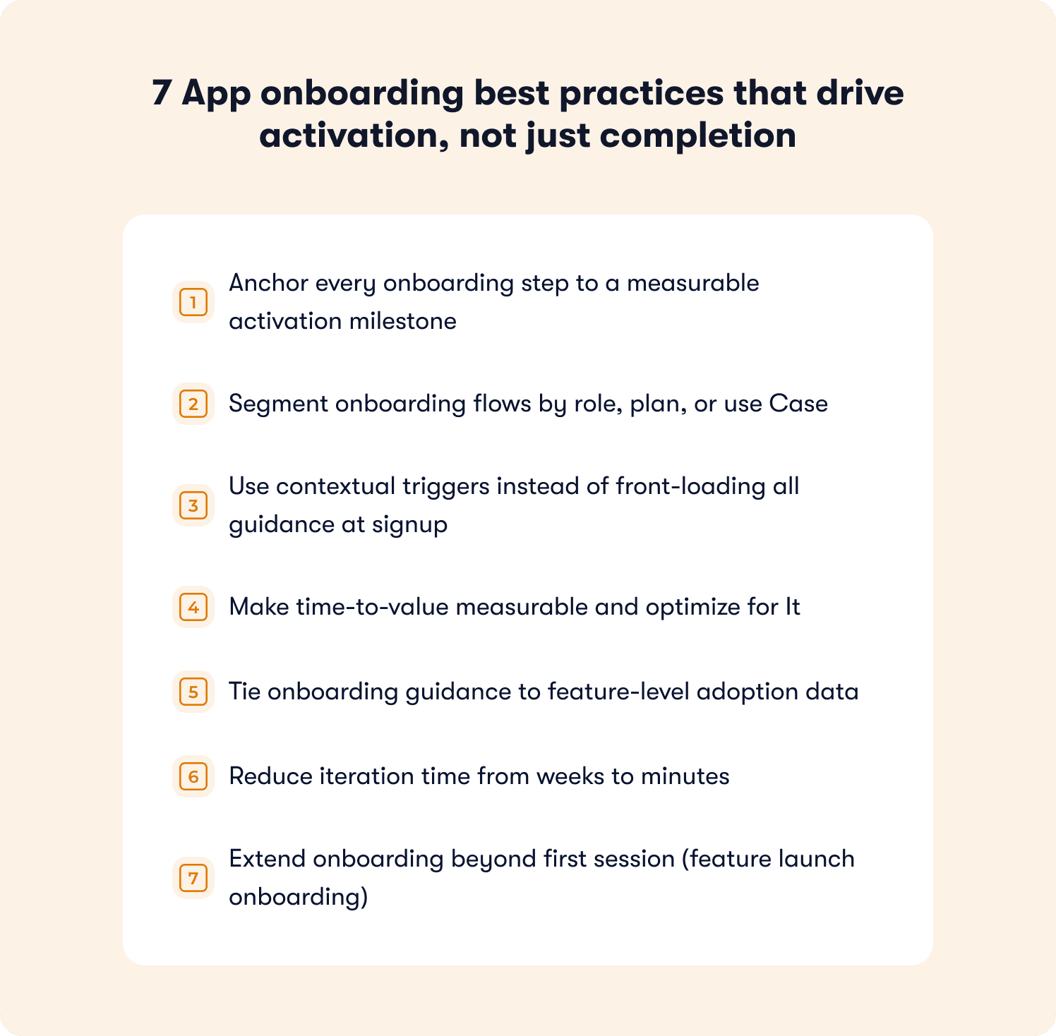
Effective app onboarding is the strategic process of guiding new users through their first interaction with a mobile or desktop application to ensure they reach their "aha!" moment as quickly as possible. By focusing on personalization, progressive disclosure, and clear value communication, developers can significantly reduce churn rates and increase long-term user retention during the critical first minutes of use.
1. Focus on Value Over Functionality
The most common mistake in onboarding is overwhelming users with a feature tour that acts as a manual. Users rarely care about how a tool works until they understand what the tool does for them. The goal of your initial screens should be to articulate the core value proposition.
Instead of showing a slideshow of buttons and settings, demonstrate the problem your app solves. Use the first three screens to highlight the benefits: save time, earn money, connect with friends, or secure data. When users understand the benefit, they are naturally more motivated to learn the navigation required to achieve those results.
2. Implement Progressive Disclosure
Progressive disclosure is a design strategy that focuses on showing only the information necessary for the current task. By sequencing interactions, you prevent "cognitive overload," a state where a user becomes frustrated by too much information at once.
Rather than forcing users to fill out a ten-field registration form or set up complex preferences immediately, ask for the bare minimum to get started. Save advanced configuration options for later sessions. When a user finally decides to use a specific advanced feature, that is the perfect time to request the necessary permissions or preferences, as the context for that request is already established.
3. Leverage "Learn by Doing" Interactive Walkthroughs
Passive tutorials—where users tap "Next" through static images—often result in low retention. Research shows that users retain significantly more information when they participate in an active, hands-on experience.
Replace the "slide deck" tutorial with an interactive overlay that asks the user to perform the primary action of the app. For example, if you are building a task management app, the onboarding should not just explain how to add a task; it should prompt the user to create their first task immediately. This creates a psychological sense of accomplishment and ensures the app is not empty when they begin their actual session.
4. Use Empty States for Guidance
When a user first downloads an app, the interface is often barren. An "empty state" is a screen that appears when there is no data to display—such as a user’s dashboard before they have added contacts or projects.
Turn these empty states into an onboarding opportunity rather than a dead end. Instead of displaying a blank white screen, provide a call-to-action (CTA) that explains what the user can do there. For example, "You don't have any projects yet. Tap here to start your first project." This provides a clear path forward and eliminates the ambiguity that often leads to app abandonment.
5. Optimize Permission Requests
Requesting too many system permissions—such as access to location, camera, contacts, or notifications—immediately upon launch is a major friction point. In 2026, user privacy awareness is at an all-time high, and asking for access without context often results in a "Deny" response, which can cripple app functionality.
Wait until the user is about to perform a specific action that requires a permission to ask for it. If your app requires location access, wait until the user clicks the "Find nearby locations" button. By linking the request to a specific, beneficial outcome, you increase the likelihood that the user will grant the permission.
6. Offer a "Skip" Option
Even the best-designed onboarding process can become a hindrance for power users or those who have used your app before. Forcing every user to sit through the same tutorial creates friction and annoyance.
Always provide a clear, easy-to-find "Skip" button. If a user chooses to skip the onboarding, it is a signal that they either already know your product or prefer to explore independently. For these users, provide a "Help" or "Tutorial" icon in the settings menu so they can return to the guide if they find themselves stuck later.
7. Measure Success with Analytics
Onboarding is not a "set it and forget it" feature. You must monitor how users interact with your onboarding flow to identify where they drop off. Utilize event tracking to see exactly which screen or interaction causes the highest bounce rate.
Use A/B testing to refine your onboarding. Test two different copy variations, different visual cues, or different lengths of the walkthrough. By basing your onboarding design on actual user behavior data, you move away from guesswork and toward an evidence-based design process that aligns with your specific user demographic.
Comparison of Onboarding Methods
| Method | Best For | Potential Drawback |
|---|---|---|
| Interactive | Complex productivity apps | Higher development effort |
| Static Slides | Simple, single-purpose apps | Low engagement/High skip rates |
| Empty States | Data-heavy dashboards | Requires clever copywriting |
| Progressive | Social and utility apps | Can delay feature discovery |
Frequently Asked Questions
Why do users skip app onboarding?
Users typically skip onboarding because they feel the information presented is either irrelevant to their needs or because they are impatient to reach the app's core functionality. Providing a clear skip option respects the user's time and prevents negative sentiment toward your brand.
How long should an onboarding flow be?
The ideal onboarding flow should be as short as possible to achieve the user's "aha!" moment. Aim for three to five screens or steps at most. If your app is complex, focus only on the mission-critical steps needed to get started, and leave secondary features for later tutorials.
When should I ask for push notifications?
Never ask for push notifications on the very first screen. Wait until the user has performed an action that highlights the benefit of receiving notifications. For example, a delivery app should ask for notification permissions only after the user has placed their first order, explaining that the notification is for tracking their delivery status.
How do I know if my onboarding is effective?
The primary metric for effective onboarding is the conversion rate from the first app launch to the completion of the "first success" (e.g., adding a contact, making a post, or starting a timer). If your onboarding drop-off rate is high, you likely need to simplify the steps or improve your value proposition.
Can I change my onboarding process after the app is live?
Absolutely. Using an over-the-air (OTA) update or a feature-flagging system, you can test different onboarding variations on segments of your user base without submitting new versions to the app store. Continuous iteration based on user feedback is essential for maintaining high retention.
Should I gamify the onboarding process?
Gamification, such as progress bars or small rewards for completing setup, can be effective in increasing completion rates. However, ensure the gamification feels natural to your brand. For a professional B2B app, a simple progress bar is usually better than a playful, game-like experience.
Final Recommendation
To create the best app onboarding, start by identifying the exact moment a new user realizes the value of your application. Build your entire onboarding flow backwards from that moment. Remove any step, screen, or request that does not directly contribute to the user reaching that goal. By keeping your process concise, interactive, and user-centric, you will foster a positive first impression that sets the foundation for a long-term user relationship.