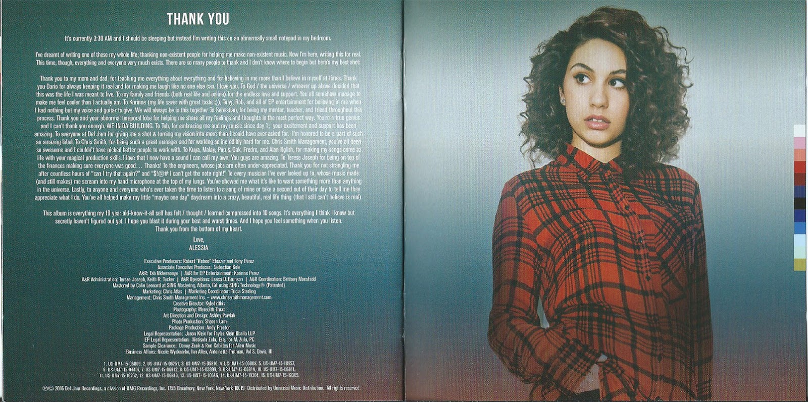
Alessia Cara’s album covers serve as a visual diary of her transition from a bedroom-dwelling teenager to a sophisticated global artist. Known for blending raw vulnerability with specific symbolic motifs—like the oversized suit or the color blue—her artwork emphasizes authenticity over traditional pop glamour, reflecting the introspective and often self-deprecating nature of her songwriting.
Across her discography, Cara has maintained a distinct visual language that rejects the highly polished, "manufactured" aesthetic typical of modern pop. As of 2026, her body of work stands as a testament to the power of consistent branding rooted in personal truth. From the literalism of her debut EP to the surrealist leaning of her more recent releases, each cover provides a crucial entry point into the sonic world she builds for her listeners.
The Significance of Alessia Cara’s Visual Branding
The visual identity of Alessia Cara is inseparable from her music. While many pop stars use album art to project a persona of untouchable stardom, Cara’s covers have historically leaned into the "outsider" perspective. This is a deliberate choice that mirrors her breakout single "Here," which celebrated the awkwardness of being the person at a party who doesn't want to be there.
The evolution of her covers shows a clear trajectory:
- The Early Era (2015-2016): Focus on the "everygirl" aesthetic, utilizing residential settings and casual clothing to build trust with a Gen Z audience.
- The Transitional Era (2018-2019): Heavy use of symbolism and metaphor, specifically addressing the pressures of fame and the discomfort of aging.
- The Mature Era (2021-2025): High-concept photography that balances artistic sophistication with the same emotional honesty found in her early work.
By analyzing these covers, we can see how Cara uses color theory, fashion, and composition to communicate complex emotional states before the listener even hears a single note.
Four Pink Walls EP (2015): The Foundation of the Bedroom Pop Aesthetic
The cover for Four Pink Walls is perhaps the most literal interpretation of Cara’s origins. It features a close-up, slightly grainy photo of Alessia, but the title itself refers to her childhood bedroom in Brampton, Ontario.
The Symbolism of the Room
The "four pink walls" were the site where Cara recorded her early YouTube covers and wrote the songs that would eventually secure her record deal. By referencing this space, the artwork established a narrative of "from my bedroom to the world." The aesthetic was lo-fi and approachable, a sharp contrast to the EDM-heavy visuals of 2015.
Color and Composition
The color palette was dominated by muted pinks and natural skin tones. This wasn't the neon pink of high-energy pop, but a faded, nostalgic hue. The composition was intimate, placing the viewer in the same physical and emotional space as the artist. This established the "anti-pop" branding that would define her career.
Know-It-All (2015): Defining the "Anti-Pop" Star
For her debut full-length album, Know-It-All, Cara opted for a cover that further cemented her defiant stance against the music industry's beauty standards. The artwork features Cara standing against a bright, solid pink background, wearing a simple olive jacket and an expression that is neither a smile nor a pout—it is a look of observation.
Artistic Choice and Defiance
The choice to use a simple, unadorned background was a power move for a debut artist. It forced the focus entirely onto her. There were no flashy props or extravagant costumes. This visual simplicity signaled to the audience that the music would be equally unpretentious.
The Impact of "The Look"
In interviews during this era, Cara often spoke about her refusal to be "glammed up" in a way that felt unnatural. The Know-It-All cover captured her exactly as she was: a teenager with curly hair and a skeptical gaze. This imagery resonated deeply with a younger demographic that was becoming increasingly disillusioned with the "perfection" shown on social media.
The Pains of Growing (2018): Symbolism and the Oversized Suit
If her debut was about being an outsider, her sophomore effort, The Pains of Growing, was about the crushing weight of adulthood. The cover is one of the most iconic in recent pop history, featuring Cara wearing an enormous, poorly fitted grey business suit.
The Metaphor of the Suit
The oversized suit was a literal representation of "trying to fill big shoes." Cara explained that the suit symbolized the roles we are forced to play as adults—roles that often feel too big or uncomfortable. It was a visual manifestation of imposter syndrome.
Creative Collaboration
The art direction for this era involved a high degree of intentionality. By wearing a suit that swallowed her frame, Cara made herself look smaller and more vulnerable, despite being the center of the frame. This juxtaposition perfectly mirrored the album’s themes of navigating the industry and personal heartbreak.
This Summer EP (2019): A Shift in Color and Mood
Following the heavy conceptual nature of The Pains of Growing, the This Summer EP featured a more relaxed, though still moody, visual approach. The cover uses warm, sun-drenched tones, but the imagery remains grounded.
Heat and Humidity
The photography for This Summer captures the feeling of a sweltering afternoon. It moves away from the studio-slick backgrounds of previous projects and into the "real world." The use of grain and film-like textures suggests a sense of fleeting time, which aligns with the EP’s focus on short-lived seasonal romances and reflections.
In the Meantime (2021): Exploring Emotional Depth Through Blue Tones
With her third studio album, In the Meantime, Cara’s visual identity took a dramatic turn toward the aquatic and the surreal. The cover features her submerged or surrounded by water, utilizing a deep, monochromatic blue palette.
The Psychology of Blue
Blue is often associated with sadness, but it also represents depth and tranquility. For this album, which dealt with anxiety and the "in-between" moments of life, the color was a perfect fit. The imagery was shot by renowned photographer Renell Medrano, who brought a high-fashion sensibility to Cara’s signature vulnerability.
Technical Mastery in Photography
The use of water in the In the Meantime visuals required significant technical skill. The way light refracts through the water onto Cara’s face creates a sense of distortion, representing the blurred lines of reality when dealing with mental health struggles. This was her most "artistic" cover to date, moving away from the literalism of the oversized suit into something more evocative.
Love & Leisure (2024/2025): Maturity and Refinement
As we look back from 2026, her project Love & Leisure (released in the 2024-2025 window) represents the pinnacle of her visual evolution. The cover art for this era moved toward a warmer, more sophisticated palette—think deep oranges, creams, and earthy tones.
Surrealist Elements
The Love & Leisure visuals often featured Cara in slightly "off" environments—rooms with unusual proportions or shadows that didn't quite match the light source. This indicated a shift toward surrealism, suggesting that while she is now a "mature" artist, the world she occupies is still one of introspection and questioning.
Typography and Branding
The typography for this era became more minimalist. Moving away from the bold, handwritten fonts of her youth, Love & Leisure utilized elegant, serif typefaces. This subtle change signaled to the audience that the artist had entered a new phase of her career, characterized by refinement and confidence.
Comparison of Key Design Elements Across Albums
The following table summarizes the primary visual components of Alessia Cara's major releases through 2026.
| Album/EP | Release Year | Primary Color Palette | Core Visual Motif | Photographer/Art Director |
|---|---|---|---|---|
| Four Pink Walls | 2015 | Muted Pink, Beige | The Bedroom | Tinashe Muchemwa |
| Know-It-All | 2015 | Magenta, Olive | The Defiant Gaze | Various (Def Jam Creative) |
| The Pains of Growing | 2018 | Grey, White | The Oversized Suit | Superduperbrick |
| In the Meantime | 2021 | Deep Blue, Teal | Water/Submersion | Renell Medrano |
| Love & Leisure | 2024 | Burnt Orange, Cream | Surreal Interiors | Various |
Technical Analysis: Photography and Typography
To understand why Alessia Cara’s album covers are effective, one must look at the technical choices made by her creative teams.
The Role of Film Grain
Throughout her career, Cara has preferred the look of film over the clinical sharpness of digital photography. This choice adds a layer of "humanity" to her covers. The slight imperfections—noise in the shadows, soft focus—make the images feel like personal photos rather than corporate assets.
Font Choices as Narrative
- Know-It-All: Used a bold, slightly jagged font that felt youthful and energetic.
- The Pains of Growing: Utilized a clean, almost institutional sans-serif, mimicking the corporate feel of the suit.
- In the Meantime: Switched to a more spaced-out, ethereal font that felt like it was floating, much like the water motif.
Collector's Guide: Physical Media and Alternate Covers
For fans and collectors, the album covers are more than just digital thumbnails; they are the face of physical products like vinyl and CDs.
- Vinyl Variations: Most of Cara's albums have been released with gatefold jackets that expand on the cover art. For example, the In the Meantime vinyl includes expanded photography that shows the full scale of the water sets.
- Limited Editions: Some releases, particularly The Pains of Growing, featured alternate covers for Target or Urban Outfitters. These often showed different angles of the "suit" motif, providing a 360-degree view of the concept.
- Digital Deluxe Art: In the streaming era, Cara has often updated the "canvas" (the moving video on Spotify) to breathe life into the static cover art. These loops often use outtakes from the original cover shoot.
Frequently Asked Questions
Why does Alessia Cara wear a suit on the cover of The Pains of Growing?
The oversized suit is a metaphor for the discomfort of adulthood and the music industry. Alessia felt that at 21, she was being asked to fill a role (an "adult" or a "star") that she didn't yet feel big enough for. The suit represents the "pains of growing" into a person you aren't yet fully ready to be.
Who is the photographer for Alessia Cara's album covers?
Cara has worked with several photographers, but Renell Medrano is perhaps the most notable for the In the Meantime era. Her creative director for several projects has been Superduperbrick, who helped develop the cohesive visual storytelling found in her second and third albums.
What is the meaning behind the color blue in the In the Meantime cover?
The blue palette represents a period of deep introspection and anxiety. Following the success of her first two albums, Cara went through a phase of mental health struggles. The water and blue tones symbolize the feeling of being "underwater"—unable to breathe or see clearly, yet finding a strange kind of peace in the quiet of the depths.
Has Alessia Cara ever won awards for her album art?
While the Grammy for "Best Recording Package" is a technical award, Cara’s art direction has been widely praised by design publications like It's Nice That and Billboard. Her "oversized suit" concept was particularly noted for its high-concept approach to pop branding.
Are there hidden messages in the Love & Leisure cover?
Fans have noted that the shadows and furniture in the Love & Leisure (2024) artwork contain subtle nods to her previous eras—a pink wall in a mirror's reflection, or a grey fabric reminiscent of her famous suit. These "Easter eggs" reward long-term fans who have followed her visual journey since 2015.
Final Recommendation for Designers and Fans
When studying Alessia Cara’s album covers, the primary takeaway is the importance of narrative consistency. If you are a designer or an artist, look at how Cara uses a single, powerful motif—be it a color, a piece of clothing, or an element like water—to tell a story. Do not feel pressured to follow the "glamour" trends of the moment. Instead, identify a personal truth and find a visual way to exaggerate it. For fans, these covers remain a vital part of the listening experience, offering a window into the mind of an artist who has never been afraid to look a little "unpolished" in the pursuit of being real.