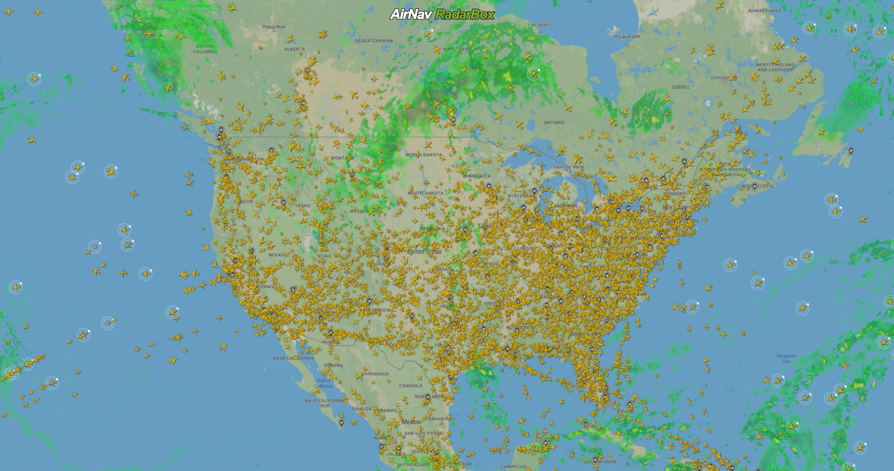
An America airport map for travelers provides a visual representation of the United States' vast aviation network, ranging from large-scale geographic distributions of major hubs to granular, interactive terminal layouts. These maps help passengers identify connection points, locate essential amenities like lounges and security checkpoints, and navigate complex inter-terminal transit systems across the nation's 5,000+ public airports.
Navigating the American airspace in 2026 requires more than just a boarding pass; it demands a spatial understanding of the infrastructure that supports millions of daily movements. Whether you are a first-time visitor or a seasoned business traveler, understanding how to read and utilize an America airport map is the cornerstone of a stress-free journey. The United States maintains one of the most complex airport systems in the world, characterized by a "hub-and-spoke" model that necessitates frequent transfers at massive central facilities.
The Geography of the American Aviation Network
To effectively use an America airport map, one must first understand the hierarchy of the US National Plan of Integrated Airport Systems (NPIAS). The Federal Aviation Administration (FAA) categorizes airports based on their activity levels. Primary airports are those receiving more than 10,000 passenger boardings annually, but the travelers’ focus is almost always on the "Large Hubs." These 30 or so airports account for over 70% of all passenger enplanements in the United States.
On a macro-level map of America, you will notice clusters of high-activity airports along the Northeast Corridor, the West Coast, and southern hubs like Florida and Texas. These airports, such as Hartsfield-Jackson Atlanta International (ATL), Los Angeles International (LAX), and Chicago O'Hare (ORD), serve as the primary gateways for international arrivals and the main switching stations for domestic flights. Understanding their geographic placement helps travelers predict flight durations and potential weather-related delays, which often ripple across the network from specific geographic "choke points" like the Great Lakes or the New York metro area.
For a traveler, a geographic map serves as a strategic tool for itinerary planning. By visualizing where major hubs are located, you can choose connections that make sense. For instance, if traveling from London to San Francisco, a map reveals that connecting through Seattle (SEA) or Los Angeles (LAX) might be more efficient than a mid-continent backtrack through Dallas (DFW). In 2026, many digital mapping tools integrate real-time weather overlays, allowing travelers to see how a storm over the Midwest might impact the "spokes" connected to Chicago or Denver.
Anatomy of a Modern Terminal Map
While a national map helps with planning, a terminal map is what a traveler needs for execution. Modern American terminal maps are divided into two distinct zones: landside and airside. Understanding this distinction is vital for time management. The landside area includes ticketing, check-in, and baggage claim—areas accessible to the general public. The airside area is the secure zone beyond the Transportation Security Administration (TSA) checkpoints.
In 2026, terminal maps have become highly sophisticated, often featuring 3D renderings and multi-level views. A comprehensive map should clearly indicate the location of TSA PreCheck and CLEAR lanes, as these can significantly alter your transit time. Furthermore, look for "Post-Security Connections" on these maps. In many large airports like Atlanta or Denver, all terminals are connected airside via underground people movers, meaning you do not have to exit security to change gates. Conversely, at airports like New York-JFK or LAX, moving between certain terminals may require exiting the secure area and re-clearing security, a detail that a well-designed traveler's map will highlight with warning icons or specific color-coding.
Beyond gates and security, terminal maps are the primary resource for locating "passenger experience" amenities. This includes wellness centers, pet relief areas, quiet rooms, and the increasingly popular "micro-hotel" pods found in hubs like Philadelphia (PHL) or Charlotte (CLT). For those with specific accessibility needs, maps now frequently highlight the locations of sensory rooms and ADA-compliant restrooms, ensuring that the airport environment is navigable for everyone.
Major US Aviation Hubs: Comparison and Layouts
Navigating a major hub requires understanding its unique architectural footprint. US airports are generally designed in one of several layouts: pier (finger) terminals, satellite terminals, or semicircular terminals. Each has implications for walking distances and transit times.
| Airport Name | IATA Code | Primary Layout Type | Key Navigation Feature |
|---|---|---|---|
| Hartsfield-Jackson Atlanta | ATL | Parallel Linear Concourses | Plane Train (Underground) |
| Chicago O'Hare | ORD | Pier/Finger Layout | Airport Transit System (ATS) |
| Dallas/Fort Worth | DFW | Semicircular (High-Gate Access) | Skylink High-Speed Train |
| Denver International | DEN | Satellite Concourses | Automated Guide Way Transit |
| Los Angeles International | LAX | U-Shaped Terminal Cluster | Automated People Mover (APM) |
| New York John F. Kennedy | JFK | Decoupled Terminal Blocks | AirTrain JFK (Landside) |
| San Francisco International | SFO | Circular/Pier Hybrid | AirTrain SFO (On-Airport) |
The table above illustrates that the "best" map for a traveler depends on the airport's specific design. For instance, at DFW, the map is essential for identifying which "side" of the semicircular terminal your gate is on, as the Skylink train runs in a continuous loop connecting all five terminals. In contrast, ATL uses a simple linear spine; if you know your concourse letter (T, A, B, C, D, E, F), you simply move forward or backward along that single line.
Digital vs. Physical Maps: Navigating in 2026
The transition from paper to digital mapping is nearly complete in 2026. While large physical directories still exist near airport entrances, the most effective "America airport map for travelers" is now found on mobile devices. Most major US airlines—such as Delta, United, and American—have integrated detailed terminal maps directly into their mobile apps. These are not static images; they are interactive tools that can track your blue-dot location via the airport’s internal Wi-Fi and Bluetooth beacons.
A significant advancement in 2026 is the use of Augmented Reality (AR) wayfinding. By pointing your phone's camera at the terminal surroundings, the app overlays directional arrows on the screen, guiding you to your specific gate, the nearest Starbucks, or a specific lounge. This technology is particularly useful in massive, multi-level structures like the New Tom Bradley International Terminal at LAX or the rebuilt Terminal B at LaGuardia (LGA).
However, travelers should not rely solely on data-dependent maps. In some basement-level corridors or reinforced concrete structures, GPS signals and cellular data can drop out. It is a best practice to download "offline maps" of your departure, arrival, and connection airports before you leave home. This ensures that even if the airport Wi-Fi is congested or your roaming data is slow, you still have access to the floor plans and gate locations.
Security and Customs: The Map’s Role in Formalities
For international travelers entering the United States, the airport map serves a critical role in navigating the Customs and Border Protection (CBP) process. Upon arrival, travelers are funneled into a specific international arrivals corridor. Maps of these areas often show the progression from the arrival gate to the primary inspection area, then to the international baggage claim, and finally through the customs exit.
In 2026, many "America airport maps" for international arrivals also designate the location of Mobile Passport Control (MPC) lanes and Global Entry kiosks. Knowing where these are located relative to the general queue can save an hour or more of waiting time. Furthermore, for those with a domestic connection, the map will indicate the location of the "Connection Baggage Drop." This is a crucial step where you re-hand your checked luggage to the airline after clearing customs but before heading to your domestic departure gate.
Security maps also help domestic travelers manage their "landside" time. By checking a real-time map, you can see which security checkpoints have the shortest wait times. In large airports like Seattle-Tacoma (SEA) or Orlando (MCO), all checkpoints usually lead to all gates, but one might be significantly less crowded than the others. A map that displays live wait-time data allows you to make an informed decision on where to enter the secure area.
Accessibility and Special Services Wayfinding
The Americans with Disabilities Act (ADA) ensures that all US airports provide accessible routes, but a map is often necessary to find them. Modern traveler maps include specific layers for accessibility. This includes the location of elevators (which are sometimes tucked away behind escalators), accessible restrooms, and "Service Animal Relief Areas" (SARAs).
For travelers with "hidden disabilities," such as autism or sensory processing disorders, 2026 airport maps frequently mark the locations of "Sensory Rooms" or "Quiet Rooms." These are dedicated spaces designed to provide a reprieve from the bright lights and loud noises of the main terminal. Additionally, the TSA Cares program often provides specialized maps or assistance for those who require extra help navigating the security process.
Parents traveling with young children also benefit from specialized map icons. Nursing suites (often provided by companies like Mamava) are now standard in most US hubs, and their locations are clearly marked on digital maps. Similarly, play areas for children are increasingly common, providing a space for kids to burn off energy during long layovers. Identifying these on a map before you land can make a layover significantly more manageable.
Practical Tips for Utilizing Airport Maps Effectively
To maximize the utility of an America airport map, travelers should adopt a "pre-flight" mapping routine. Before leaving for the airport, spend five minutes reviewing the layout of your departure terminal. Identify the closest parking garage or drop-off point to your airline’s check-in desks. This prevents the common mistake of walking the entire length of a terminal because you were dropped off at the "wrong" end.
During your flight, if you have a connection, use the in-flight Wi-Fi (which is often free for messaging or airline apps in 2026) to check your arrival gate and your next departure gate. Look at the terminal map to see if you need to change concourses. If your connection is tight—say, less than 60 minutes—knowing exactly which direction to turn when you step off the plane can be the difference between making your flight and being stranded.
Finally, always be aware of "Gate Changes." In the US, gate assignments are fluid. A map is only as good as the data feeding it. Always cross-reference your digital map with the physical "Flight Information Display System" (FIDS) screens located throughout the airport. If your gate changes from A1 to C12, your map will help you find the fastest route to that new location, whether it be a brisk walk or a ride on an inter-terminal train.
Frequently Asked Questions
Where can I find the most accurate map of an American airport?
The most accurate maps are usually found on the official website of the specific airport (e.g., flychicago.com for O'Hare) or within the mobile app of the airline you are flying. These sources are updated most frequently to reflect construction, gate changes, and new concession openings.
Do I need to exit security to change terminals in most US airports?
It depends on the airport. At "mega-hubs" like Atlanta (ATL), Denver (DEN), and Dallas/Fort Worth (DFW), all terminals are connected airside via trains or walkways. However, at older or more fragmented airports like New York (JFK) or Boston (BOS), you may need to exit the secure area, take a shuttle or train, and re-clear security at your new terminal. Always check the airport map for "Airside Connections."
Are there maps that show food and shopping options near my gate?
Yes, digital maps in 2026 are highly integrated with commercial data. Apps like LoungeBuddy or the airline's own app allow you to filter the map by "Dining," "Shopping," or "Lounges." Many even allow you to order food directly from the map interface for pickup as you walk to your gate.
How can a map help me find ground transportation?
Every airport map has a dedicated "Landside" or "Ground Transportation" level. This map will show specific zones for Ride-Share (Uber/Lyft), Taxis, Hotel Shuttles, and Public Transit (like the "L" train in Chicago or the BART in San Francisco). These zones are often strictly regulated and located on different levels or at specific curbside pillars.
Can I see security wait times on an airport map?
In 2026, many major airports integrate live security wait times into their digital maps and website dashboards. The TSA website also provides general data, but for the most precise "at-the-moment" information, the airport’s own app is the superior tool.
Final Recommendations for Travelers
To master the American airport landscape, prioritize digital tools while maintaining a basic understanding of physical layouts. Download the app for every airline you are flying and the "hub" airports where you have layovers. If you are an international traveler, familiarize yourself with the CBP and baggage re-check locations via the airport's official terminal diagrams. By treating the airport map as a dynamic guide rather than a static picture, you can navigate the complexities of 2026 air travel with confidence and efficiency.