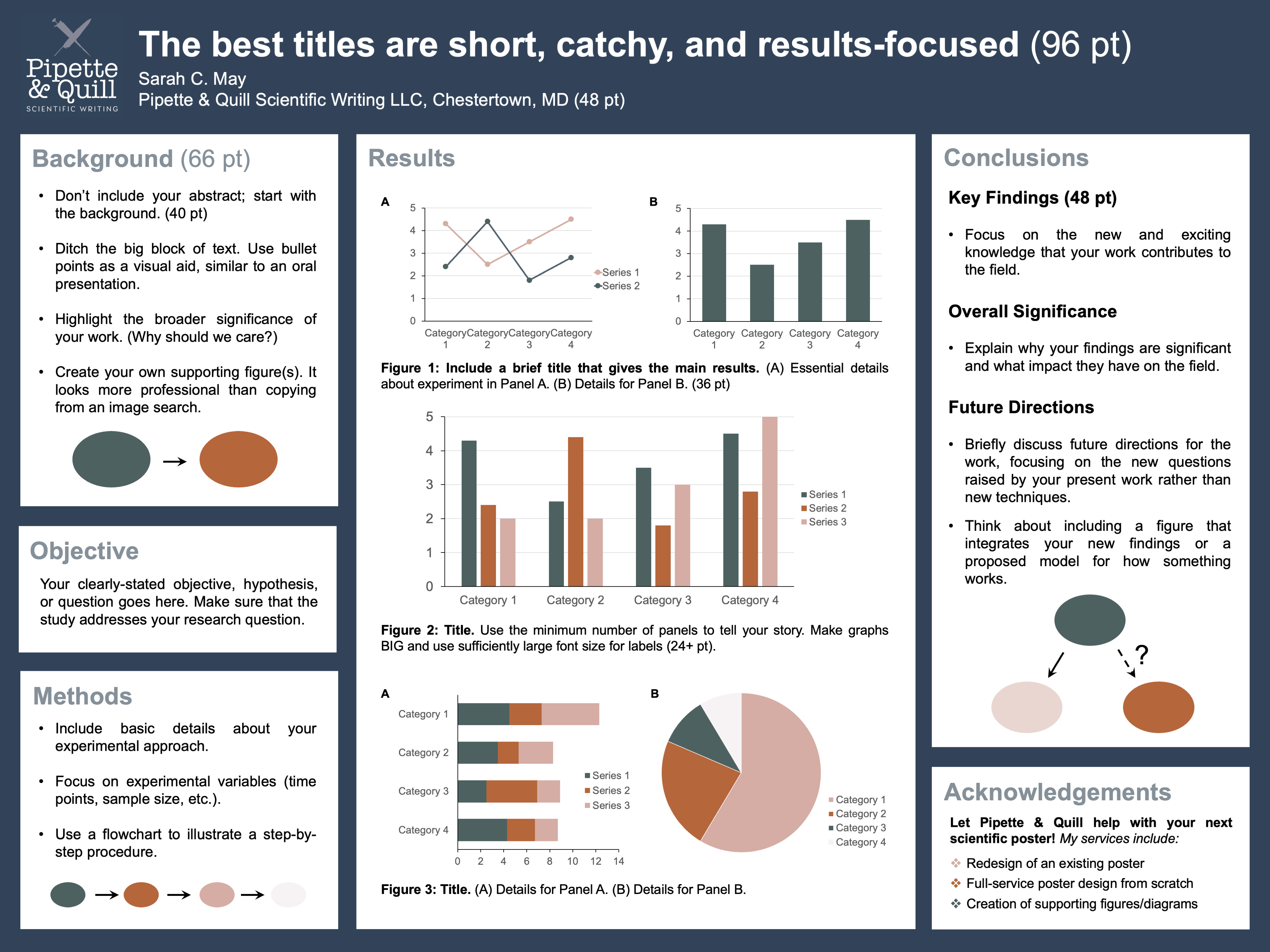
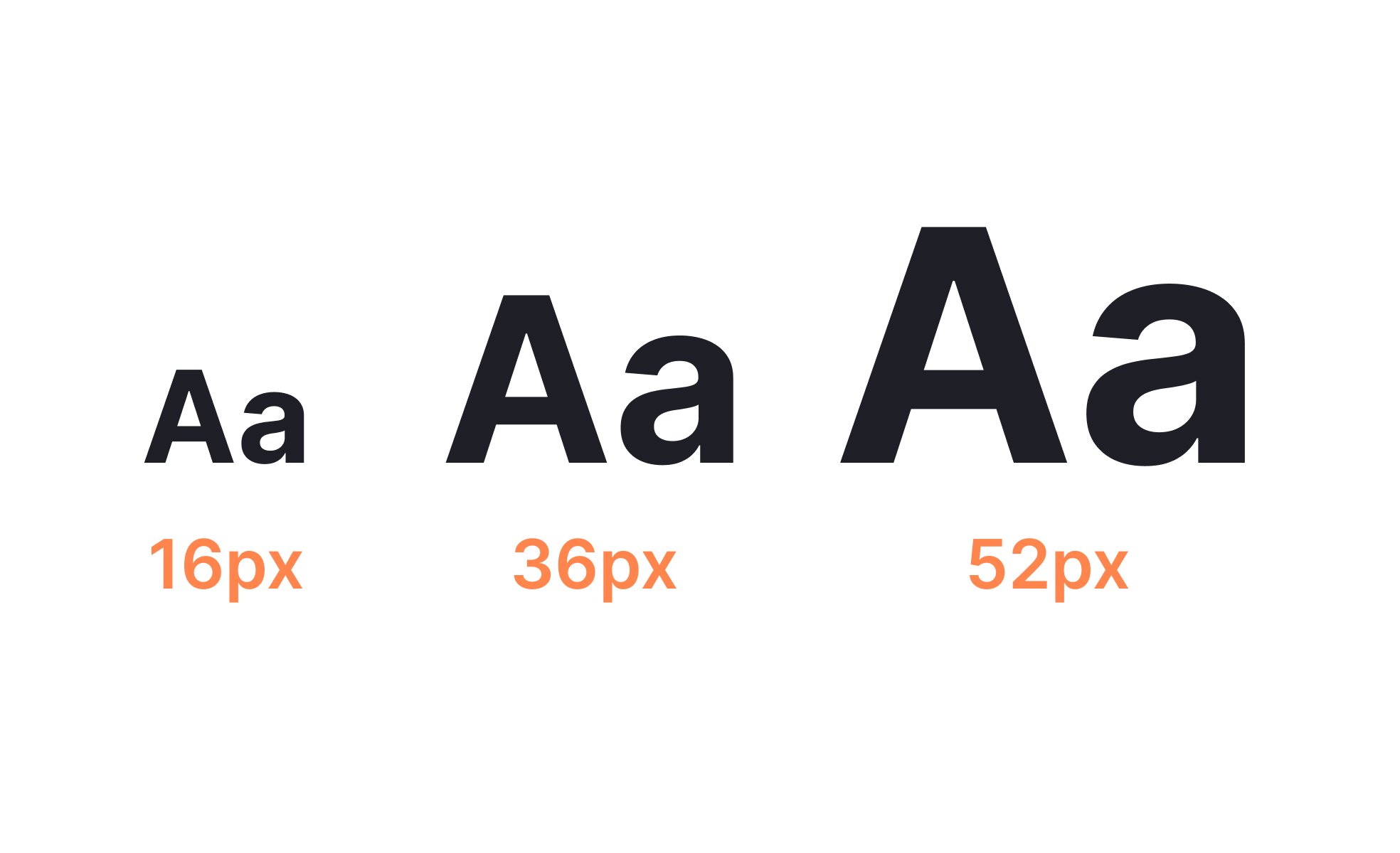
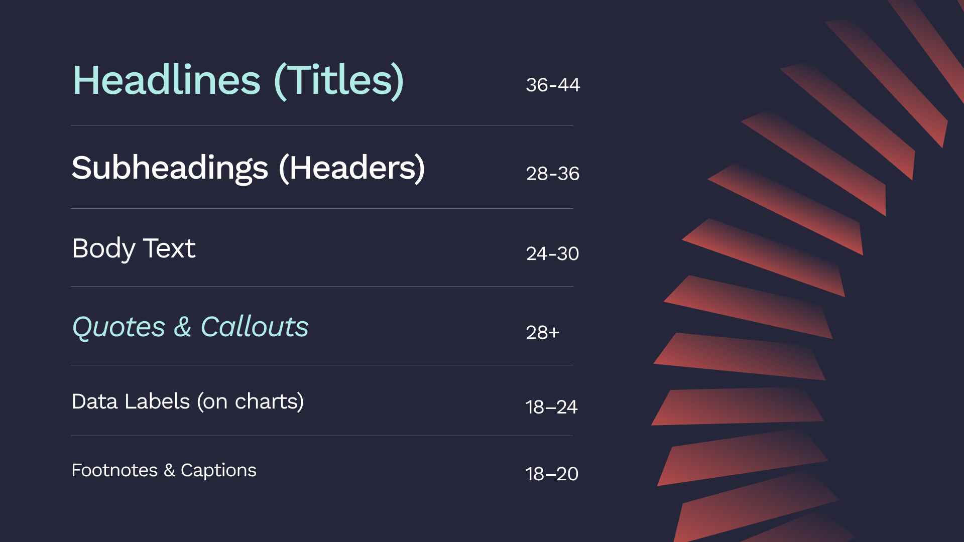
Effective A3 poster design requires a clear typographic hierarchy to ensure your message is legible and impactful. For a standard 297 x 420 mm layout, headlines should range from 72 to 120 points, subheadlines from 36 to 54 points, and body text from 18 to 28 points. These sizes guarantee readability from a distance of one to two meters.
Understanding the A3 Canvas and Viewing Distance
When designing an A3 poster in 2026, the primary factor determining your font size is the intended viewing distance. Unlike a brochure held in the hand or a billboard viewed from a car, an A3 poster occupies a "middle-ground" space. It is commonly used for indoor signage, event promotions in hallways, or informational notices in retail environments.
The A3 format measures 297 x 420 millimeters (11.7 x 16.5 inches). Because it is exactly double the size of an A4 sheet, many designers mistakenly believe they can simply double their standard document font sizes. However, poster legibility operates on a different psychological and physical plane. In a professional setting, an A3 poster is typically viewed from a distance of 1 to 3 meters. If your font is too small, your audience will walk past without engaging; if it is too large, the lack of white space creates visual "noise" that repels the eye.
To optimize for 2026 standards, designers must prioritize the "Scan, Read, Act" workflow. This means the headline must be scannable from across a room, the subheadings readable from 2 meters, and the body text clear from an arm's length.
The Essential Typography Hierarchy for A3 Posters
Hierarchy is the arrangement of elements to imply importance. In poster design, font size is your most powerful tool for establishing this order. Without a clear hierarchy, the viewer’s eye does not know where to start, leading to information fatigue.
The Main Headline: The Hook
The headline is the most critical element of your A3 poster. Its purpose is not to inform, but to arrest attention. In 2026, with the saturation of digital and physical media, a headline must be bold and immediate. For an A3 layout, your headline should never drop below 72 points. If the headline is short (three words or fewer), you can safely scale up to 120 points or even larger, depending on the typeface’s X-height.
Subheadlines: The Context
Once the headline has captured the viewer, the subheadline provides the "Why" or "When." This text acts as a bridge between the initial hook and the detailed information. Subheadlines should be approximately half the size of the main headline. A range of 36 to 54 points is ideal. This allows the subheadline to remain visible from a distance of 2 meters, providing enough context to encourage the viewer to step closer.
Body Text: The Detail
Body text contains the "meat" of your message—dates, descriptions, or instructions. On an A3 poster, body text must be significantly larger than what you would use in a book or on a website. While 12-point font is standard for documents, it is nearly invisible on a wall-mounted poster. Aim for 18 to 28 points. This ensures that the text is comfortable to read from 1 meter away without the viewer needing to press their face against the paper.
Fine Print and Calls to Action
Fine print, such as terms and conditions, sponsorship credits, or secondary contact info, can be smaller, but should rarely go below 10 to 12 points. Your Call to Action (CTA), such as a website URL or a "Register Now" prompt, should often be treated as a secondary subheadline, hovering around 30 to 40 points to ensure it isn't missed.
Recommended Font Sizes for A3 Posters
The following table provides a breakdown of point sizes for standard A3 poster elements based on optimal viewing distances.
| Poster Element | Recommended Size (Points) | Recommended Size (mm) | Minimum Viewing Distance | Primary Goal |
|---|---|---|---|---|
| Primary Headline | 72 - 120+ pt | 25 - 42 mm | 3 - 5 Meters | Immediate Attention |
| Secondary Headline | 48 - 72 pt | 17 - 25 mm | 2 - 3 Meters | Categorization |
| Subheadlines | 36 - 48 pt | 12 - 17 mm | 1.5 - 2 Meters | Context & Clarity |
| Body Copy | 18 - 28 pt | 6 - 10 mm | 0.5 - 1 Meter | Detailed Information |
| Call to Action | 30 - 45 pt | 10 - 15 mm | 1 - 1.5 Meters | Driving Response |
| Captions/Credits | 12 - 16 pt | 4 - 6 mm | < 0.5 Meters | Secondary Details |
Factors Influencing Font Legibility on A3
While point size is a reliable metric, it is not the only factor that determines whether your poster is readable. In 2026, technical nuances in typeface design and printing technology play a significant role.
Typeface Choice: Serif vs. Sans Serif
The style of the font significantly impacts its perceived size. Sans Serif fonts (like Helvetica, Montserrat, or Arial) are generally preferred for posters because they have clean lines and high contrast, making them easier to read from a distance. Serif fonts (like Times New Roman or Garamond) can work for headlines to convey authority or elegance, but their fine "tails" can blur when printed at smaller sizes or viewed from an angle.
Weight and Tracking
The "weight" (thickness) of the font is just as important as the size. A 72-point "Ultra Light" font may be harder to read than a 48-point "Bold" font. For A3 posters, medium or bold weights are usually best for headlines. Furthermore, tracking (the space between all letters) should be slightly increased for poster text. Tight letter spacing can cause characters to "bleed" together when viewed from a distance, a phenomenon known as "haloing" in print.
Color Contrast
The relationship between the font color and the background color can make or break your guidelines. A 90-point yellow font on a white background will be less legible than a 24-point black font on a white background. In 2026, accessibility standards such as the WCAG (Web Content Accessibility Guidelines) are increasingly applied to print design. Aim for a contrast ratio of at least 4.5:1 for body text and 3:1 for large headlines to ensure your poster is accessible to individuals with visual impairments.
The Science of Viewing Distance: The 1:100 Rule
Professional designers often use the 1:100 rule as a baseline for poster legibility. This rule suggests that for every 100 units of distance, the letter height should be at least 1 unit.
- For a viewing distance of 1 meter (1000mm), your lowercase "x" height should be at least 10mm.
- In typographic terms, 10mm of physical height roughly equates to a 36-to-40 point font size, depending on the typeface.
Because an A3 poster is often positioned in environments where people are moving (like a corridor), you should always lean toward the larger end of the scale. If your message is critical, such as a "Fire Exit" or "Safety Protocol," you should increase these minimums by 25%.
Technical Setup for A3 Printing in 2026
To ensure your chosen font sizes appear crisp and professional when printed, your digital file must be set up correctly. Typography that looks sharp on a 4K monitor can appear "fuzzy" or "pixelated" if the resolution is insufficient.
- Resolution (DPI): Your file must be at least 300 DPI (dots per inch) at the actual size of 297 x 420 mm. If you design at 72 DPI, your 72-point headline will have jagged edges when printed.
- Color Space: Always design in CMYK (Cyan, Magenta, Yellow, Black) rather than RGB. RGB is for screens; CMYK is for ink. Converting from RGB to CMYK at the last minute can shift your colors, potentially reducing the contrast of your text.
- Bleed and Margins: Maintain a "safe zone" of at least 10mm from the edge of the A3 sheet. Placing text too close to the edge not only looks cramped but risks being cut off during the industrial trimming process.
- Vector vs. Raster: Whenever possible, keep your text in vector format (using programs like Adobe Illustrator or InDesign). Vector text uses mathematical paths rather than pixels, ensuring that your fonts remain perfectly sharp at any size.
Common Mistakes in A3 Poster Typography
Despite having clear guidelines, many posters fail due to easily avoidable errors. Understanding these pitfalls is essential for any designer in 2026.
Using Too Many Fonts
A common mistake is using more than two or three different typefaces. This creates visual clutter. Instead, use one font family and vary the size and weight to create hierarchy. For example, use "Roboto Bold" for headlines and "Roboto Regular" for body text.
Overcrowding the Content
Many designers try to fit an entire brochure’s worth of information onto an A3 poster. This forces font sizes down to illegible levels. If you find yourself needing to use 10-point font for body text on an A3 poster, you have too much copy. Edit the text down to the essentials and use a QR code to link to a website for the full details.
Ignoring Vertical Space (Leading)
Leading is the space between lines of text. On a poster, tight leading makes the text look like a solid block, which is intimidating to a reader. Ensure your leading is at least 1.2x to 1.5x the font size. For a 24-point body text, your leading should be approximately 30 to 36 points.
FAQ: A3 Poster Font Size Guidelines
What is the absolute minimum font size for an A3 poster?
While 10-point font is technically printable, the absolute minimum for a professional A3 poster intended for public viewing is 16 to 18 points. Anything smaller will require the viewer to stand within 50cm of the poster, which is often impractical in high-traffic areas.
Can I use the same font sizes for a digital A3 display?
Digital displays (like 4K digital signage) often have higher perceived contrast than print. However, the same hierarchy rules apply. Because viewers often glance at digital screens for shorter periods, you may want to increase your headline size to 100+ points to ensure the message "pops" instantly.
Should I use all caps for my poster headline?
Using all caps can make a headline look more like a block or a "graphic," which is great for short, punchy words (e.g., "SALE," "STOP," "DANCE"). However, for headlines longer than three or four words, sentence case or title case is generally easier to read because the varying heights of lowercase letters provide visual "shapes" that the brain recognizes faster.
How do I know if my font size is right before printing?
A classic 2026 design trick is the "Step Back Test." Print your design on a standard A4 printer using the "Scale to Fit" setting. If you can read the text easily from 1.5 meters away on the A4 sheet, it will be perfectly legible at full size on an A3 poster. Alternatively, view your design on your monitor at 100% scale and physically step back 2 meters from your desk.
Does the background color affect what font size I should use?
Yes. Dark backgrounds with light text (knockout text) often require slightly larger and bolder fonts. This is because light colors tend to "bleed" into the dark background visually, which can make thin or small fonts appear even thinner or "choked."
Practical Recommendation for Your Next A3 Project
To achieve the best results for an A3 poster in 2026, start by defining your Primary Message and your One Essential Action. Limit your headline to 5-7 words at 90pt, use a clear 48pt subheadline for the date or location, and keep your body text to a maximum of three short sentences at 24pt. By prioritizing white space and using high-contrast Sans Serif fonts, you ensure that your poster is not just a piece of paper on a wall, but a functional communication tool that achieves its purpose.