The history of a Katy Perry album cover is a chronicle of pop culture transformation, moving from 1950s pin-up aesthetics and candy-coated dreamscapes to high-concept surrealism and futuristic imagery. Each cover serves as a visual manifesto for the musical era it represents, utilizing world-class photographers and fine artists to establish a distinct brand identity for one of the 21st century's most successful artists.
The Art of the Pop Statement: An Overview
For Katy Perry, the album cover is never an afterthought; it is the cornerstone of a multi-sensory marketing campaign. From the release of One of the Boys in 2008 to her latest explorations in 143, Perry has consistently used her cover art to signal a shift in sonic direction and personal growth. These covers do more than just house a disc or a digital file; they create an immersive world.
The evolution of her visual identity can be categorized into three distinct phases: the Retro-Kitsch era (One of the Boys), the Hyper-Saturated Pop era (Teenage Dream and Prism), and the Experimental-Conceptual era (Witness, Smile, and 143). Each phase reflects the broader trends in graphic design and photography of its time while maintaining Perry’s signature blend of camp, color, and vulnerability.
The Retro-Kitsch Foundation: One of the Boys (2008)
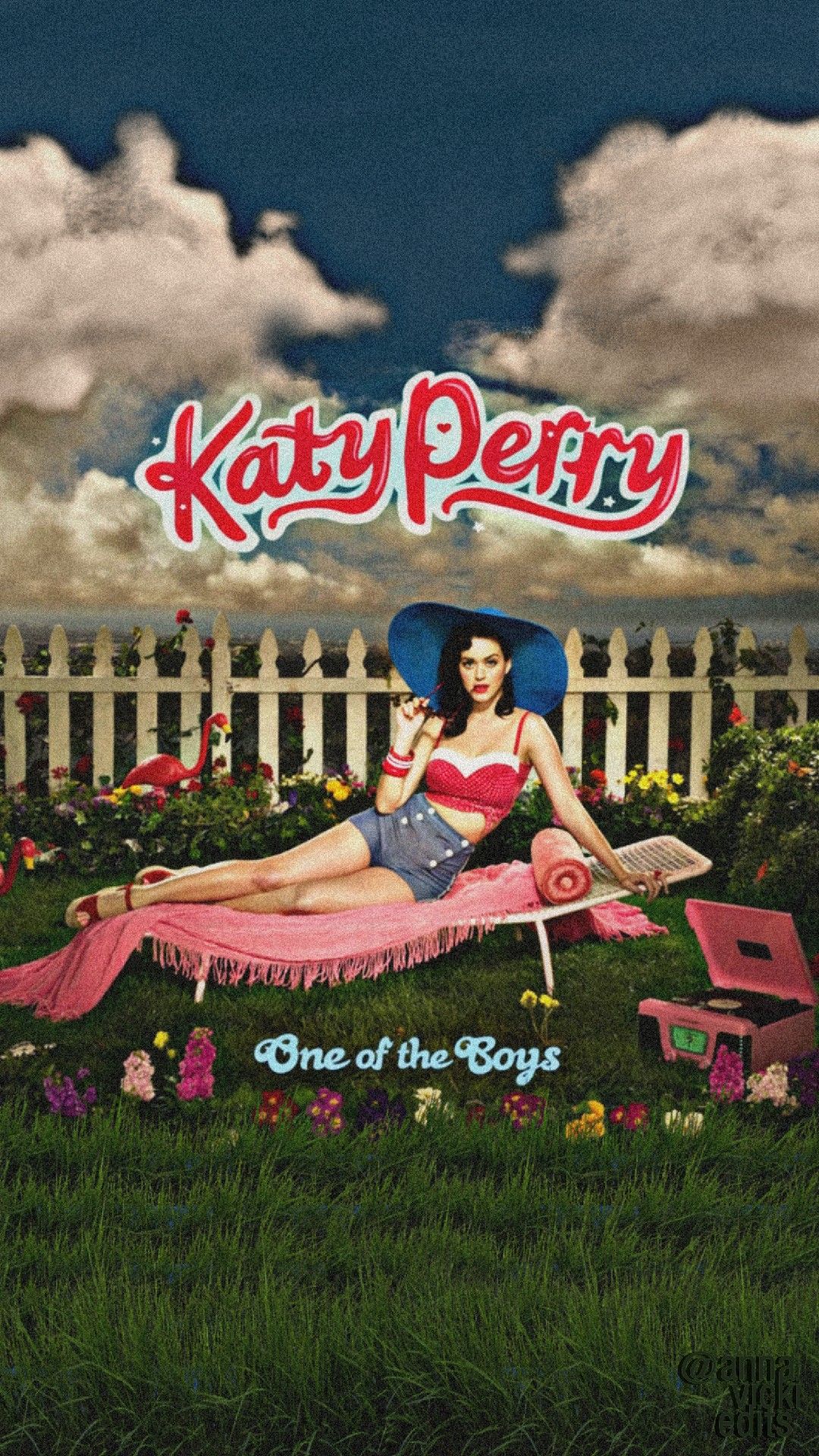
The cover for One of the Boys introduced the world to the "Katy Perry" brand. Photographed by Yu Tsai, the imagery leaned heavily into the "New Americana" and "Pin-up Girl" aesthetic popularized by 1940s illustrators like Gil Elvgren.
Visual Components and Symbolism
The cover features Perry reclining on a lawn chair, surrounded by inflatable flamingos and lush greenery. She sports a vintage-style swimsuit and a signature dark bob with bangs. This imagery was a tactical move to distance herself from her 2001 gospel album (released under her birth name, Katy Hudson) and her scrapped Matrix-produced projects.
The color palette is dominated by vibrant greens and pinks, signaling a playful, "tongue-in-cheek" femininity. This kitsch aesthetic perfectly mirrored the album’s lyrical content—songs that were bratty, guitar-driven, and slightly provocative. It established her as a relatable yet stylized character in the pop landscape.
The High-Art Masterpiece: Teenage Dream (2010)
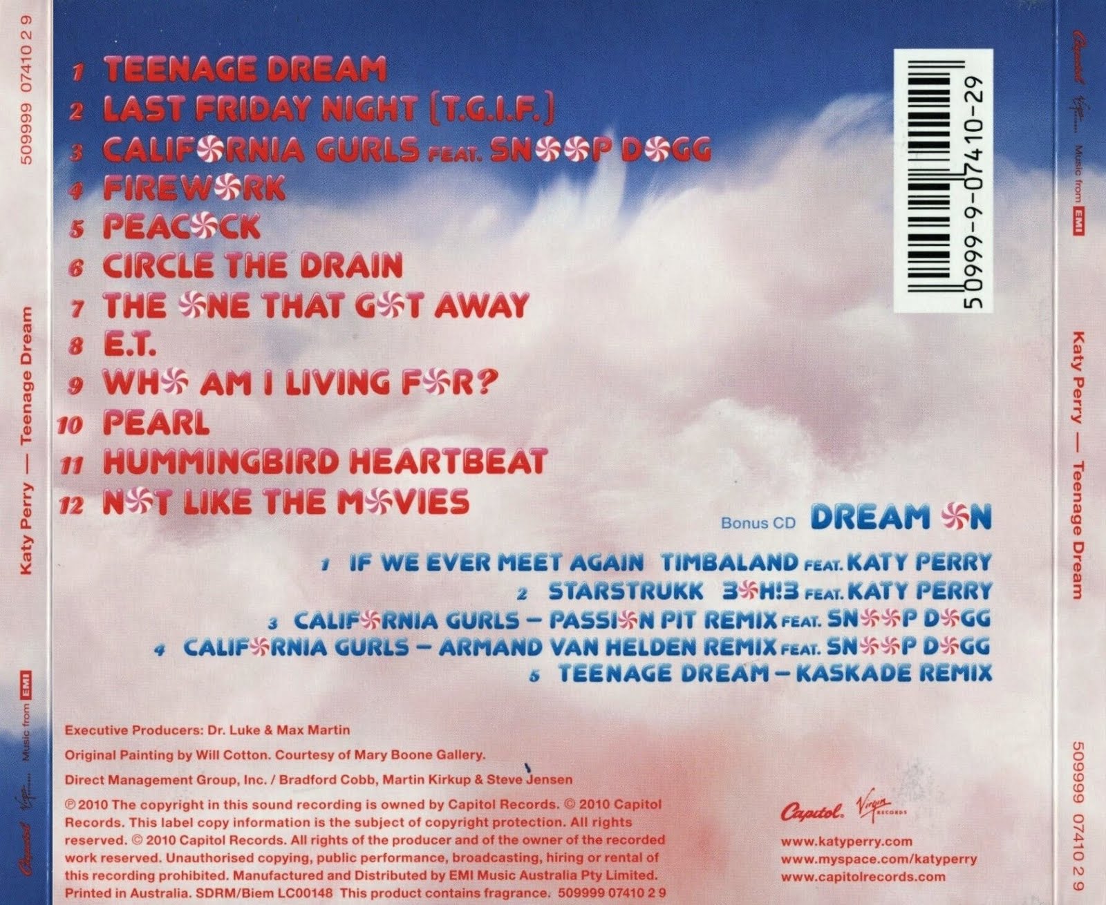
If there is one definitive Katy Perry album cover, it is Teenage Dream. This era saw Perry moving from kitsch to high-concept pop art. Unlike many pop covers of the time that relied on digital manipulation and high-fashion photography, Perry commissioned an actual oil painting.
The Collaboration with Will Cotton
Perry collaborated with renowned American painter Will Cotton, known for his landscapes made of sweets and candy. Cotton painted Perry lying naked on a cloud of pink cotton candy. The lack of clothing was handled tastefully, obscured by the sugary clouds, emphasizing a sense of ethereal sweetness rather than overt sexuality.
Production and Impact
The physical release of the album was famous for being "scented"—the booklet and tray liner were infused with a cotton candy fragrance. This was a revolutionary marketing move in 2010, turning a visual product into a tactile and olfactory experience. The cover art became so iconic that it was later acquired by the National Portrait Gallery in Washington, D.C., cementing its status as a piece of legitimate art history.
The Refraction of Light: Prism (2013)
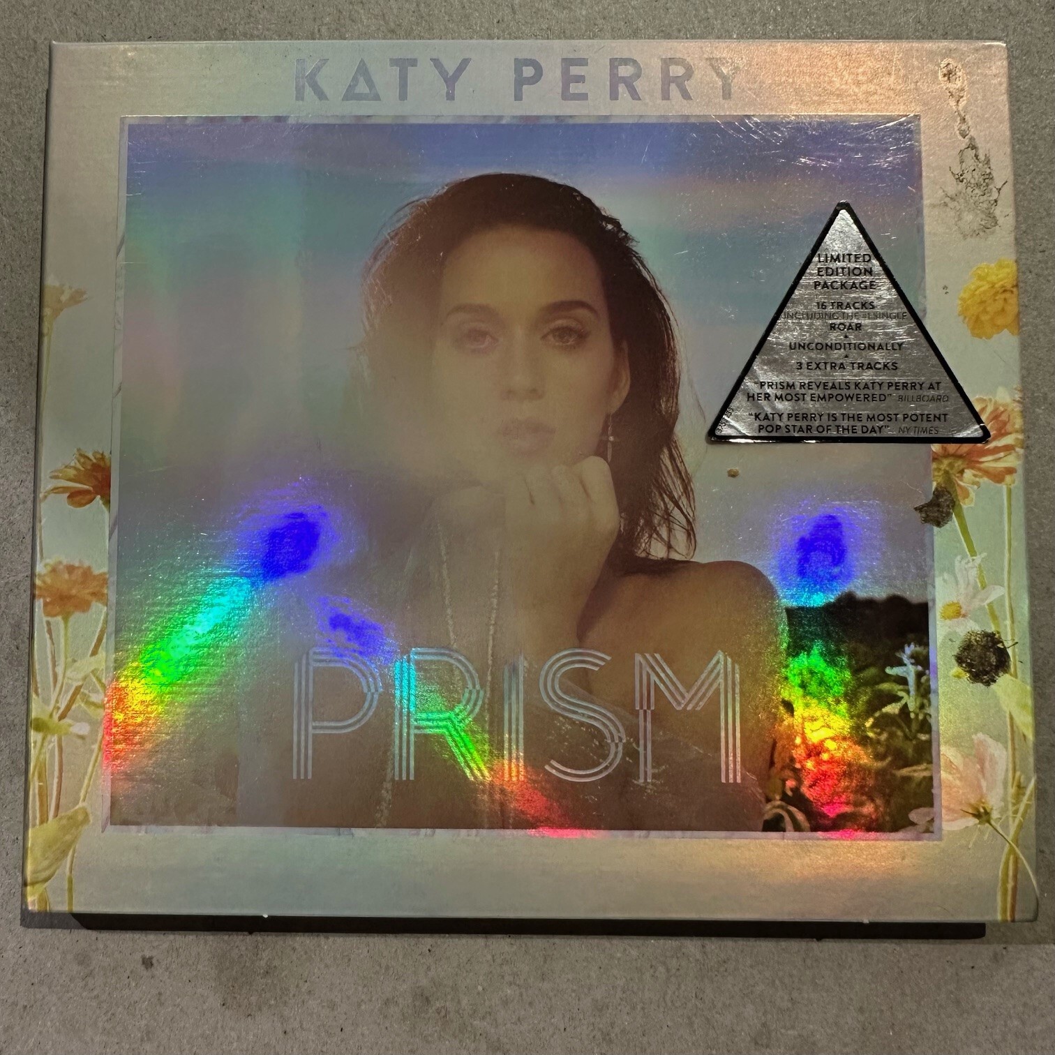
With Prism, Perry pivoted away from the artificial, candy-coated world of the previous three years. The cover, shot by photographer Ryan McGinley, opted for a more organic, "back-to-nature" vibe.
Naturalism and Sun-Drenched Imagery
The Prism cover features Perry in a field of wildflowers, her face illuminated by soft, natural sunlight. The design is iridescent, with a prismatic border that creates a rainbow effect when it catches the light. This visual shift was intended to represent "letting the light in," a theme of healing and self-discovery following her highly publicized divorce.
Technical Simplicity
The typography is minimal, allowing the photography to lead. This era proved that Perry’s brand didn’t always need neon colors and props to be effective. The simplicity of Prism showcased a more mature artist, moving toward an adult contemporary-pop hybrid.
Surrealism and Social Critique: Witness (2017)
The Witness era marked the most drastic visual departure for Perry. Moving into what she termed "purposeful pop," the cover art embraced the avant-garde and surreal.
The Eye Motif
Photographed by Jack Bridgland, the Witness cover features a close-up of Perry’s face, but with a surrealist twist: her eyes are closed, and a third eye is placed inside her open mouth. The blonde pixie cut she adopted for this era further emphasized the change.
The symbolism was heavy-handed but intentional—it suggested a "new way of seeing" or a collective awakening. The cover polarized fans, as it abandoned the traditional "pretty" pop star aesthetic in favor of something jarring and high-concept. From a technical standpoint, the color grading was cooler, using stark whites and blues, contrasting sharply with the warm tones of Prism.
The Resilient Clown: Smile (2020)
Released during a global period of uncertainty, Smile returned to a more colorful palette but with a melancholic undertone. The cover utilizes the "sad clown" trope to explore the concept of finding joy in the midst of depression.
Circus Imagery and Design
The cover features Perry in full clown-inspired makeup and a checkered outfit, sitting atop the word "SMILE." Her expression is weary rather than joyful, a deliberate choice that reflected her personal journey through a "dark night of the soul."
The font choice—a bold, circus-style typeface—and the primary color scheme (red, blue, yellow) harkened back to her pop roots while maintaining a sense of weary maturity. It was a visual representation of the album’s core message: resilience.
The Futuristic Return: 143 (2024)
As we look at Perry's career from the perspective of 2026, the 143 era (released in late 2024) stands out as her "cyber-pop" rebirth. This album cover moved her into a digital-first aesthetic, blending high-fashion photography with futuristic CGI elements.
The "143" Aesthetic
The title, a numerical code for "I love you," is reflected in the cover's sleek, tech-heavy design. Perry appears in a stylized, almost robotic pose, surrounded by translucent, aerodynamic materials. The color palette is metallic—silvers, electric blues, and sharp purples. This cover signaled her return to dance-pop and club-focused anthems, moving away from the organic textures of her middle-career works.
| Album Title | Year | Primary Visual Theme | Key Collaborator/Photographer |
|---|---|---|---|
| One of the Boys | 2008 | 1950s Pin-up / Americana | Yu Tsai |
| Teenage Dream | 2010 | Candy-land / Surrealism | Will Cotton (Painter) |
| Prism | 2013 | Naturalism / Iridescence | Ryan McGinley |
| Witness | 2017 | Avant-Garde / Surrealism | Jack Bridgland |
| Smile | 2020 | Circus / Sad Clown | Christine Hahn |
| 143 | 2024 | Cyberpunk / Futuristic | Various / VFX Teams |
Technical Considerations: Photography vs. Illustration
A critical aspect of analyzing a Katy Perry album cover is understanding the shift between medium types. Perry is one of the few pop stars to consistently blur the line between photography and fine art.
- Medium Selection: By choosing an oil painting for Teenage Dream, she bypassed the "perfection" of Photoshop, opting for a medium that carries historical weight. This elevated the album from a commercial product to a collectible art piece.
- Color Theory: Perry’s covers often utilize high-contrast color schemes. Even in the more muted Prism, the use of iridescent foil on physical copies created a "shifting" color experience that was technically difficult to replicate in digital thumbnails.
- Typography Integration: Over the years, her team has moved from integrated, illustrative typography (like the candy-cane font of Teenage Dream) to minimal or even non-existent text on the front cover. This follows the industry trend where the artist’s face and brand recognition are powerful enough that a title is almost secondary.
Physical Packaging and Collector Value
In the streaming age, the physical "cover" extends to the entire packaging design. Perry has remained a champion of the physical format, often releasing multiple variants of her covers to satisfy collectors.
- Vinyl Variants: For Smile and 143, Perry released several alternate covers exclusively for vinyl. These variants often featured different color schemes or alternate poses, encouraging fans to buy multiple versions of the same record.
- Tactile Elements: As mentioned with the scented Teenage Dream booklet, Perry’s team often incorporates textures. The Witness vinyl featured a glossy, high-shine finish on the "eye" portion of the cover, making it pop against the matte background of the rest of the sleeve.
Frequently Asked Questions
Which Katy Perry album cover is the most famous?
The Teenage Dream cover, painted by Will Cotton, is widely considered her most iconic. Its unique use of a commissioned oil painting rather than a photograph, combined with its cultural ubiquity during the 2010s, solidified it as a landmark in pop art history.
Who painted the Teenage Dream cover?
The American artist Will Cotton painted the original oil-on-linen work. Cotton is famous for his candy-themed landscapes, and his collaboration with Perry extended beyond the album cover into the "California Gurls" music video, for which he served as the artistic director.
Why does the Witness cover have an eye in the mouth?
The "eye in the mouth" on the Witness cover is a surrealist symbol for "purposeful pop" and perception. It suggests that what the artist "sees" and what she "speaks" are interconnected, signaling a more conscious, observant approach to her songwriting during that era.
What does the numbers "143" on her 2024 album cover mean?
"143" is a pager-era code for "I love you" (based on the number of letters in each word). The cover art uses this numerical theme to reflect a digital, futuristic aesthetic, symbolizing a universal message delivered through modern technology.
Did Katy Perry design her own album covers?
While Perry is the primary visionary and signs off on every creative detail, she works with a professional creative team, including creative directors, photographers, and graphic designers. Her role is akin to a "creative director-in-chief," ensuring the visuals align with the music’s emotional core.
Recommendation for Collectors and Fans
To truly appreciate the artistry of a Katy Perry album cover, one should look beyond the digital thumbnail on a streaming service. The technical depth of these works—from the scent of Teenage Dream to the iridescence of Prism—is best experienced through physical media.
If you are a collector, prioritize the 12-inch vinyl pressings. These larger formats allow you to see the brushstrokes in Will Cotton’s painting or the intricate VFX work in the 143 cover. Furthermore, looking for "Special Edition" or "Deluxe" physical copies often reveals hidden artwork and alternate photography that provides a more complete picture of the album's visual narrative. As of 2026, these physical artifacts remain the gold standard for experiencing Perry’s commitment to pop iconography.