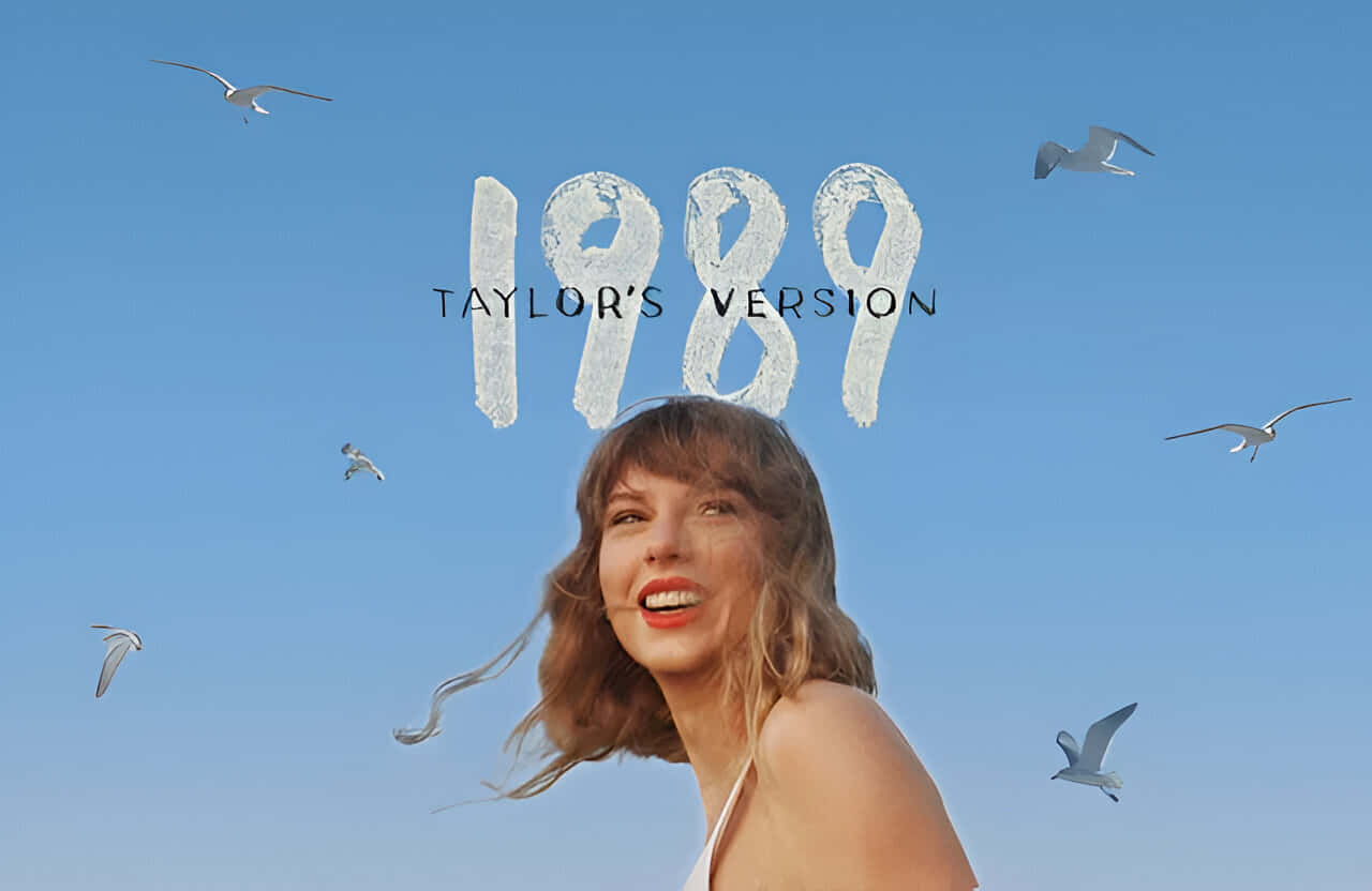
1989 album covers represent a pivotal shift in music history, bridging the gap between the polished neon aesthetics of the 1980s and the raw, gritty realism of the 1990s. As the compact disc (CD) began to outsell vinyl, designers adapted to smaller formats, resulting in iconic imagery ranging from the psychedelic collages of De La Soul to the industrial textures of Nine Inch Nails.
The Technological and Cultural Crossroads of 1989
The year 1989 was more than just the end of a decade; it was a technological transition point for the music industry. Designers in 1989 faced a unique challenge: creating artwork that looked impressive on a 12-inch vinyl sleeve while remaining legible and striking on a 5-inch CD jewel case. This "shrinkage" of the canvas fundamentally changed how typography and photography were utilized. In the United States, the "longbox"—a tall cardboard package for CDs—provided additional vertical real estate for marketing, but the primary cover art had to be versatile.
Technologically, the industry was on the cusp of the digital revolution. While Adobe Photoshop was officially released in early 1990, its precursors and high-end Scitex workstations were already beginning to influence professional graphic design. However, the majority of 1989's most famous covers were still the product of physical craft: airbrushing, manual typesetting, physical collage, and traditional darkroom manipulation. This reliance on tactile methods gave the era's covers a distinctive depth and "analog" warmth that is often digitally emulated in 2026.
Culturally, the world was witnessing the fall of the Berlin Wall and the rise of the "Generation X" sensibility. This shift was reflected in the move away from the high-gloss, high-budget glamour of mid-80s synth-pop toward something more authentic, subversive, or abstract. From the "Daisy Age" of hip-hop to the birth of grunge, the visual language of 1989 reflected a society in the midst of a massive identity shift.
The "Daisy Age" and the Hip-Hop Visual Revolution
One of the most significant visual departures of 1989 occurred in the realm of hip-hop. While the genre had previously been dominated by images of artists in street wear, tracksuits, or "b-boy" stances, the group De La Soul introduced a completely new aesthetic with their debut album, 3 Feet High and Rising.
Designed by the collective Grey Organisation, the cover of 3 Feet High and Rising featured a vibrant, neon-colored collage of flowers and the three band members' faces. This was the birth of the "Daisy Age." It was a radical departure from the aggressive posturing of contemporaneous acts. The use of fluorescent pinks, yellows, and oranges, paired with hand-drawn doodles, signaled a move toward peace, playfulness, and eccentricity.
Similarly, the Beastie Boys released Paul’s Boutique in 1989. The cover, a panoramic photograph taken at the corner of Ludlow and Rivington Streets in New York City, moved away from the "party animal" image of their debut. Shot by photographer Jeremy Shatan, the image is a masterclass in urban landscape photography, capturing a specific moment in Lower East Side history. The gatefold vinyl was essential for this image, allowing the listener to unfold a wide-angle view of the neighborhood, reinforcing the album's dense, sample-heavy, and location-specific sound.
Alternative Rock and the 4AD Aesthetic
In the alternative and indie rock sectors, 1989 saw the perfection of the "mood-based" cover art. No organization was more influential in this regard than the UK-based label 4AD and its primary designer, Vaughan Oliver (v23). The release of the Pixies' Doolittle in 1989 remains a benchmark for surrealist album design.
Oliver, working with photographer Simon Larbalestier, created a series of images for Doolittle that felt ancient and decayed. The cover features a monkey with a halo, referencing the song "Monkey Gone to Heaven." The textures—achieved through various printing techniques and physical manipulation of the photographs—mirrored the jagged, dynamic shifts in the Pixies’ music.
Another landmark of 1989 was The Cure’s Disintegration. The cover features a blurred, multi-layered portrait of frontman Robert Smith, surrounded by ethereal flora. Designed by Parched Art (Porl Thompson and Andy Vella), the imagery perfectly captured the melancholic, claustrophobic, and cinematic quality of the music. By using soft focus and organic textures, the designers avoided the harsh digital crispness of the late 80s, creating an image that felt timeless and immersive.
The Rise of Industrial and Grunge Aesthetics
As the 1980s closed, a harder, more industrial visual language began to emerge. Nine Inch Nails’ debut, Pretty Hate Machine, released in late 1989, featured a cover that would influence industrial music imagery for decades. Designed by Gary Talpas, the cover features a manipulated photo of a turbine or mechanical part, tinted in cold blues and purples. It looks both organic and mechanical—a visual representation of the "man vs. machine" themes found in Trent Reznor’s lyrics.
Simultaneously, in Seattle, the foundations of grunge were being laid. Nirvana’s debut album, Bleach, was released on Sub Pop in 1989. The cover art, a high-contrast black-and-white photograph by Tracy Marander (Kurt Cobain’s then-girlfriend), was intentionally low-budget. The "negative" effect applied to the photo gave it a ghostly, underground feel. This DIY aesthetic was a direct rejection of the polished, airbrushed covers of the "Hair Metal" bands that still dominated the charts, signaling a shift toward the "grunge" era that would define the early 90s.
Pop Icons and the Power of Photography
Despite the rise of alternative styles, 1989 was also a year of massive pop statements. Two of the most influential covers of the year came from Madonna and Janet Jackson, both of whom used photography to communicate complex themes of religion, sexuality, and social justice.
Madonna’s Like a Prayer featured a cover that was both provocative and deeply personal. The photography by Herb Ritts focused on Madonna’s midriff, adorned with heavy jewelry and denim, blending the sacred and the profane. The original vinyl release was even infused with the scent of patchouli oil to simulate the smell of a church. This multi-sensory approach to an album cover was revolutionary, showing that the physical package could be an extension of the music's thematic world.
Janet Jackson’s Rhythm Nation 1814 took a different approach. The cover, shot by Yuri Elizondo, featured Jackson in a black, military-inspired outfit, set against a stark, industrial grey background. The metal "1814" tag and the rigid uniform symbolized unity and discipline, reflecting the album's themes of social reform and racial equality. It was a bold, monochromatic statement that moved Jackson away from the "girl next door" image into a position of authority and artistic leadership.
Technical Analysis of 1989 Printing and Design
To understand why 1989 covers look the way they do, one must consider the printing technology of the era. Most covers were printed using a four-color process (CMYK), but the quality of the paper stock and the use of "spot colors" or "Pantone" inks allowed for the vibrant neons seen on De La Soul records or the deep, rich blacks on metal albums.
| Album | Artist | Lead Designer/Photographer | Visual Style | Format Impact |
|---|---|---|---|---|
| 3 Feet High and Rising | De La Soul | Grey Organisation | Psychedelic Collage | Best on Vinyl; lost detail on CD |
| Disintegration | The Cure | Parched Art | Blurred Impressionism | Worked well across all formats |
| Doolittle | Pixies | Vaughan Oliver / Simon Larbalestier | Surrealist / Textured | Heavily utilized booklet art |
| Paul's Boutique | Beastie Boys | Jeremy Shatan | Urban Panoramic | Required gatefold for full effect |
| Pretty Hate Machine | Nine Inch Nails | Gary Talpas | Industrial / Mechanical | Set the standard for 90s Industrial |
| Bleach | Nirvana | Tracy Marander | High-Contrast B&W | Low-budget DIY aesthetic |
| Like a Prayer | Madonna | Herb Ritts | Symbolic / Sensual | Included scented inserts |
| Rhythm Nation 1814 | Janet Jackson | Yuri Elizondo | Monochromatic Military | Iconic branding and silhouette |
| The Stone Roses | The Stone Roses | John Squire | Jackson Pollock-inspired | Abstract expressionism in Pop |
| Full Moon Fever | Tom Petty | Janet Levinson | Classic Portraiture | Clean, traditional photography |
The Transition to the CD Longbox
In 2026, music historians often look back at 1989 as the "Year of the Longbox." Because American retail stores were set up for vinyl bins, the 5x5 inch CD jewel case was too small to be displayed effectively. The solution was the 6x12 inch cardboard longbox.
This created a secondary canvas for 1989 album covers. In many cases, the longbox featured an extended version of the cover art or entirely different graphics. For example, the longbox for 3 Feet High and Rising allowed the vibrant floral patterns to explode across a larger surface area. However, the environmental impact of this extra packaging led to its phase-out by the early 90s, making original 1989 longboxes highly sought-after items for collectors today.
Preservation and Collecting in 2026
As of 2026, the market for original 1989 vinyl pressings remains robust. Collectors value these items not just for the audio quality, but for the large-scale artwork that defines the era. The shift toward high-resolution digital streaming has paradoxically increased the demand for physical "artifacts" from 1989.
When assessing the quality of a 1989 album cover for a collection, one must look for:
- Ring Wear: A common issue where the outline of the record becomes visible on the cover due to storage pressure.
- Lamination Peeling: Many UK and European pressings from 1989 used a laminated finish that can bubble or peel over decades.
- Color Fading: Particularly with the neon inks used in 1989, UV exposure can significantly dull the original vibrancy.
The "Mofi" (Mobile Fidelity Sound Lab) and other high-end reissue labels often return to the original 1989 negatives to reproduce the artwork with modern printing precision, sometimes revealing details that were lost in the original 1989 production runs.
Frequently Asked Questions
What was the most expensive album cover to produce in 1989?
While exact figures are rarely disclosed by labels, Madonna’s Like a Prayer and Janet Jackson’s Rhythm Nation 1814 were among the most expensive due to the high-profile photographers (Herb Ritts, Yuri Elizondo), elaborate styling, and, in Madonna's case, the unique scented-ink process and multiple inserts.
Why did many 1989 covers use blurred or "out of focus" photography?
This was a stylistic reaction against the harsh, bright photography of the early 1980s. Artists like The Cure and The Stone Roses wanted to create a more "cinematic" or "impressionistic" feel that matched the atmospheric and layered production of their music.
Did the transition to CDs affect how 1989 covers were designed?
Yes. Designers began to simplify images and use bolder typography so that the artwork remained legible at the smaller size of a CD jewel case. This led to a move away from the intricate, small-detail illustrations that were common in the 1970s.
Who was the most influential graphic designer for album art in 1989?
Vaughan Oliver is widely considered the most influential of that year. His work for the 4AD label, specifically on the Pixies’ Doolittle, redefined what "Alternative" music looked like, moving it away from punk's xeroxed aesthetic toward a high-art, surrealist approach.
Are 1989 CD longboxes valuable in 2026?
Yes, they are extremely valuable to collectors. Because most consumers threw the cardboard longbox away immediately after purchase, finding intact longboxes for major 1989 releases (like Paul's Boutique or Pretty Hate Machine) is rare, and they can command high prices in the secondary market.
Recommendation for Collectors and Designers
For those looking to explore the visual history of 1989, the best approach is to seek out original UK or US vinyl pressings. These versions offer the most accurate representation of the designer's intent before the art was scaled down for digital formats. Designers today can learn much from the 1989 era by studying how artists like Vaughan Oliver and John Squire (of The Stone Roses) integrated physical textures—paint, rust, and organic decay—into their work, a technique that provides a much-needed "human" element in an increasingly AI-driven design landscape.