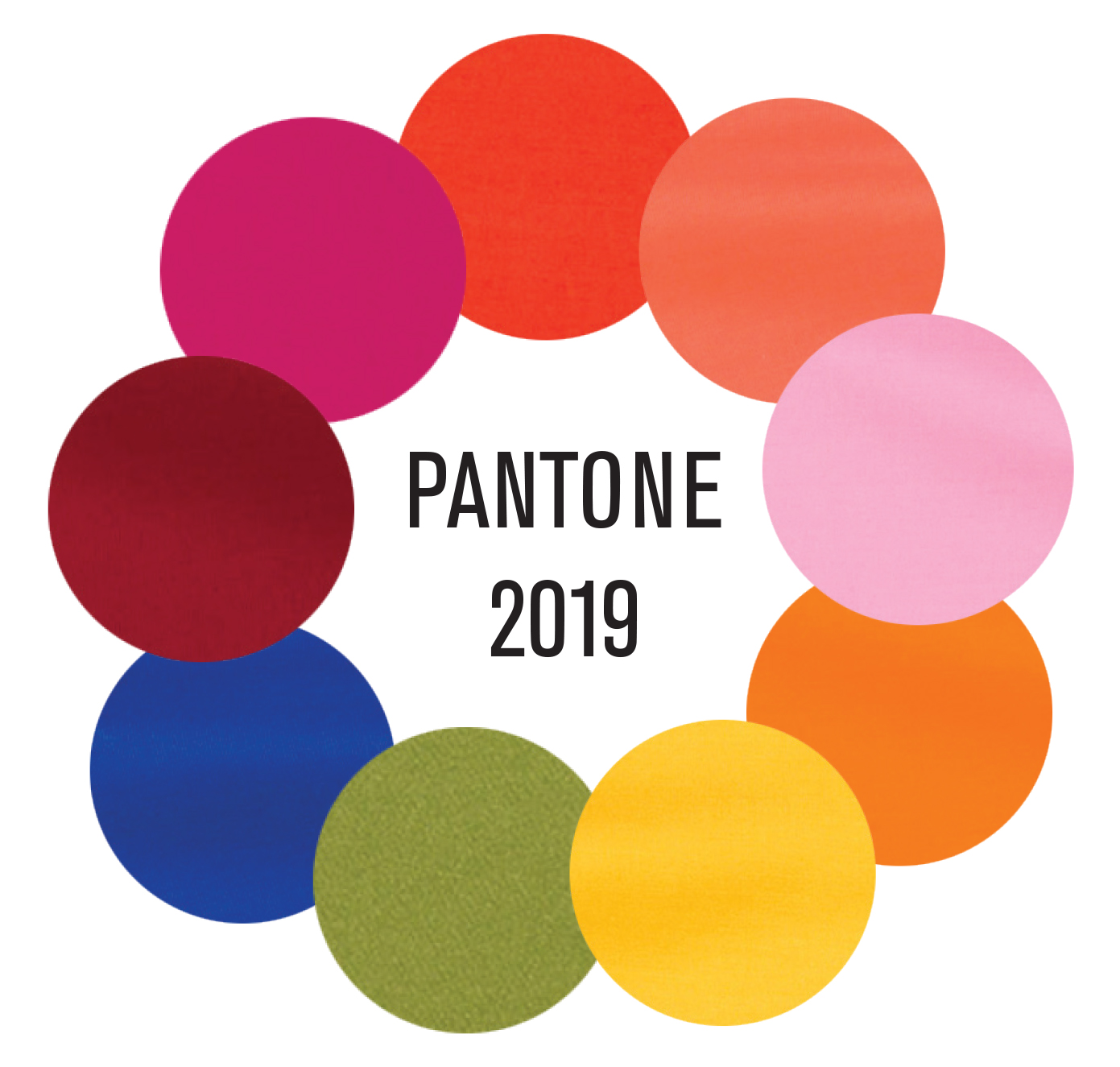
The most popular colors of 2019 were defined by a blend of vibrant optimism and deep, nature-inspired stability. Key shades included Pantone’s Living Coral, the deep teal-green of Night Watch, the versatile Spiced Honey, the architectural Metropolitan Gray, and the resurgence of warm Terracotta tones across fashion and interiors.
In the landscape of design history, 2019 stands as a pivotal year that bridged the gap between the high-gloss minimalism of the mid-2010s and the more grounded, organic aesthetics that would come to define the early 2020s. From a 2026 perspective, we can look back at these specific color choices as more than just aesthetic preferences; they were cultural signals reflecting a global desire for connection, environmental awareness, and a departure from the stark "clinical" whites that had previously dominated digital and physical spaces.
Understanding these five colors requires looking at the psychological drivers that industry leaders like the Pantone Color Institute, Benjamin Moore, and PPG used to forecast the mood of the year. Here is a comprehensive analysis of the five most influential colors of 2019, their technical applications, and their enduring impact on design.
1. Pantone 16-1546 Living Coral: The Pulse of Optimism
Pantone’s selection of Living Coral as the 2019 Color of the Year was perhaps the most influential trend-setter of the period. Described as an animating and life-affirming coral hue with a golden undertone, it was designed to provide comfort and buoyancy in a continually shifting environment.
The Psychological and Social Context
In 2019, the world was increasingly dominated by digital technology and social media. Pantone’s experts argued that Living Coral represented the "fusion of modern life," appearing in our natural surroundings while simultaneously displaying a lively presence within social media. It was a reaction to the onslaught of digital technology and the "coldness" of the screen. The color sought to foster authentic experiences and immersive connections.
Application in Consumer Electronics and Fashion
Living Coral had a massive impact on product design. One of the most notable examples was the iPhone XR, which featured a coral finish that mirrored this trend. In fashion, the color appeared on runways from Marc Jacobs to Prada, utilized both as a statement monochromatic look and as an accent in floral prints. Its versatility allowed it to work across various skin tones, making it a staple in the cosmetics industry, particularly for blushes and lipsticks that aimed for a "healthy glow" aesthetic.
Environmental Symbolism
Beyond aesthetics, Living Coral was a pointed nod to the state of the world’s oceans. By highlighting a color found in threatened coral reefs, Pantone subtly integrated environmental advocacy into the mainstream design conversation. From our vantage point in 2026, this choice is recognized as one of the early instances where "color activism" began to take a firm hold in corporate branding.
2. Night Watch (PPG1145-7): The Return to Biophilic Design
While Pantone went bright, PPG (Pittsburgh Paints and Glass) leaned into the shadows with Night Watch. This deep, hunter-green infused with teal undertones was a direct response to the growing "urban jungle" movement—the desire to bring the restorative power of nature into indoor spaces.
The Rise of the "Plant Parent" Trend
2019 was the height of the indoor plant craze, where millennials and Gen Z sought to fill their apartments with greenery. Night Watch provided the perfect backdrop for this. Unlike the bright "Kelly Green" of previous years, Night Watch was moody and sophisticated. It allowed for a sense of "cocooning," a design philosophy aimed at creating a sanctuary away from the noise of the outside world.
Technical Performance in Interiors
Architecturally, Night Watch was revolutionary because it challenged the long-standing rule that dark colors make rooms feel smaller. When used with high-gloss finishes, the color added depth and a sense of luxury to cabinetry and accent walls. It was frequently paired with metallic accents, particularly brushed gold and champagne bronze, which became the standard hardware pairing for luxury kitchen renovations throughout 2019.
Commercial and Hospitality Impact
The hospitality sector adopted Night Watch aggressively. High-end boutiques and "speakeasy-style" bars used the color to evoke a sense of heritage and permanence. It represented a shift away from the "disposable" feeling of fast-furniture aesthetics toward something more rooted and timeless.
3. Spiced Honey (Dulux/AkzoNobel): Stability and Purpose
Dulux (under the AkzoNobel umbrella) identified Spiced Honey (also known as Crème Brulée in certain regions) as its 2019 Color of the Year. This warm, amber-toned neutral was selected under the theme "Let the Light In."
Transitioning from Gray to Warmth
For nearly a decade leading up to 2019, "Cool Gray" was the default neutral for everything from flooring to exterior paint. Spiced Honey signaled the beginning of the end for the "all-gray" era. It was a versatile shade that could be "soothing" when paired with soft pastels, or "energizing" when matched with bold primaries.
The Human Element
The selection of Spiced Honey was based on a global trend toward "optimistic resilience." After a period of social and political unrest, consumers were looking for colors that felt safe and nourishing. Spiced Honey mimicked the appearance of natural wood and raw materials, tapping into the "Hygge" movement that emphasized comfort and simple pleasures.
Market Adoption in Home Textiles
This color translated exceptionally well into textiles. Velvet sofas, linen curtains, and knitted throws in Spiced Honey tones flooded the market. It provided a sophisticated alternative to beige, offering more "soul" and "character" without being as demanding as a bright yellow or orange.
4. Metropolitan AF-690: The Sophisticated Architectural Neutral
Benjamin Moore chose Metropolitan AF-690 as its 2019 headliner. While it remained in the gray family, it was a far cry from the flat, industrial grays of the early 2010s. Metropolitan was a "glamorous gray"—a neutral with cool undertones that felt both airy and grounded.
Defining Modern Minimalism
Metropolitan represented a more "mature" version of minimalism. It wasn't about emptiness, but about precision. Benjamin Moore’s creative director at the time described it as a color that "finds common ground." It was designed to work in any lighting condition, shifting slightly throughout the day from a soft silver to a deeper slate.
The Role of Light and Texture
The success of Metropolitan in 2019 was tied to the advancement of paint technology. Matte and "eggshell" finishes were optimized to show the subtle nuances of this shade. It became the go-to color for open-concept living spaces, providing a cohesive thread that could connect a kitchen, dining area, and living room without overwhelming the senses.
Strategic Use in Professional Environments
Beyond the home, Metropolitan became a staple in corporate office design. As companies moved away from "cubicle farms" toward collaborative "we-work" style spaces, this color provided a professional yet calming atmosphere that promoted focus and reduced visual clutter.
5. Terracotta and Earthy Ocher: The New Bohemian
While not tied to a single brand’s "Color of the Year" announcement, Terracotta and its associated earthy tones (clay, sienna, and burnt orange) emerged as a dominant organic trend in 2019. This was driven largely by the influence of Southwestern and Mediterranean aesthetics on social media platforms like Instagram and Pinterest.
The "Global Nomad" Aesthetic
The popularity of Terracotta in 2019 was part of a larger movement toward the "Global Nomad" style. This involved mixing handcrafted items, vintage rugs, and natural materials. Terracotta offered a sense of "sun-baked" warmth that felt authentic and unpretentious. It was the antithesis of the "millennial pink" that had dominated the previous three years.
Materiality over Pigment
What made Terracotta unique in 2019 was its focus on materiality. It wasn't just a paint color; it was a revival of the material itself. Terracotta floor tiles, handmade ceramics, and exposed brickwork became high-demand design elements. This trend emphasized the "beauty in imperfection," aligning with the Japanese concept of Wabi-sabi.
Fashion and Streetwear
In the fashion world, Terracotta (often marketed as "Rust" or "Copper") became a staple for autumn collections. It worked as a bridge between the neon colors seen in streetwear and the more traditional neutrals of high-fashion tailoring. Its ability to look expensive in suede and leather made it a favorite for accessories, particularly boots and handbags.
Comparing the 5 Popular Colors of 2019
The following table summarizes the technical and emotional profiles of these five influential colors.
| Color Name | Hex Code (Approx.) | Primary Source | Emotional Impact | Best Application |
|---|---|---|---|---|
| Living Coral | #FF6F61 | Pantone | Optimistic, Social, Vital | Digital UI, Fashion, Accents |
| Night Watch | #374E43 | PPG | Healing, Luxurious, Deep | Cabinetry, Accent Walls |
| Spiced Honey | #A68A64 | Dulux | Nourishing, Steady, Versatile | Textiles, Living Areas |
| Metropolitan | #9EA2A2 | Benjamin Moore | Caloric, Composed, Sleek | Professional Spaces, Trim |
| Terracotta | #E2725B | General Trend | Authentic, Warm, Earthy | Ceramics, Flooring, Outerwear |
The Lasting Legacy of 2019 Trends
Looking back from 2026, the color trends of 2019 were the first indicators of a major shift in how humans interact with their environment. We see the DNA of these colors in current sustainable design movements. For example, the 2019 obsession with Night Watch evolved into the "Bio-Luxe" movements of the mid-2020s, where living walls and integrated indoor ecosystems are now standard in high-end architecture.
Furthermore, the transition from Metropolitan Gray to Spiced Honey marked the definitive pivot point where "warmth" replaced "coolness" as the primary goal of residential interior design. This shift has persisted through to 2026, with current palettes favoring "enveloping neutrals" that prioritize psychological comfort over sterile perfection.
The "Instagrammability" of 2019's colors also changed how brands approach product development. Because Living Coral and Terracotta photographed so well under smartphone filters, manufacturers began testing color swatches specifically for their "digital rendering accuracy." This practice is now a standard part of the color-forecasting lifecycle.
FAQ
Why was "Living Coral" chosen as the 2019 Color of the Year?
Living Coral was chosen to provide a sense of "buoyancy" and optimism in a world increasingly dominated by digital screens and social media. Pantone felt that people were craving authentic human connection, and this vibrant, warm shade of orange-pink evoked the feeling of a supportive social environment and the natural beauty of the ocean.
How did these colors influence the "Millennial Pink" trend?
2019 marked the beginning of the decline for Millennial Pink. While Pink was still visible, the popular colors of 2019 shifted toward more "grown-up" and "nature-based" versions. Living Coral took the sweetness of pink and added energy, while Terracotta took the softness of pink and added a grounding, earthy weight.
Was "Night Watch" used mostly for interior or exterior design?
Night Watch was primarily an interior color, favored for "statement rooms" like dining rooms, studies, and bedrooms. However, it did see some use in exterior design for front doors and shutters, especially in modern-farmhouse styles that wanted to move away from the standard black-and-white palette.
What is the difference between "Spiced Honey" and traditional beige?
Unlike traditional beige, which can sometimes feel flat or "muddy," Spiced Honey has a higher concentration of gold and amber undertones. This gives it a "glow" when hit by sunlight, making it feel more active and intentional rather than just a background neutral.
Are the 2019 colors still relevant in 2026?
Yes, particularly in the vintage and "retro-modern" revival movements. As we reach the mid-2020s, many homeowners are revisiting the "organic warmth" of 2019. Terracotta and Night Watch, in particular, have become "modern classics" that are no longer seen as trends but as foundational elements of sophisticated design.
How did the tech industry react to 2019 color trends?
The tech industry reacted by introducing more colorful hardware. Prior to 2019, most devices were limited to silver, space gray, or gold. The popularity of colors like Living Coral (seen in the iPhone XR) and deep greens (seen in the later release of the Midnight Green iPhone 11 Pro) proved that consumers were willing to use their devices as fashion statements.
Practical Recommendations for Using 2019 Colors Today
If you are looking to incorporate these historically significant colors into a modern project in 2026, consider the following "Next Actions":
- Modernize Terracotta: Pair it with high-tech materials like carbon fiber or brushed aluminum to create a "Futuristic Earth" aesthetic.
- Use Night Watch as a Neutral: Instead of treating it as a "bold" choice, use it as you would navy blue. It works exceptionally well as a base for colorful art collections.
- Accent with Living Coral: Since it is a high-energy color, use it in small, digital-first applications, such as website call-to-action buttons or mobile app icons, where you need to draw the eye quickly.
- Balance Spiced Honey with Cool Tones: To prevent a room from feeling too "dated," balance the warmth of Spiced Honey with cool Metropolitan Gray or crisp white trim.
By understanding the historical weight of these colors, designers can create spaces that feel both timely and timeless, drawing on the optimistic and grounded spirit that 2019 represented.