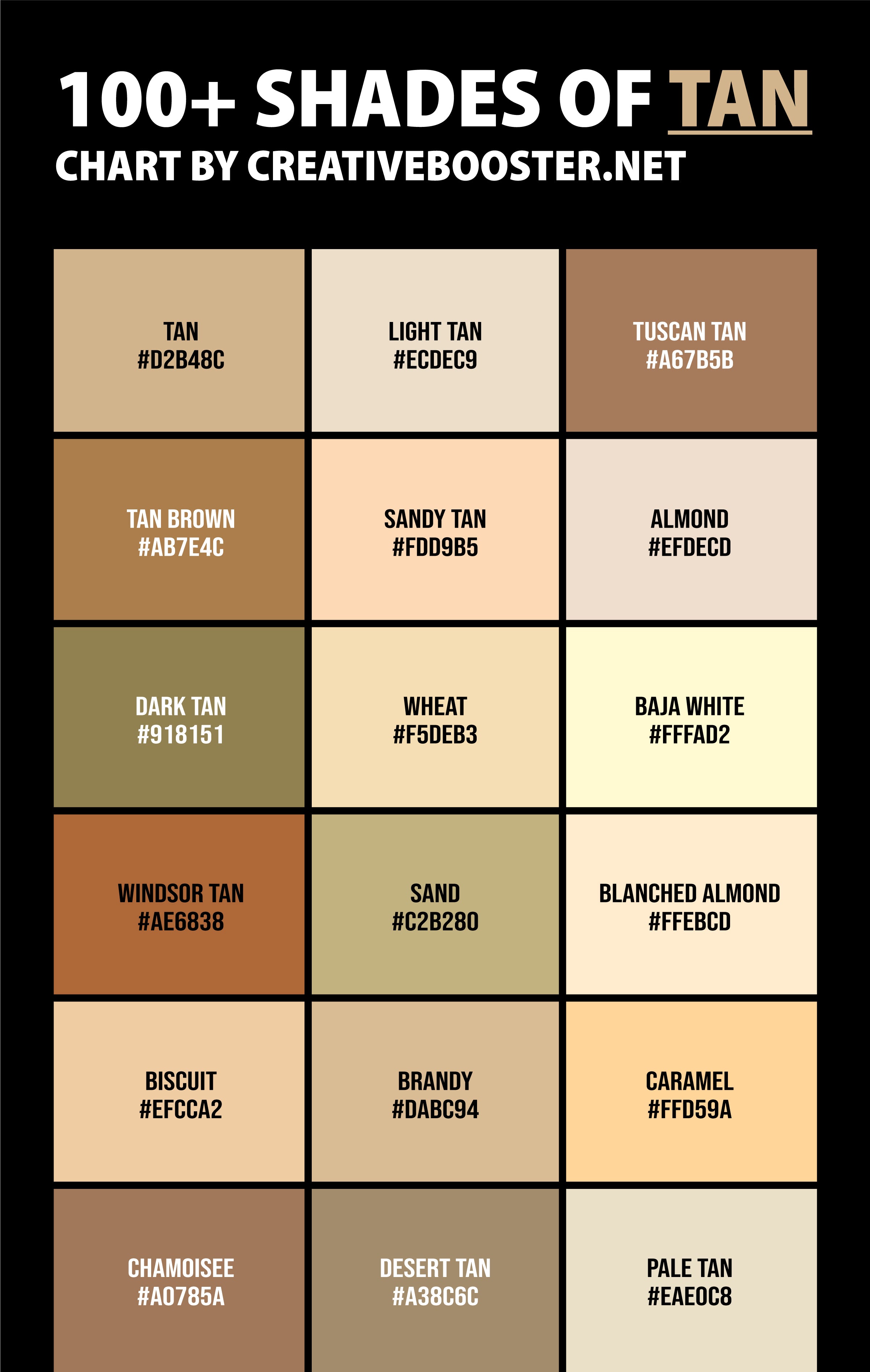
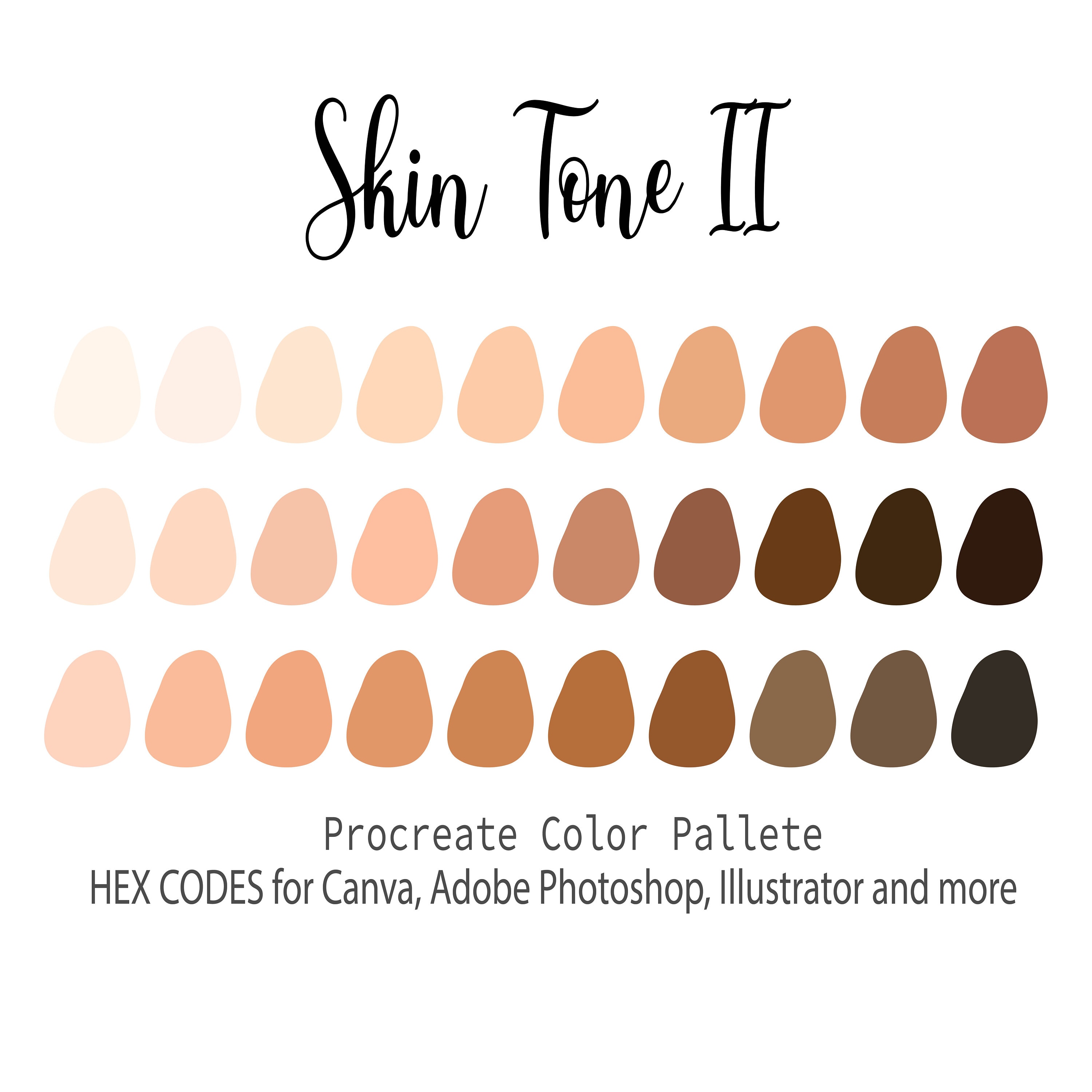
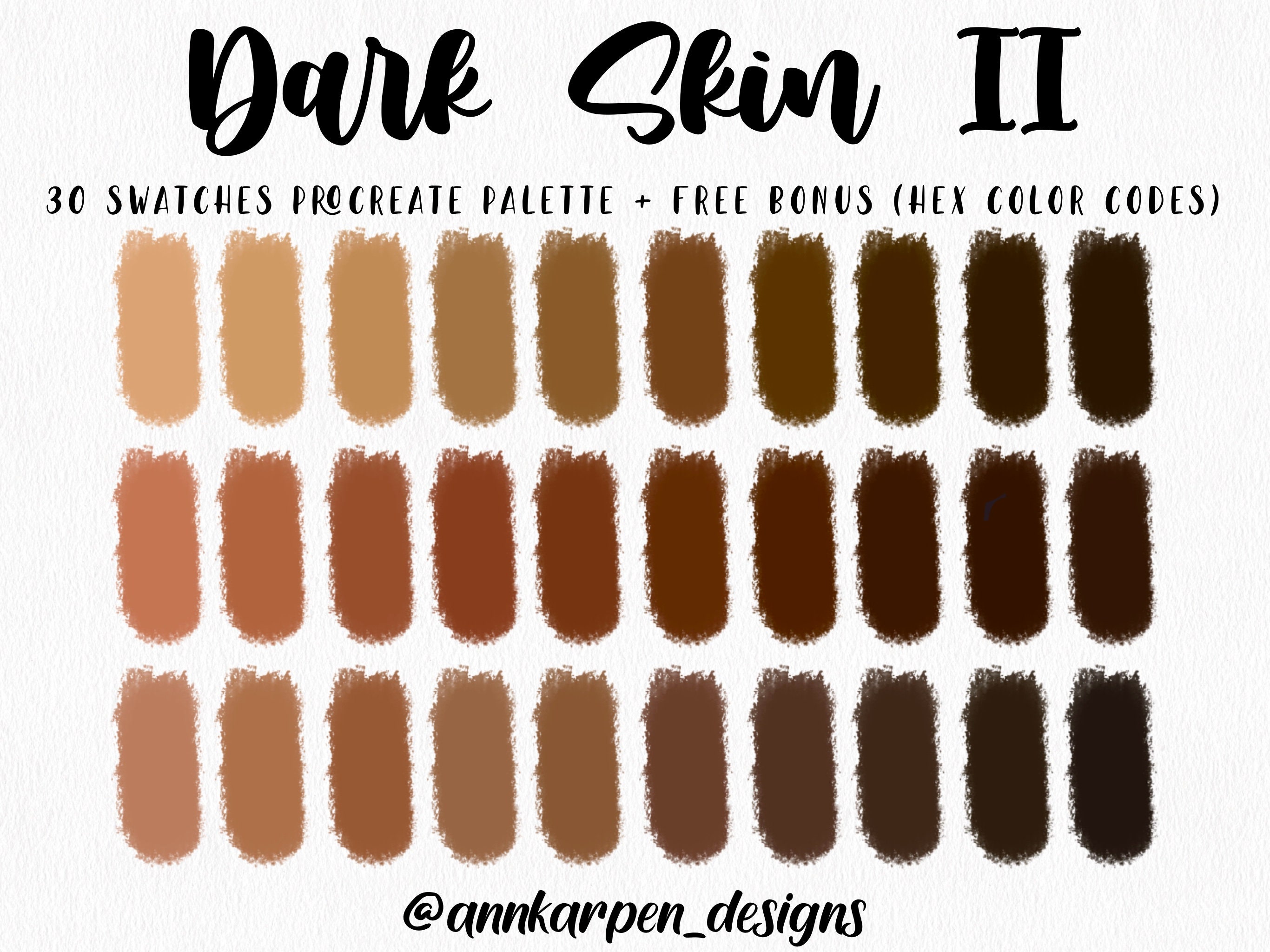
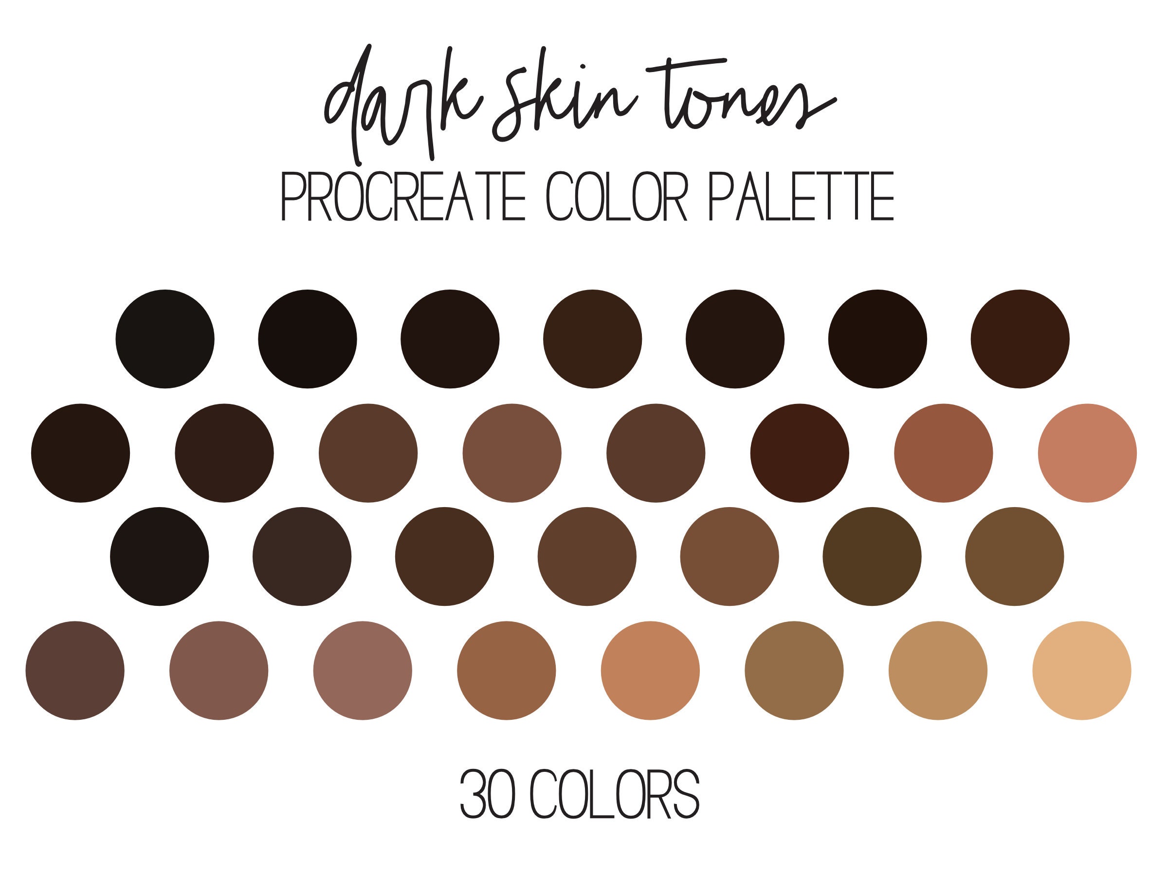
Finding the correct Asian skin tone hex code is a nuanced task that requires moving beyond simplistic labels to understand the interplay of undertones, saturation, and lighting. Because "Asian" encompasses a vast spectrum of complexions—ranging from pale porcelain to deep, sun-kissed bronze—a single hex value cannot accurately represent the demographic. Instead, successful digital design requires a palette-based approach, utilizing specific color values that reflect the diversity of skin pigmentation while ensuring accessibility and visual harmony in UI/UX, illustration, and digital artistry.
The Complexity of Representing Skin Tones Digitally
In the context of digital color theory, skin is never a solid, flat color. It is a semi-translucent, multi-layered organ that shifts in appearance based on lighting, surrounding colors, and screen calibration. When seeking an "Asian skin tone hex code," designers are often searching for a starting point to create realistic digital portraits, inclusive avatars, or diverse marketing assets.
The technical challenge lies in the RGB (Red, Green, Blue) color space, which is the standard for display screens. Human skin is primarily composed of various concentrations of melanin, carotene, and hemoglobin. Translating these biological pigments into a six-digit hexadecimal string requires balancing the warm, yellow-toned undertones often associated with East, Southeast, and South Asian skin with the necessary depth to avoid looking "flat" or "muddy" on a monitor.
Defining Undertones: The "Yellow" Misconception
A common pitfall in digital design is the over-reliance on overly saturated yellow or orange values. While many Asian skin tones possess warm, golden, or olive undertones, applying pure yellow shifts can result in an unnatural, jaundice-like appearance. Professional color palettes for Asian skin tones typically incorporate a mix of:
- Golden/Warm: Values with higher red and green components.
- Olive/Neutral: Values with balanced red, green, and blue, often leaning toward desaturated, slightly greenish-grey undertones.
- Cool/Pale: Values with higher blue-light influence, often found in lighter East Asian skin profiles.
Selecting and Verifying Hex Codes
When selecting a color, you should rely on a system that allows for variation. The most effective way to utilize hex codes for skin is to treat them as a "base" color, then layer highlights and shadows to create depth.
Common Hex Ranges for Asian Skin Tones
The following table provides representative hex ranges. Note that these are starting points; for production-level work, you should sample from high-quality photography with consistent neutral lighting.
| Tone Category | Representative Hex Range | Characteristics |
|---|---|---|
| Fair / Porcelain | #FCE3D0 – #F7D3B5 | Light with warm or pinkish undertones |
| Light / Medium | #E8C1A0 – #D3A987 | Golden undertones, high versatility |
| Medium / Tan | #B88A68 – #9C7153 | Rich warmth, often olive or sun-kissed |
| Deep / Bronze | #8C6445 – #6E4D36 | Deep pigmentation with brown undertones |
Note: Hex codes are dependent on the color profile of your software (e.g., sRGB vs. Adobe RGB). Always verify your output in the color space intended for your final medium.
Practical Implementation in Digital Design
Once you have identified the target skin tone, the next phase is application. You cannot achieve a realistic result with a single block of color.
Step 1: Establish the Base Layer
Select the hex code that matches the mid-tone of the subject. This should be the color that occupies the largest surface area of the skin in your composition. Ensure this color is not the brightest or the darkest part of the skin.
Step 2: Develop the Shadow Palette
Shadows on Asian skin tones are rarely just a darker version of the base color. They often lean cooler. If your base color is #D3A987, do not simply darken the value in your color picker. Instead, shift the hue slightly toward a cooler, more desaturated tone (such as a deeper, muted mauve or brownish-grey) to simulate the way light diffuses through skin.
Step 3: Integrate Highlights and Subsurface Scattering
Highlights should reflect the environment. If the light source is warm (like a sunset), the highlight hex code should drift toward #FFF0E0. If the light is cool (like an overcast day), shift toward a cooler, whiter tone.
Step 4: Testing for Accessibility
When using these codes in UI design—such as avatars for a user profile or illustrations in a medical portal—ensure that the contrast between the skin tone and any overlaying text or icons meets WCAG (Web Content Accessibility Guidelines) standards. Using a skin tone as a background for white text is generally discouraged as it rarely provides sufficient contrast.
Common Mistakes to Avoid
- Using Flat, Single-Hex Fills: Even in vector illustration, adding a subtle gradient or a "multiply" layer over the base skin tone creates a professional appearance.
- Ignoring Lighting Environments: A hex code that looks perfect in a studio lighting setup will look alien in an outdoor or moonlight-themed environment. Always adjust the hex values based on the "time" and "place" of your visual scene.
- Over-saturating: Beginners often pick colors that are too bright. Skin tones usually exist in the middle of the saturation spectrum. If a color looks like a crayon, it is likely too saturated.
- Neglecting Screen Calibration: Different monitors render colors differently. What looks like a perfect medium-tan on your laptop may look orange on a mobile phone. Always test your chosen hex codes across multiple devices.
FAQ: Skin Tone Representation
Why do some hex codes look "off" or "muddy" on screen?
This is usually caused by an imbalance in the RGB channels. If your hex code has very low values for all three channels (Red, Green, and Blue), the color approaches black, which can appear muddy. If the values are too high and close together, the color becomes a flat grey. Aim for a balanced distribution that favors the red and green channels for warmth.
How do I match a specific skin tone from a photo?
Use the eyedropper tool in your design software. However, do not click the brightest highlight or the darkest shadow. Click the "mid-tone" area—the portion of the cheek or forehead where the light is even. From there, tweak the hex code manually to ensure it fits the overall color scheme of your project.
Are these hex codes valid for print design?
Hex codes are intended for digital (RGB) use. If you are preparing a file for print, you must convert these values to CMYK. A direct conversion can sometimes result in duller colors. When printing, it is highly recommended to use a physical Pantone color book to cross-reference your digital skin tone, as monitor calibration is never 1:1 with ink on paper.
Should I use one hex code for all Asian characters in my design?
No. Diversity within the Asian diaspora is significant. Using a single hex code to represent all individuals of Asian descent is inaccurate and can lead to a "generic" or "corporate" look that lacks authenticity. Use a small, cohesive library of 3–5 skin tones to show variety if your project features multiple characters.
How do I handle skin tone consistency across different software?
Ensure your working color profile is set to sRGB (Standard Red Green Blue). This is the universal standard for web content. If you work in a different color space, like ProPhoto RGB, the hex codes you pick will look drastically different when exported for a website or social media platform.
Final Recommendation
When working with Asian skin tone hex codes, prioritize variation over standardization. Start by selecting a base hex value from the ranges provided in the table above, but treat that value only as the foundation. Always iterate by adjusting the saturation and hue for shadows and highlights based on your light source. By focusing on the "middle" of the complexion and layering depth, you will create digital assets that appear natural, diverse, and technically sound. If you are designing for a project requiring high precision, such as a character illustration or a brand asset, create a small, curated swatches palette that you can reuse to maintain visual consistency throughout your project.