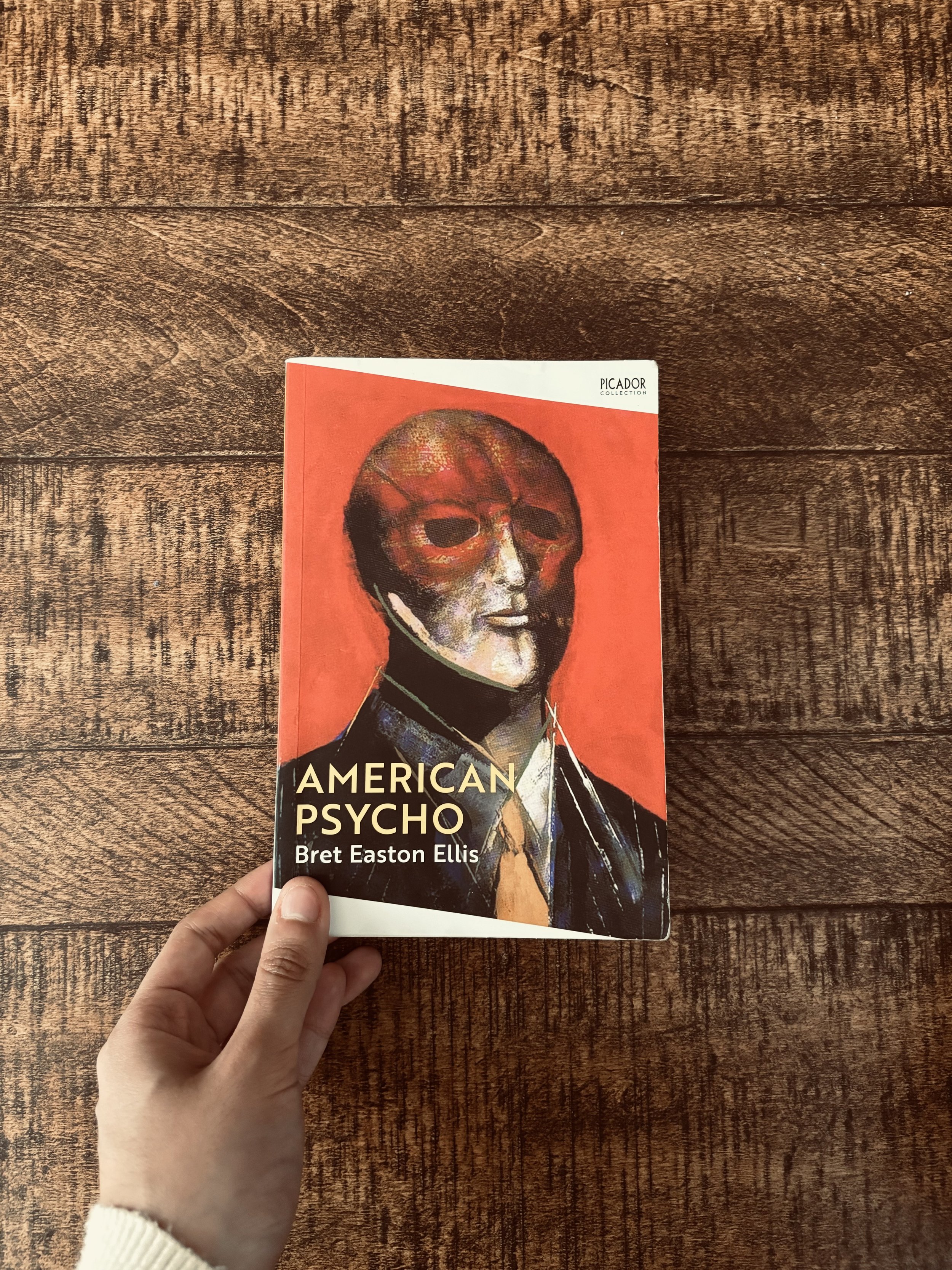
Since its 1991 release, American Psycho book covers have evolved from Marshall Arisman’s visceral, expressionist painting to minimalist designs focusing on 1980s corporate iconography and movie tie-ins featuring Christian Bale. These covers reflect the changing cultural perception of Patrick Bateman from a figure of visceral horror to a cold symbol of consumerist satire and "sigma" internet culture.
The visual identity of Bret Easton Ellis’s most famous work is as fractured and multifaceted as its protagonist, Patrick Bateman. Over the last thirty-five years—stretching from the initial 1991 controversy to the premium anniversary editions of 2026—the cover art has served as a barometer for how society views the novel’s themes of greed, superficiality, and violence. Collectors and design students alike study these covers not just as marketing tools, but as interpretations of a text that remains one of the most polarizing works in contemporary American literature.
The Original 1991 Controversy and Marshall Arisman
The history of American Psycho begins with a scandal that extended to its very packaging. Originally slated for publication by Simon & Schuster, the company famously dropped the book due to its graphic content just weeks before its scheduled release. When Sonny Mehta at Vintage Books stepped in to publish it as a trade paperback original, the cover design became a critical tool in positioning the book as a work of "transgressive fiction" rather than mere slasher horror.
The chosen artist was Marshall Arisman, an illustrator known for his raw, haunting depictions of violence and internal psychological states. Arisman’s painting for the cover—titled simply "American Psycho"—features a man in a business suit whose face is a blurred, demonic smear of red and black. One eye is visible, staring with a mix of vacuousness and malice.
Design Analysis of the Arisman Cover
This cover is widely considered the definitive visual representation of the novel. The use of a suit—the uniform of the Wall Street elite—contrasted with the monstrous facial features perfectly encapsulated the "man-is-a-monster" theme. In the 1990s, this cover was a warning. It signaled to the reader that the professional veneer of the 1980s "Yuppie" was merely a mask for something primordial and terrifying.
By 2026, original 1991 Vintage trade paperbacks in mint condition have become highly sought-after collector's items. The Arisman cover is praised for its refusal to depict Bateman’s vanity directly, choosing instead to depict his internal rot.
The Picador Influence and International Variations
While Vintage handled the US release, Picador published the novel in the United Kingdom. The early UK covers took a different approach, often leaning into the "Pop Art" aesthetic or a more sterile, clinical look.
One notable early Picador edition featured a monochromatic, high-contrast image of a man’s face, partially obscured. This shifted the focus from the "monster" to the "man," emphasizing Bateman’s status as a handsome, "normal-looking" member of high society. Other international versions, particularly in Europe, experimented with symbols of the 1980s:
- The Bloody Razor: Highlighting the visceral horror.
- The Tie: Emphasizing the corporate constraint.
- The Champagne Glass: Focusing on the shallow luxury of the Manhattan elite.
These variations show how different markets prioritized different elements of the story—some selling it as a psychological thriller, others as a dark social satire.
The "Movie Tie-In" Era and the Face of Christian Bale
The release of Mary Harron’s film adaptation in 2000 fundamentally changed the visual branding of the book. For many years following the film's success, publishers favored "movie tie-in" covers. These covers replaced original artwork with promotional stills of Christian Bale as Patrick Bateman.
The most famous of these features Bale in a raincoat, wielding an axe, or the close-up of his blood-spattered face during the "Paul Allen" scene. While purists often dislike movie tie-ins, these editions were instrumental in cementing Bateman’s image in the collective consciousness. By 2026, the film’s influence remains so strong that even non-tie-in covers often use typography or silhouettes that subtly evoke Bale’s likeness.
Minimalism and the Corporate Aesthetic
In the 2010s and early 2020s, a trend toward minimalism took over book design. This era saw the rise of the "Object-Oriented" cover. Instead of depicting Bateman himself, these covers focused on the inanimate objects that define his existence.
The most successful of these designs utilized the Business Card. In the novel, the scene where Bateman and his colleagues compare their nearly identical business cards is a pinnacle of satirical tension. Modern covers have replicated this by making the entire book look like a business card—white or off-white background, elegant serif typography (resembling "Silian Rail" or "Bone"), and plenty of negative space.
Key Elements of the Minimalist Style:
- Typography: Heavy use of Helvetica, Futura, or traditional serifs to mimic 1980s corporate branding.
- Color Palette: Primarily white, black, and silver, with a single "pop" of blood-red.
- Iconography: A single knife, a single drop of blood, or a perfectly knotted silk tie.
This shift reflects a more sophisticated understanding of the novel. It acknowledges that the horror of American Psycho isn't just in the violence, but in the sterile, interchangeable nature of corporate identity.
Special Editions and the 2026 Market
As we reach 2026, the market for "Prestige" or "Legacy" editions has exploded. Small, independent presses have released high-end versions of American Psycho that treat the book as a piece of fine art.
Suntup Editions and Centipede Press
Publishers like Suntup Editions and Centipede Press have produced limited runs that are masterpieces of bookbinding and design. These editions often include:
- Tipped-in Illustrations: New artwork by contemporary surrealists.
- Unique Materials: Covers made of leather, cloth, or even materials that mimic the feel of a 1980s suit.
- Slipcases: Custom-designed boxes that protect the book and add to its shelf presence.
The Centipede Press edition is particularly notable for re-integrating Marshall Arisman’s art into a high-quality hardcover format, bringing the book’s visual history full circle.
Comparative Overview of Major Editions (1991–2026)
| Year | Publisher | Designer/Artist | Style | Significance |
|---|---|---|---|---|
| 1991 | Vintage (US) | Marshall Arisman | Expressionist | The "Original" controversial look. |
| 1991 | Picador (UK) | Neil Lang | Literary | Established the book's prestige in Europe. |
| 2000 | Vintage | Lionsgate/Film Still | Movie Tie-In | Tied the character to Christian Bale. |
| 2012 | Picador | 4th Estate/Classic | Minimalist | Used the "Business Card" aesthetic. |
| 2021 | Suntup | Various Artists | Fine Press | High-end collector's item with luxury materials. |
| 2026 | Vintage | 35th Anniv. Design | Retro-Modern | Combines Arisman’s grit with modern typography. |
Technical Analysis of Design Choices
The typography of American Psycho covers is a study in psychological branding. In many modern editions, designers choose fonts that reflect Bateman's obsession with status. The use of Copperplate Gothic or Bodoni evokes the luxury brands Bateman name-drops incessantly (Valentino, Armani, Ralph Lauren).
The "White Space" on modern covers acts as a metaphor for the emptiness of the characters' lives. In design, white space usually suggests elegance and clarity; here, it suggests a void. When a single red element—like a title in crimson or a blood spatter—is introduced, the contrast is jarring. This "Visual Shock" mimics the experience of reading the novel, where mundane descriptions of consumer products are suddenly interrupted by extreme brutality.
The Impact of Internet Culture on Cover Preferences
By 2026, the "Patrick Bateman" meme culture has influenced how people buy the book. Younger readers often seek out editions that look "clean" or "aesthetic," fitting into the "Dark Academia" or "Corporate Chic" visual styles popular on social media. This has led to a resurgence in the popularity of the minimalist white covers over the more "ugly" or "disturbing" Arisman original.
However, serious collectors still prioritize the Arisman cover because it remains the most "honest" representation of Ellis’s text. It does not attempt to make Bateman look cool or aspirational; it shows him as a literal "psycho."
Frequently Asked Questions
Why was the first cover of American Psycho so controversial?
The first cover featured Marshall Arisman’s "man-as-demon" painting. At the time, the novel was being attacked by various groups for its graphic violence. The cover was seen as an extension of that "offensive" content because it didn't shy away from the horrific nature of the protagonist. It became a symbol of the "transgressive fiction" movement of the early 90s.
Which American Psycho cover is the most valuable for collectors?
The most valuable "standard" edition is usually the 1991 Vintage first printing (signed by Bret Easton Ellis). However, in the 2026 market, the Suntup Editions "Numbered" or "Lettered" editions are the most expensive, often retailing for thousands of dollars on the secondary market due to their hand-bound craftsmanship and limited quantity.
Is there a "standard" font used for the title?
There is no single standard font, but most iconic designs use either Helvetica (for its cold, modern, corporate feel) or a high-contrast Serif (like Bodoni or Didot) to evoke high-fashion magazines like Vogue or GQ, which Bateman reads religiously.
Did Bret Easton Ellis have a say in the cover designs?
Authors generally have limited control over cover art, which is handled by the publisher’s marketing and design teams. However, Ellis has frequently praised the Marshall Arisman cover in interviews, stating that it captured the "internal landscape" of the character better than any literal depiction could.
Why do some covers not feature Patrick Bateman’s face?
Many designers believe that showing Bateman’s face ruins the "blankness" of the character. In the novel, Bateman is often mistaken for other people, and he feels like a "ghost." Minimalist covers that use objects (like an axe or a business card) allow the reader to project their own image of the character onto the story, which aligns better with the novel's themes of anonymity and the loss of self.
Practical Recommendation for Collectors
If you are looking to start a collection of American Psycho editions in 2026, prioritize the 1991 Vintage trade paperback for its historical significance. For those who appreciate modern design, the Picador 30th Anniversary edition offers the best balance of minimalist aesthetic and high-quality paper stock. If your interest lies in the intersection of film and literature, the 2000 movie tie-in remains a fascinating artifact of how Hollywood shaped the novel's public image. Regardless of the version you choose, ensure the spine is uncreased and the corners are sharp, as the predominantly white covers of most editions are notorious for showing wear and "foxing" (yellowing) over time.